Ionic 2 Popover
Ionic 2 Popover : Popover is an important component of Ionic 2 framework. Popover is basically dialog that appears above the content’s view. It can be used to provide or gather information from user. It is very simple to create popover in Ionic 2. Here in this tutorial we are going to explain how you can create popover with various examples & demo. You can also use our online editor to run and see the output of the example.
Ionic 2 Popover Example
PopoverController is used to create the popovers so it must be imported before using it. Let us create the very basic popover in ionic 2, It contains the following part-
- Html part
- Controller Part
Html Part : demo.html
Ionic 2 Popover Example: Html Part
<ion-header>
  <ion-navbar color="primary">
    <ion-title>Popovers</ion-title>
    <ion-buttons end>
     <a ion-button icon-only (click)="openPopover($event)">
      <ion-icon name="more"></ion-icon>
    </a>
    </ion-buttons>
  </ion-navbar>
</ion-header>
|
Controller Part : demo.ts
Popover Controller Example
import { Component } from '@angular/core';
import { PopoverController} from 'ionic-angular';
import { PopoverContentPage } from './popover';
@Component({
  templateUrl: 'demo.html'
})

export class DemoPage {
 constructor(public popoverCtrl: PopoverController) { }

  openPopover(myEvent) {
    let popover = this.popoverCtrl.create(PopoverContentPage);
    popover.present({
      ev: myEvent
    });
  }
  }
|
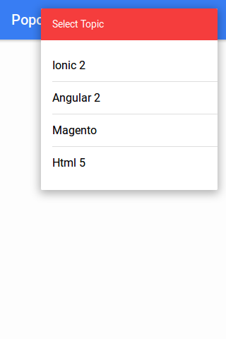
If you run the above example it will produce the following output-
Now let us define the popover component
Controller Part : popover.ts
Create popover.ts file and add the following script-
Popover Controller Example:
import { Component } from '@angular/core';
import { ViewController } from 'ionic-angular';
@Component({
  templateUrl: 'popover.html'
})

export class PopoverContentPage {
constructor(public viewCtrl: ViewController) {}
close() {
    this.viewCtrl.dismiss();
  }
}
|
Html Part : popover.html
Create popover.html file and add the content which will be displayed in popover. Here is an example of popover template-
Popover Controller Example:
<ion-list>
      <ion-list-header color="danger">Select Topic</ion-list-header>
      <button ion-item (click)="close()">Ionic 2</button>
      <button ion-item (click)="close()">Angular 2</button>
      <button ion-item (click)="close()">Magento</button>
      <button ion-item (click)="close()">Html 5</button>
</ion-list>
|
Add Popover Config in app.module.ts
Add the configuration for PopoverContentPage, import { PopoverContentPage } from ‘../pages/demo/popover’; and add declaration, entryComponents for PopoverContentPage.-
Popover app.module.ts configuration Example:
import { NgModule, ErrorHandler } from '@angular/core';
import { IonicApp, IonicModule, IonicErrorHandler } from 'ionic-angular';
import { MyApp } from './app.component';
import { DemoPage } from '../pages/demo/demo';
import { PopoverContentPage } from '../pages/demo/popover';

@NgModule({
  declarations: [
    MyApp,
    DemoPage,
    PopoverContentPage
  ],
  imports: [
    IonicModule.forRoot(MyApp)
  ],
  bootstrap: [IonicApp],
  entryComponents: [
    MyApp,
    DemoPage,
    PopoverContentPage

  ],
  providers: [{provide: ErrorHandler, useClass: IonicErrorHandler}]
})
export class AppModule {}
|
Download Code
file_download Popovers
Options Available
Instance Methods
Popover Create Method Options:
create(component, data, opts); |
| Param | Type | Details |
|---|---|---|
| component | object | The Popover view |
| data | object | Any data to pass to the Popover view |
| opts | object | Popover options |
Advanced
| Option | Type | Description |
|---|---|---|
| cssClass | String | Css class for custom styling. |
| showBackdrop | boolean | Whether to show the backdrop. Default is true. |
| enableBackdropDismiss | boolean | Whether the popover should be dismissed by tapping the backdrop. Default is true. |
Advertisements
Add Comment
📖 Read More
- 1. Ionic 2 Radio
- 2. Ionic 2 Range
- 3. Ionic 2 Searchbar
- 4. Ionic 2 Segment
- 5. Ionic 2 Select


