Ionic 2 Range
Ionic 2 Range slider – The range slider is basically a control which enables you to select from range of values. Range is selected using movable slider knob along with the slider bar. By default there is only one knob which controls the value of the slider but there can be dual knobs to select range between the two values.
Here in this tutorial we are going to explain how to create range sliders in Ionic 2 and use them. You can also use our online editor to run and see the output of the examples.
Ionic 2 Range Slider Example
ion-range Component is used to create the range slider. Let us first create a simple range slider –
Ionic 2 Range Example With Model
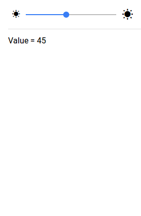
<ion-list>
<ion-item>
  <ion-range [(ngModel)]="brightness">
    <ion-icon range-left small name="sunny"></ion-icon>
    <ion-icon range-right name="sunny"></ion-icon>
  </ion-range>
</ion-item>
<ion-item>
 Value = {{brightness}}
</ion-item>
</ion-list>
|
In the above example we have create very basic range slider, we have the model brightness which handles the value of slider knob when it moves.
If you run the above example it will produce the output something like this-
Input Properties
Following input properties are available-
| Attribute | Type | Details |
|---|---|---|
| color | string | This is used to change the color of the range slider, you can add the predefined colors using this attribute . For example: color = “primary”, color =”secondary”, color= “danger”. |
| mode | string | The mode to apply to this component. Mode can be ios, wp, or md. |
| min | number | Minimum integer value of the range. Defaults to 0. |
| max | number | Maximum integer value of the range. Defaults to 100. |
| step | number | Specifies the value granularity. Defaults to 1. |
| snaps | number | If true, the knob snaps to tick marks evenly spaced based on the step property value. Defaults to false. |
| pin | number | If true, a pin with integer value is shown when the knob is pressed. Defaults to false. |
| debounce | number | How long, in milliseconds, to wait to trigger the ionChange event after each change in the range value. |
| dualKnobs | boolean | This is used to show two knobs. Defaults to false. |
| disabled | boolean | This is used to disable the range slider. Set disabled=”true” to disable the range slider. Defaults to false. |
Advertisements


