Ionic 2 Segment
Ionic 2 Segment – Segment is basically group of buttons that are displayed in single line and these buttons can be used to show and hide the element based upon the segment’s value. Segments provide functionality like tabs. Here in this tutorial we are going to explain how you can create segment in ionic 2. You can also use our online demo to edit and see the output of the example.
Ionic 2 Segment Example
ion-segment component is used to create segment in ionic 2. Create segment and add the model for segment. ion-segment-button is used to add the segment buttons. After Adding button use ngSwitch and ngSwitchCase to add respective elements for the buttons. Let us first create very basic segment example. This contains following parts-
- Html Part
- Controller Part
Html Part : demo.html
Ionic 2 Segment Example: Html Part
<div padding>
  <ion-segment [(ngModel)]="cat">
    <ion-segment-button value="men">
      Men
    </ion-segment-button>
    <ion-segment-button value="women">
      Women
    </ion-segment-button>
    </ion-segment>
</div>

<div [ngSwitch]="cat">
  <ion-list *ngSwitchCase="'men'">
    <ion-item>
      <ion-thumbnail item-left>
        <img src="img/men-image1.png">
      </ion-thumbnail>
      <h2>Cothing</h2>
    </ion-item>
    <ion-item>
      <ion-thumbnail item-left>
        <img src="img/men-image2.png">
      </ion-thumbnail>
      <h2>Watches</h2>
    </ion-item>
    <ion-item>
      <ion-thumbnail item-left>
        <img src="img/men-image3.png">
      </ion-thumbnail>
      <h2>Footwear</h2>
    </ion-item>
  </ion-list>

  <ion-list *ngSwitchCase="'women'">
   <ion-item>
      <ion-thumbnail item-left>
        <img src="img/women-image1.png">
      </ion-thumbnail>
      <h2>Cothing</h2>
    </ion-item>
    <ion-item>
      <ion-thumbnail item-left>
        <img src="img/women-image1.png">
      </ion-thumbnail>
      <h2>Watches</h2>
    </ion-item>
    <ion-item>
      <ion-thumbnail item-left>
        <img src="/img/women-image1.png">
      </ion-thumbnail>
      <h2>Footwear</h2>
    </ion-item>
 </ion-list>
</div>
|
Now let us create controller script part.
Controller Part : demo.ts
Ionic 2 Segment Example: Controller
import { Component } from '@angular/core';
@Component({
  templateUrl: 'demo.html'
})

export class DemoPage {
  cat: string = "men"; // default button
 }
|
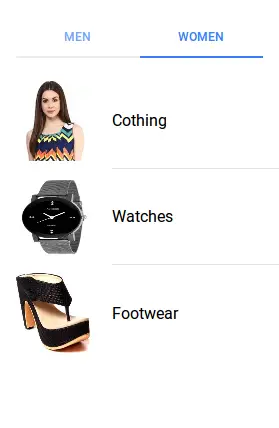
If you run the above example it will produce output something like this-
Input Properties
Following input properties are available-
| Attribute | Type | Details |
|---|---|---|
| color | string | This is used to change the color of segment, you can add the predefined colors using this attribute . For example: color = “primary”, color =”secondary”, color= “danger”. |
| mode | string | The mode to apply to this component. Mode can be ios, wp, or md. |
| disabled | boolean | This is used to disable the segment button. |
Output Properties
Following Output properties is available-
| Attribute | Details |
|---|---|
| ionChange | Emitted when a segment button has been changed. |
Advertisements


