Ionic 2 Radio
Ionic 2 Radio Button: Radio button is input component which enables user to check/uncheck and holds the boolean value. Ionic 2 uses the html radio buttons but it adds some styles to the default radio buttons. Radio button component enables user to select one radio from the group of radio buttons.
It is very simple to create radio buttons in Ionic 2. Here in this tutorial we are going to explain how you can create radio buttons in ionic 2. You can also use our online editor to run and see the output of the example.
Ionic 2 Radio Button Example
Let us create basic radio button-
Ionic 2 Radio Button Example:
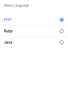
<ion-list radio-group>
  <ion-list-header>
    Select Language
  </ion-list-header>
  <ion-item>
    <ion-label>PHP</ion-label>
    <ion-radio checked="true" value="PHP"></ion-radio>
  </ion-item>

  <ion-item>
    <ion-label>Ruby</ion-label>
    <ion-radio value="Ruby"></ion-radio>
  </ion-item>

  <ion-item>
    <ion-label>Java</ion-label>
    <ion-radio value="Java"></ion-radio>
  </ion-item>
</ion-list>
|
checked attribute is used to set default selected and disabled attribute is used to disable the radio button.
If you run the above example it will produce the output something like this –
Input Properties
Following input properties are available-
| Attribute | Type | Details |
|---|---|---|
| color | string | This is use to change the radio button color, you can use predefined colors to use. For example: “primary”, “secondary”, “danger”. |
| mode | string | This is used to apply mode to this component. Example- ios, wp, or md. |
| value | any | This is used to assign the value to the radio button. Defaults to the generated id. |
| checked | boolean | This is used to check/uncheck the radio button. Default false. |
| disabled | boolean | This is used to eanble/disable the radio button. Default false. |
Advertisements
Add Comment
📖 Read More
- 1. Ionic 2 Range
- 2. Ionic 2 Searchbar
- 3. Ionic 2 Segment
- 4. Ionic 2 Select
- 5. Ionic 2 Slides


