Category Archives: Ionic 2
Ionic 2 Fabs
Ionic 2 Fabs : Fabs Stands for Floating Action Buttons. Fabs are basically Material design Component which are used frequently in mobile devices. Fabs are buttons which prompts set of actions when you click/hover on it. Fabs are placed on the top of the content and their position is fixed when you scroll the page. It is very simple to create fabs in Ionic 2. Here in this tutorial we are going to explain how you can create fabs in Ionic, You can also use our online editor to see the demo.
Ionic 2 Fabs | Buttons | Actions | Icons Example
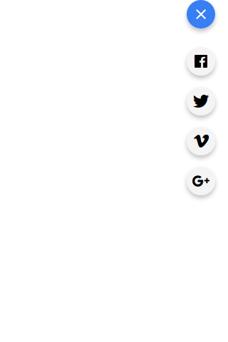
Let us create first Fabs, this fab will be placed at the top right corner(edge) of the page however you can place it at other corners. –
Ionic 2 Fabs Example:
<ion-content>
  <ion-fab top right edge>
    <button ion-fab mini><ion-icon name="add"></ion-icon></button>
    <ion-fab-list>
      <button ion-fab><ion-icon name="logo-facebook"></ion-icon></button>
      <button ion-fab><ion-icon name="logo-googleplus"></ion-icon></button>
      <button ion-fab><ion-icon name="logo-twitter"></ion-icon></button>
      <button ion-fab><ion-icon name="logo-vimeo"></ion-icon></button>
    </ion-fab-list>
  </ion-fab>
</ion-content>
|
If you run the above example it will produce the output something like this –
Attributes
| Attribute | Description |
|---|---|
| mini | This reduces the size of the Fab button |
Input Properties
| Attr | Type | Details |
|---|---|---|
| color | string | You can change the fab button colors using the predefined colors. For example: “primary”, “secondary”, “danger”. |
| mode | string | The mode to apply to this component. Mode can be ios, wp, or md. |
Learn More
Let us create some more examples on Fabs.
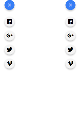
Fab Position – Left Edge | Right Edge
You can place the fab to the left edge or right edge(corner) simply as below –
Place Fab Button to Left Edge | Right Edge Example:
<ion-content>
  <ion-fab top left edge style="margin-top:20px;">
    <button ion-fab mini><ion-icon name="add"></ion-icon></button>
    <ion-fab-list>
      <button ion-fab><ion-icon name="logo-facebook"></ion-icon></button>
      <button ion-fab><ion-icon name="logo-googleplus"></ion-icon></button>
      <button ion-fab><ion-icon name="logo-twitter"></ion-icon></button>
      <button ion-fab><ion-icon name="logo-vimeo"></ion-icon></button>
    </ion-fab-list>
  </ion-fab>
 <ion-fab top right edge style="margin-top:20px;">
    <button ion-fab mini><ion-icon name="add"></ion-icon></button>
    <ion-fab-list>
      <button ion-fab><ion-icon name="logo-facebook"></ion-icon></button>
      <button ion-fab><ion-icon name="logo-googleplus"></ion-icon></button>
      <button ion-fab><ion-icon name="logo-twitter"></ion-icon></button>
      <button ion-fab><ion-icon name="logo-vimeo"></ion-icon></button>
    </ion-fab-list>
  </ion-fab>
</ion-content>
|
The output of the above example will be something like this –
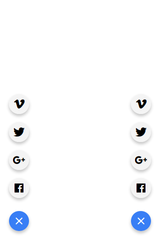
Fab Position – Left Bottom | Right Bottom
You can place the fab to the left bottom and right bottom simply as below-
| Example:
<ion-content>
  <ion-fab left bottom >
    <button ion-fab mini><ion-icon name="add"></ion-icon></button>
    <ion-fab-list side="top">
      <button ion-fab><ion-icon name="logo-facebook"></ion-icon></button>
      <button ion-fab><ion-icon name="logo-googleplus"></ion-icon></button>
      <button ion-fab><ion-icon name="logo-twitter"></ion-icon></button>
      <button ion-fab><ion-icon name="logo-vimeo"></ion-icon></button>
    </ion-fab-list>
  </ion-fab>
 <ion-fab right bottom >
    <button ion-fab mini><ion-icon name="add"></ion-icon></button>
    <ion-fab-list side="top">
      <button ion-fab><ion-icon name="logo-facebook"></ion-icon></button>
      <button ion-fab><ion-icon name="logo-googleplus"></ion-icon></button>
      <button ion-fab><ion-icon name="logo-twitter"></ion-icon></button>
      <button ion-fab><ion-icon name="logo-vimeo"></ion-icon></button>
    </ion-fab-list>
  </ion-fab>
</ion-content>
|
The output of the above example will be something like this –
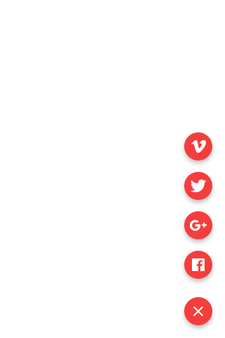
Change Fab Button Color
To change the background color of the Fab Button you can use the input property color to set the predefined color.
How to Change Fab Button Color In Ionic 2 Example:
<ion-content>
 <ion-fab right bottom>
    <button ion-fab mini color="danger"><ion-icon name="add"></ion-icon></button>
    <ion-fab-list side="top">
      <button ion-fab color="danger"><ion-icon name="logo-facebook"></ion-icon></button>
      <button ion-fab color="danger"><ion-icon name="logo-googleplus"></ion-icon></button>
      <button ion-fab color="danger"><ion-icon name="logo-twitter"></ion-icon></button>
      <button ion-fab color="danger"><ion-icon name="logo-vimeo"></ion-icon></button>
    </ion-fab-list>
  </ion-fab>
</ion-content>
|
The output of the above example will be something like this –
Ionic 2 DateTime
Ionic 2 DateTime DateTime component is used to create datepicker which enables user to select dates and times. Ionic’s datetime component enables us to create the datetime picker in preferred format. Here in this tutorial we are going to explain how you can create date time picker in Ionic 2. You can also use our online editor to edit and run the code online.
Ionic 2 DateTime Example
Let us first create very simple example of the DateTime –
Basic DateTime
It Contains two parts Html and JavaScript, Let us create one by one –
- 1. HTML Part – It contains the Html Part.
- 2. Script Part – This contains typescript code for the Alerts.
Html Part : demo.html
Ionic 2 DateTime Basic Eaxmple : Html
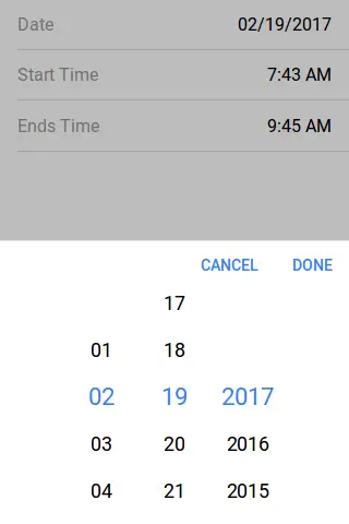
<ion-item> <ion-label>Date</ion-label> <ion-datetime displayFormat="MM/DD/YYYY" [(ngModel)]="event.month"></ion-datetime> </ion-item> <ion-item> <ion-label>Start Time</ion-label> <ion-datetime displayFormat="h:mm A" pickerFormat="h mm A" [(ngModel)]="event.timeStarts"></ion-datetime> </ion-item> <ion-item> <ion-label>Ends Time</ion-label> <ion-datetime displayFormat="h:mm A" pickerFormat="h mm A" [(ngModel)]="event.timeEnds"></ion-datetime> </ion-item> |
JavaScript Part : demo.ts
Now let us create event function Which will add the default time, month and timeEnds in the dateTime Picker-
Ionic 2 DateTime Basic Eaxmple : Html
import { Component } from '@angular/core';

@Component({
  templateUrl: 'demo.html'
})
export class DemoPage {
 public event = {
   month: '2017-02-19',
    timeStarts: '07:43',
    timeEnds: '09:45'
  }
}
|
The output of the above example will look something like this –
Options For Display & Picker
Following Options are available for display and picker of DatTime which can used easily to format the options –
| Format | Description | Example |
|---|---|---|
| YYYY | Year, 4 digits | 2018 |
| YY | Year, 2 digits | 18 |
| M | Month | 1 … 12 |
| MM | Month, leading zero | 01 … 12 |
| MMM | Month, short name | Jan |
| MMMM | Month, full name | January |
| D | Day | 1 … 31 |
| DD | Day, leading zero | 01 … 31 |
| DDD | Day, short name | Fri |
| DDDD | Day, full name | Friday |
| H | Hour, 24-hour | 0 … 23 |
| HH | Hour, 24-hour, leading zero | 00 … 23 |
| h | Hour, 12-hour | 1 … 12 |
| hh | Hour, 12-hour, leading zero | 01 … 12 |
| a | 12-hour time period, lowercase | am pm |
| A | 12-hour time period, uppercase | AM PM |
| m | Minute | 1 … 59 |
| mm | Minute, leading zero | 01 … 59 |
| s | Second | 1 … 59 |
| ss | Second, leading zero | 01 … 59 |
| Z | UTC Timezone Offset | Z or +HH:mm or -HH:mm |
Ionic 2 Checkbox
Ionic 2 Checkbox Checkbox is an input component which enables user to select one or more items. Checkboxes in Ionic 2 are same as Html input. It is very simple to create Checkboxes in Ionic 2. Here in this tutorial we are going to explain how you can create Checkboxes In Ionic 2. You can also use our online editor to see the output of the example.
Ionic 2 Checkbox | Change Color | Disabled | Checked Example
Checkbox holds Boolean(true/false) values when you check or uncheck it.
Checkbox | Checked | Eaxmple
Here we are going to create simple checheckboxes with default checked & unchecked.
Ionic 2 Checkbox | Check | Uncheck Example
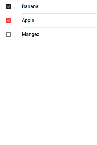
<ion-list> <ion-item> <ion-label>Banana</ion-label> <ion-checkbox color="dark" checked="true"></ion-checkbox> </ion-item> <ion-item> <ion-label>Apple</ion-label> <ion-checkbox color="danger" checked="true"></ion-checkbox> </ion-item> <ion-item> <ion-label>Mangeo</ion-label> <ion-checkbox></ion-checkbox> </ion-item> </ion-list> |
The output of the above example will look something like this –
Options Available
| Attribute | Type | Description |
|---|---|---|
| color | string | This is used to add/change the checkbox color. For example: “primary”, “secondary”, “danger”. |
| mode | string | The mode to apply to this component. |
| checked | boolean | This is used to set the check/uncheck property of checkbox(default is false). |
| disabled | boolean | This is used to disable the checkbox. |
Learn More
Let us have some More example and demo about the Ionic 2 Checkboxes.
Ionic 2 Disabled Checkbox Eaxmple
To disable the checkbox in Ionic 2 Add attribute disabled=”true”.
How to disable Checkbox in Ionic 2 Example
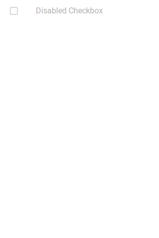
<ion-list> <ion-item> <ion-label>Disabled Checkbox</ion-label> <ion-checkbox checked="ture" disabled="true"></ion-checkbox> </ion-item> </ion-list> |
The output of the above example will look something like this –
Ionic 2 Checkbox Group | Lists Eaxmple
Sometimes we need to create group of checkbox lists which enables user to select one or more than one item from the list. Here is simple example of the Ionic 2 Group.
Ionic 2 Group | Lists Eaxmple
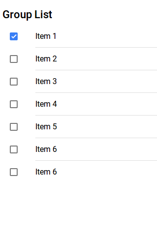
<h3> Group List</h3> <ion-list> <ion-item> <ion-label>Item 1</ion-label> <ion-checkbox checked="true"></ion-checkbox> </ion-item> <ion-item> <ion-label>Item 2</ion-label> <ion-checkbox></ion-checkbox> </ion-item> <ion-item> <ion-label>Item 3</ion-label> <ion-checkbox></ion-checkbox> </ion-item> <ion-item> <ion-label>Item 4</ion-label> <ion-checkbox></ion-checkbox> </ion-item> <ion-item> <ion-label>Item 5</ion-label> <ion-checkbox></ion-checkbox> </ion-item> <ion-item> <ion-label>Item 6</ion-label> <ion-checkbox></ion-checkbox> </ion-item> <ion-item> <ion-label>Item 6</ion-label> <ion-checkbox></ion-checkbox> </ion-item> </ion-list> |
The output of the above example will look something like this –
Ionic 2 Cards
Ionic 2 Cards : Cards are basically used to display the important pieces of content, and emerging as the core design pattern for apps. Cards are great way to display the information in organised format. Cards are widely used by companies like – google, twitter and have become one of the most popular design pattern. Here in this tutorial we are going to explain how to create cards in Ionic 2. You can also use our Online tool to run the example and see the output.
Ionic 2 Cards Example
Cards are important component of the apps, it allows to display the same information on different size of screens. It is very simple to create Cards in Ionic 2. Let us understand the cards one by one-
- 1. Basic Cards
- 2. Card Headers
- 3. Card Lists
- 4. Card Images
- 5. Background Images
- 6. Advanced Cards
Let us go one by one to understand the Ionic 2 Cards-
Basic Cards
Cards are basically css component. You can create basic cards simply as below-
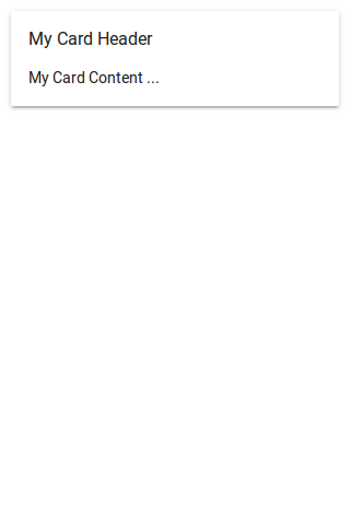
Basic Card Header Example
<ion-card> <ion-card-header> My Card Header </ion-card-header> <ion-card-content> <p>My Card Content …</p> </ion-card-content> </ion-card> |
The output of the above example will look something like this –
Card Headers
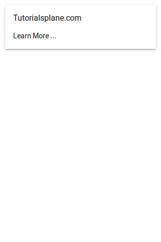
ion-card-header component is used to add the Header in card. Here is simple example of card headers-
Card Headers Example
<ion-card> <ion-card-header> Tutorialsplane.com </ion-card-header> <ion-card-content> <p>Learn More …</p> </ion-card-content> </ion-card> |
The output of the above example will look something like this –
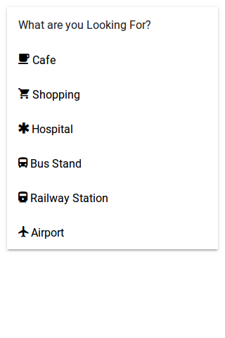
Lists In Cards
ion-list component is used to create card lists in Ionic 2. Here is simple example of Lists In Cards-
Lists In Card Headers Example
<ion-card>
  <ion-card-header>
    What are you Looking For?
  </ion-card-header>
  <ion-list>
    <button ion-item>
      <ion-icon name="cafe"></ion-icon> Cafe
    </button>
    <button ion-item>
      <ion-icon name="cart"></ion-icon> Shopping
    </button>
    <button ion-item>
      <ion-icon name="medical" ></ion-icon> Hospital
    </button>
    <button ion-item>
      <ion-icon name="bus"></ion-icon> Bus Stand
    </button>
    <button ion-item>
      <ion-icon name="train" ></ion-icon> Railway Station
    </button>
    <button ion-item>
      <ion-icon name="plane"></ion-icon> Airport
    </button>
   </ion-list>
</ion-card>
|
The output of the above example will look something like this –
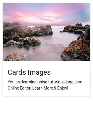
Images In Cards
We sometimes need to add images in cards, It is very simple to add images in Cards. Here is an example of Images in Cards.
Ionic 2 Card Images Example
<ion-card>
  <img src="//tutorialsplane.com/wp-content/uploads/2017/01/cothach-1790701_640.jpg"/>
  <ion-card-content>
    <ion-card-title>
      Cards Images
      </ion-card-title>
    <p>
      You are learning using tutorialsplane.com Online Editor. Learn More & Enjoy!
    </p>
  </ion-card-content>
</ion-card>
|
The output of the above example will look something like this –
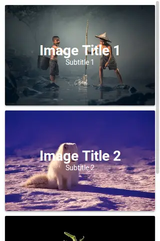
Background Images In Cards
You can set background images in Cards simply adding the image source url as below-
Background Images in Cardss Example
<ion-content class="card-background-page">

  <ion-card>
    <img src="//tutorialsplane.com/wp-content/uploads/2017/01/ace-1807511__340.jpg"/>
    <div class="card-title">Image Title 1</div>
    <div class="card-subtitle">Subtitle 1</div>
  </ion-card>a

  <ion-card>
    <img src="//tutorialsplane.com/wp-content/uploads/2017/01/norway-1758183__340.jpg"/>
    <div class="card-title">Image Title 2</div>
    <div class="card-subtitle">Subtitle 2</div>
  </ion-card>

  <ion-card>
    <img src="//tutorialsplane.com/wp-content/uploads/2017/01/tomato-1862857__340.jpg"/>
    <div class="card-title">Image Title 3</div>
    <div class="card-subtitle">Subtitle 3</div>
  </ion-card>
</ion-content>
|
The css used in the above example is given below, please don’t forget to add this to add the styles for title and subtitle.
Card Background Image Css:
.card-background-page {

  ion-card {
    position: relative;
    text-align: center;
  }

  .card-title {
    position: absolute;
    top: 37%;
    font-size: 2.0em;
    width: 100%;
    font-weight: bold;
    color: #fff;
  }

  .card-subtitle {
    font-size: 1.0em;
    position: absolute;
    top: 53%;
    width: 100%;
    color: #fff;
  }

}
|
The output of the above example will look something like this –
Ionic 2 Buttons
Ionic 2 Buttons: Buttons play an important role in navigation of any app, Ionic 2 provides predefined classes to create different-different buttons. Buttons can contain the text and icons which can be enhanced with different-different attributes. Here in this tutorial we are going to explain how you can create buttons in Ionic 2, you can also use our online editor to run and see the output of the example.
Ionic 2 Buttons | Example & Demo
Ionic uses standard html button <button> element to create buttons and ion-button directive to enhance the properties.
Following Buttons are available in Ionic 2-
- 1. Default Style
- 2. Outline Style
- 3. Clear Style
- 4. Round Buttons
- 5. Block Buttons
- 6. Full Buttons
- 7. Button Sizes
- 8. Icon Buttons
- 9. Buttons In Components
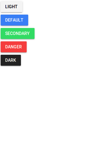
Default Style Button
To create default Style add ion-button attribute to the button Add color using color attribute simply as below –
If you run the above example it will produce output something like this –
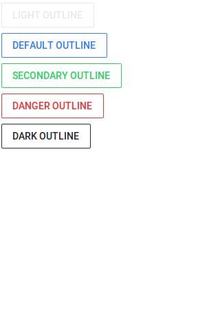
Outline Style Button
To create outline Style add outline property to the button simply as below-
If you run the above example it will produce output something like this –
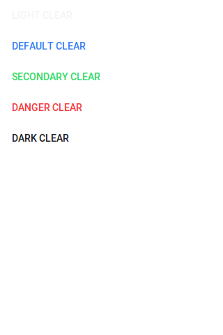
Clear Style Button
If You want to create Clear Style Button just add clear property simply as below-
If you run the above example it will produce output something like this –
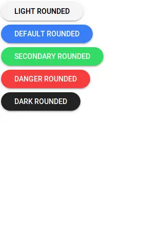
Rounded Buttons
If You want to create rounded Buttons just add round property to button simply as below-
If you run the above example it will produce output something like this –
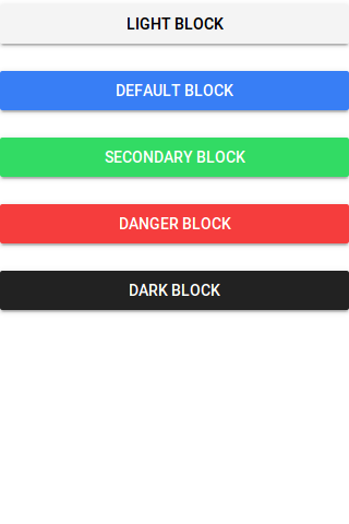
Block Buttons
Add block property to button to make the block level, it will make button 100% of its parent container. Here is an example of block level button-
If you run the above example it will produce output something like this –
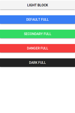
Full Buttons
Add full property to button create Full width button. Full button will be 100% of it’s parent. It removes the left and right borders of the button. Here is an example of block level button-
Ionic 2 Full Buttons Example
|
|
If you run the above example it will produce output something like this –
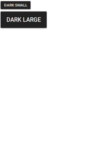
Button Sizes
You can add large attribute to make the buttons large and small to make the buttons small-
Ionic 2 Small | Large Button Example
|
|
The output of the above example will look something like this –
Icon Buttons
You can create icon buttons using ionic icons simply as in the example below –
Ionic 2 Small | Large Button Example
|
|
The output of the above example will look something like this –
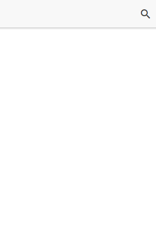
Buttons In Component
You can easily add the buttons in components such as header, footer or list items. Here is an example of a simple search button in header-
Buttons In Component Example
|
|
The output of the above example will look something like this –
Input Properties
| Attribute | Type | Description |
|---|---|---|
| large | boolean | Used to Create Large button. |
| small | boolean | Used to Create Small button. |
| default | boolean | Used to Create Default button. |
| outline | boolean | This creates transparent button with a border. |
| clear | boolean | This creates transparent button without a border. |
| solid | boolean | This is used to force a solid button. Useful for buttons within an item. |
| round | boolean | This creates button with rounded corners. |
| block | boolean | This creates button that fills its parent container with a border-radius. |
| full | boolean | This creates button that fills its parent container without a border-radius or borders on th |
| strong | boolean | This is used to represent the important action. |
| mode | string | The mode to apply to this component. |
| color | string | The predefined color to use. For example: |
Ionic 2 Badges
Ionic 2 Badges: Badges are basically numerical representaion of message that needs to be conveyed to the user. It is very easy to create Badges in Ionic 2. Here in this tutorial we are going to explain how you can create badges in Ionic 2 Framework. You can also use online editor to see the output of the example.
Ionic 2 Badges Example
You can create badge simply using ion-badge tag as in example below –
If you run the above example it will produce output something like this –

Attributes
Following Attributes can be used for badges-
| Attribute | Type | Description |
|---|---|---|
| color | string | You can use this to add predefined colors such as “primary”, “danger”. |
| mode | string | Mode to apply to this component. |
Learn More About Badges
Let us have some More example and demo about the Badges.
Change Badge Color
Some times we need to change the badge color, you can change color using color attribute simply as below –
If you run the above example it will produce output something like this –

Ionic 2 Alerts
Ionic 2 Alerts | Popup Alerts are basically used to show some specific message or ask user to make a decision or multiple decisions. Alerts can also be used to provide important information to the user. Here in this tutorial we are going to explain how you can create Alerts in Ionic 2. You can also use our online editor to edit and run the code online.
Ionic 2 Alert | Popup Example
An Alert is dialog that is used to show information or collect information from user using inputs. Alerts can also be considered as floating modal that covers a part of screen, Alerts are used for quick actions such as asking user to enter pin code sent on mobile for verification. Alerts Appear on the top of the app’s content so to interact the app’s content again it must be manually dismissed by the user.
There are following types of Alerts Available –
- 1. Basic Alerts
- 2. Prompt Alerts
- 3. Confirmation Alerts
- 4. Radio Alerts
- 5. Checkbox Alerts
Now let us go one by one to understand the above alerts-
Basic Alerts
- 1. HTML Part – It contains the Html Part.
- 2. Script Part – This contains typescript code for the Alerts.
Html Part : demo.html
Now let us first create html template and add a button to call the Alert –
Ionic 2 Alerts Example: Html Part
|
Html part contains the Layout of the page and we have created a button “Show Alert” and called function showAlert() to open a basic alert, this function is defined in JavaScript Typescript – demo.ts file.
Script Part : demo.ts
Script Part contains the required resources to create Alert Box, It contains the showAlert() function which is triggered on Button click to open the Alert Box.
MatIonic 2 Alerts Example: Script Part
import { Component } from '@angular/core';
import { AlertController } from 'ionic-angular';
@Component({
templateUrl: 'demo.html'
})
export class DemoPage {
constructor(public atrCtrl: AlertController) {
}
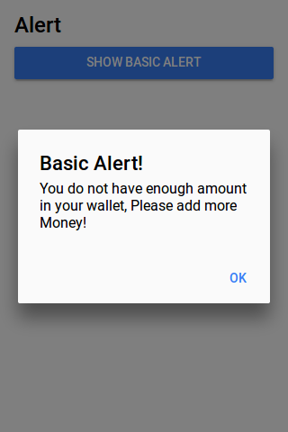
showAlert() {
let alert = this.atrCtrl.create({
title: 'Basic Alert!',
subTitle: 'You do not have enough amount in your wallet, Please add more Money!',
buttons: ['OK']
});
alert.present();
}
}
|
Import AlertsController, add in constructor as above and call create() method with parameters so main things required to create the Alert box in Ionic 2 are below-
1. importing AlertController.
2. calling it in constructor.
If you run the above example it will produce output something like this –
Confirm Alerts | Confirmation Box | Yes | No
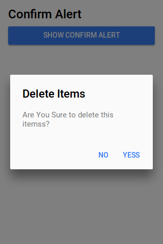
Confirmation Alert is basically used to ask user whether user wants to verify some action or not. Let us create Confirmation Box
- 1. HTML Part – It contains the Html Part.
- 2. Script Part – It contains typescript code for the Confirmation Alerts.
Html Part : demo.html
Html template contains button to Call the Confirm Alert which will call showConfirmAlert Function –
Ionic 2 Confirm Alerts Example: Html Part
|
Script Part : demo.ts
Script Part contains the definition of function showConfirmAlert()-
Ionic 2 Confirmation box Alerts Example: Script Part
import { Component } from '@angular/core';
import { AlertController } from 'ionic-angular';

@Component({
  templateUrl: 'demo.html'
})
export class DemoPage {
  constructor(public atrCtrl: AlertController) {

  }
 showConfirmAlert() {
  let alertConfirm = this.atrCtrl.create({
    title: 'Delete Items',
    message: 'Are You Sure to delete this itemss?',
    buttons: [
      {
        text: 'No',
        role: 'cancel',
        handler: () => {
          console.log('No clicked');
        }
      },
      {
        text: 'Yess',
        handler: () => {
          console.log('Yes clicked');
        }
      }
    ]
  });
  alertConfirm.present();
}


}
|
If you run the above example it will produce output something like this –
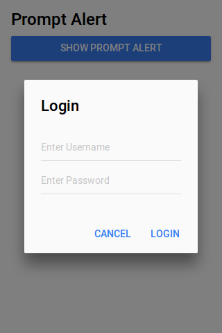
Prompt Alerts
Prompt Alert is used to get User Input such as Login Information – Enter Username & Password.
- 1. HTML Part – It contains the Html Part.
- 2. Script Part – It contains typescript code for the Prompt Alerts.
Html Part : demo.html
Html template contains button to Call the Prompt Alert which will call showPromptAlert Function –
Ionic 2 Prompt Alerts Example: Html Part
|
Script Part : demo.ts
Script Part contains the definition of function showPromptAlert()-
Ionic 2 Prompt box Alerts Example: Script Part
import { Component } from '@angular/core';
import { AlertController } from 'ionic-angular';

@Component({
  templateUrl: 'demo.html'
})
export class DemoPage {
  constructor(public atrCtrl: AlertController) {

  }
 showPromptAlert() {
  let alert = this.atrCtrl.create({
    title: 'Login',
    inputs: [
      {
        name: 'username',
        placeholder: 'Enter Username'
      },
      {
        name: 'password',
        placeholder: 'Enter Password',
        type: 'password'
      }
    ],
    buttons: [
      {
        text: 'Cancel',
        role: 'cancel',
        handler: data => {
          console.log('You Clicked on Cancel');
        }
      },
      {
        text: 'Login',
        handler: data => {
          if (User.isValid(data.username, data.password)) {
            // login is valid
          } else {
            // invalid login
            return false;
          }
        }
      }
    ]
  });
  alert.present();
}

}
|
If you run the above example it will produce output something like this –
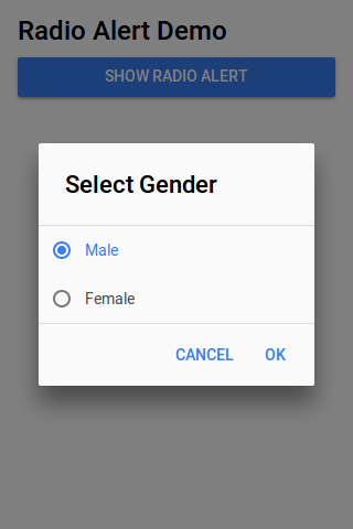
Radio Alerts
Radio Alert is used to show radio button options to select one from the list.
- 1. HTML Part – It contains the Html Part.
- 2. Script Part – It contains typescript code for the Radio Alerts.
Html Part : demo.html
Html template contains button to Call the Radio Button Alert which will call showRadioAlert Function –
Ionic 2 Radio Alerts Box Example: Html Part
|
Script Part : demo.ts
Script Part contains the definition of function showRadionAlert()-
Ionic 2 Radio Alert box Alerts Example: Script Part
import { Component } from '@angular/core';
import { AlertController } from 'ionic-angular';

@Component({
  templateUrl: 'demo.html'
})
export class DemoPage {
  constructor(public atrCtrl: AlertController) {

  }
 showRadioAlert() {
    let alert = this.atrCtrl.create();
    alert.setTitle('Select Gender');

    alert.addInput({
      type: 'radio',
      label: 'Male',
      value: 'Male',
      checked: true
    });
     alert.addInput({
      type: 'radio',
      label: 'Female',
      value: 'Female',
      checked: true
    });

    alert.addButton('Cancel');
    alert.addButton({
      text: 'OK',
      handler: data => {
        this.testRadioOpen = false;
        this.testRadioResult = data;
      }
    });
    alert.present();
  }
}

}
|
If you run the above example it will produce output something like this –
Checkbox Alerts
Checkbox Alert provides option to select multiple items.
- 1. HTML Part – It contains the Html Part.
- 2. Script Part – It contains typescript code for the Checkbox Alerts.
Html Part : demo.html
Html template contains button to Call the Checkbox Button Alert which will call Checkbox Function –
Ionic 2 Checkbox Alerts Box Example: Html Part
|
Script Part : demo.ts
Script Part contains the definition of function showCheckboxAlert()-
Ionic 2 Checkbox Alert box Alerts Example: Script Part
import { Component } from '@angular/core';
import { AlertController } from 'ionic-angular';

@Component({
  templateUrl: 'demo.html'
})
export class DemoPage {
  constructor(public atrCtrl: AlertController) {

  }
  showCheckboxAlert() {
    let alert = this.atrCtrl.create();
    alert.setTitle('Which fruit do you like?');

    alert.addInput({
      type: 'checkbox',
      label: 'Mango',
      name: 'input-mango',
      id: 'input-mango',
      value: 'Mango',
      checked: true
    });

   alert.addInput({
      type: 'checkbox',
      label: 'Banana',
      name: 'input-banana',
      id: 'input-banana',
      value: 'Banana'
    });
   alert.addInput({
      type: 'checkbox',
      label: 'Apple',
      name: 'input-apple',
      id: 'input-apple',
      value: 'Apple'
    });

    alert.addButton('Cancel');
    alert.addButton({
      text: 'Okay',
      handler: data => {
        console.log('Checkbox data:', data);
      }
    });
    alert.present();
  }

}
|
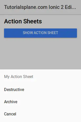
Ionic 2 Action Sheet
Ionic 2 Action Sheet: Action Sheet is dialog that allows users to choose option from the set of options. Action Sheet is placed at the bottom of the screen and it is placed at the top of the app’s content, As it is placed on the top of the content so it needs to be dismissed before interaction the app content. Here in this tutorial we are going to explain how To create Ionic 2 Action Sheet. You can also use our online tool to see the output of the example.
Ionic 2 Action Sheet Example
Action Sheet is basically created using an array of buttons and these buttons have several properties such as Text, Handler, Role, Icon etc which can be used easily to add Text, Icons etc.
ActionSheet.create(opts) Method is used to create the Action Sheet in Ionic 2 Where you can pass all the options in first Argument. Let us create a very basic Action Sheet example –
- 1. HTML Part – It contains the Html Part.
- 2. Script Part – This contains typescript code for the actionsheet.
Now let us go one by one to understand the Action Sheets –
Html Part : demo.html
Html Part Contains the a button which calls the function openMenu() on click event. This is the template where you want to add the action sheet button.
Ionic 2 Action sheet Example: Html Part
|
Html part contains the Layout of the page and we have created a button “Show Action Sheet” and we have called a function openMenu() to show menu, this function is defined in JavaScript Typescript – demo.ts file.
Script Part : demo.ts
Script Part contains the required resources to create Action Sheet, It contains the openMenu() function which is triggered on Button click to open the Action Sheet.
MatIonic 2 Action sheet Example: Script Part
import { Component } from '@angular/core';
import {ActionSheetController} from 'ionic-angular';

@Component({
  selector: 'demo-page',
  templateUrl: 'demo.html'
})
export class DemoPage {

  constructor(public actShtCtr: ActionSheetController) {

  }

  openMenu() {
    let actionSheet = this.actShtCtr.create({
      title: 'My Action Sheet',
      cssClass: 'action-sheets-basic-page',
      buttons: [
        {
          text: 'Destructive',
          role: 'destructive',
          handler: () => {
            console.log('Destructive clicked');
          }
        },{
          text: 'Archive',
          handler: () => {
            console.log('Archive clicked');
          }
        },{
          text: 'Cancel',
          role: 'cancel',
          handler: () => {
            console.log('Cancel clicked');
          }
    }
      ]
    });
    actionSheet.present();
  }
}
|
Import ActionSheetController, add in constructor as above and call create() method with parameters. The main things required to use the ActionSheet is below-
1. importing ActionSheetController.
2. calling it in constructor.
Thus using the both steps you can create action sheet anywhere.
If you run the above example it will produce output something like this-
Download Demo
To download demo files click here – Download Ionic 2 Actionsheet
If you unzip the downloaded file, it contains folders Used to created the above demo-
- folder app
- folder pages
Options Available:
Instance Method
create(opts) |
- opts(ActionSheetOptions)– Action Sheet Options are title, subtitle and array of buttons. There are basically following two types of options accepted by create method-
- 1. ActionSheet Create Options
- 2. ActionSheet Button Options
1. ActionSheet Create Options
Following ActionSheet Create Options Are Available –
| Option | Type | Description |
|---|---|---|
| title | string | This is used to Add title Action Sheet. |
| subTitle | string | This is used to Add sub-title for the Action Sheet. |
| cssClass | string | This is used to Add Additional classes for custom styles, You can add multiple classes separated by space. |
| enableBackdropDismiss | boolean | If the Action Sheet should close when the user taps the backdrop. |
| buttons | array | An array of buttons which will be displayed on Action Sheet. |
2. ActionSheet Button Options
Following options for button are provided which can be used easily –
| Option | Type | Description |
|---|---|---|
| text | string | Button text. |
| icon | icon | Button Icon |
| handler | Any | An express the button should evaluate |
| cssClass | string | Add Additional Classes separated by space. |
| role | string | How the button should be displayed, destructive or cancel |
Learn More
Let us Learn More About Ionic 2 Action Sheet.
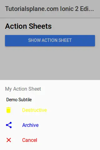
Ionic 2 ActionSheet With SubTitle | ICON | Css Class
Action sheet With Icons | Subtitle | Custom Css Example: Script Part
import { Component } from '@angular/core';
import { Platform, ActionSheetController} from 'ionic-angular';

@Component({
  selector: 'demo-page',
  templateUrl: 'demo.html'
})
export class DemoPage {
  constructor(public platform: Platform, public actShtCtr: ActionSheetController,public atrCtrl: AlertController) {

  }


  openMenu() {
    let actionSheet = this.actShtCtr.create({
      title: 'My Action Sheet',
      subTitle: ' Demo Subtile ',
      cssClass: 'action-sheets-basic-page',
      buttons: [
        {
          text: 'Destructive',
          role: 'destructive',
          icon: !this.platform.is('ios') ? 'trash' : null,
          cssClass:'yellow-color',
          handler: () => {
            console.log('Destructive clicked');
          }
        },{
          text: 'Archive',
          icon: !this.platform.is('ios') ? 'share' : null,
          cssClass:'blue-color',
          handler: () => {
            console.log('Archive clicked');
          }
        },{
          text: 'Cancel',
          role: 'cancel',
          icon: !this.platform.is('ios') ? 'close' : null,
          cssClass:'red-color',
          handler: () => {
            console.log('Cancel clicked');
          }
    }
      ]
    });
    actionSheet.present();
  }
}
|
If you run the above it will add custom color using custom css class and we have also added icons to the buttons. The output of the above example will be something like this-
Ionic 2 Tutorial
Ionic 2 Tutorial: Ionic is open source Modern front-end SDK for developing Hybrid mobile applications. Ionic’s first version was launched in 2013 with the aim to make a better for web developers to use their web skills to create mobile apps. Ionic is one of the most popular Hybrid Mobile App Development framework, more than 1.2 million apps are built on Ionic.
Ionic 2 is improved version of Ionic 1. Ionic 2 has improved performance, reduced the complexity of the code and enables you to create apps which can compete the best apps in the world.
Ionic 2 Tutorial With Example & Demo
Ionic 2 enables us to create beautiful apps with high performance which will run across each platform. Ionic 2 is different than angular 1 as it is built on Angular 2. It is easy to learn and create apps in Ionic 2.
Audience
This tutorial is made for the developers who are willing to learn the Ionic 2 with example and demo.
What You Should Know?
Before staring on Ionic 2 you should have basic knowledge of HTML, CSS And Angular 2.
Features Of Ionic 2
Ionic 2 comes with massive improvements which makes it perfect framework for cross platform Application Development. Let us have some core features of Ionic 2-
- Amazing Performance Ionic 2 comes with amazing performance, it has improved performance than v1.-
- Simplicity Ionic 2 is simple & easy to learn. It has simple folder structure and it is very simple to customize the components.
- Platform Independent : Ionic 2 is platform independent – code once and deploy on any platform – android, ios.
- Native Focused: Ionic 2 is native focused, it is easier native access such as GPS, Bluetooth, Camera etc.
- Powerful CLI: It has powerful cli which makes development easy & fast.
- Great Community: Ionic has powerful community, it’s forum has more then 2 Million page views every month and 3500+ apps created daily.
We are sure once you will learn Ionic 2, you will fall in love with it.


