Category Archives: Ionic 2
Ionic 2 Range
Ionic 2 Range slider – The range slider is basically a control which enables you to select from range of values. Range is selected using movable slider knob along with the slider bar. By default there is only one knob which controls the value of the slider but there can be dual knobs to select range between the two values.
Here in this tutorial we are going to explain how to create range sliders in Ionic 2 and use them. You can also use our online editor to run and see the output of the examples.
Ionic 2 Range Slider Example
ion-range Component is used to create the range slider. Let us first create a simple range slider –
Ionic 2 Range Example With Model
<ion-list>
<ion-item>
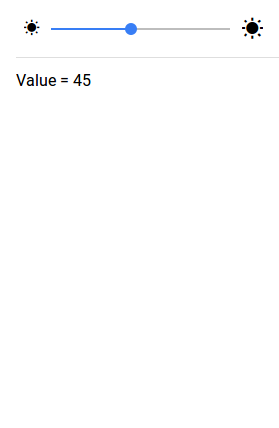
<ion-range [(ngModel)]="brightness">
<ion-icon range-left small name="sunny"></ion-icon>
<ion-icon range-right name="sunny"></ion-icon>
</ion-range>
</ion-item>
<ion-item>
Value = {{brightness}}
</ion-item>
</ion-list>
|
In the above example we have create very basic range slider, we have the model brightness which handles the value of slider knob when it moves.
If you run the above example it will produce the output something like this-
Input Properties
Following input properties are available-
| Attribute | Type | Details |
|---|---|---|
| color | string | This is used to change the color of the range slider, you can add the predefined colors using this attribute . For example: color = “primary”, color =”secondary”, color= “danger”. |
| mode | string | The mode to apply to this component. Mode can be ios, wp, or md. |
| min | number | Minimum integer value of the range. Defaults to 0. |
| max | number | Maximum integer value of the range. Defaults to 100. |
| step | number | Specifies the value granularity. Defaults to 1. |
| snaps | number | If true, the knob snaps to tick marks evenly spaced based on the step property value. Defaults to false. |
| pin | number | If true, a pin with integer value is shown when the knob is pressed. Defaults to false. |
| debounce | number | How long, in milliseconds, to wait to trigger the ionChange event after each change in the range value. |
| dualKnobs | boolean | This is used to show two knobs. Defaults to false. |
| disabled | boolean | This is used to disable the range slider. Set disabled=”true” to disable the range slider. Defaults to false. |
Ionic 2 Radio
Ionic 2 Radio Button: Radio button is input component which enables user to check/uncheck and holds the boolean value. Ionic 2 uses the html radio buttons but it adds some styles to the default radio buttons. Radio button component enables user to select one radio from the group of radio buttons.
It is very simple to create radio buttons in Ionic 2. Here in this tutorial we are going to explain how you can create radio buttons in ionic 2. You can also use our online editor to run and see the output of the example.
Ionic 2 Radio Button Example
Let us create basic radio button-
Ionic 2 Radio Button Example:
<ion-list radio-group>
  <ion-list-header>
    Select Language
  </ion-list-header>
  <ion-item>
    <ion-label>PHP</ion-label>
    <ion-radio checked="true" value="PHP"></ion-radio>
  </ion-item>

  <ion-item>
    <ion-label>Ruby</ion-label>
    <ion-radio value="Ruby"></ion-radio>
  </ion-item>

  <ion-item>
    <ion-label>Java</ion-label>
    <ion-radio value="Java"></ion-radio>
  </ion-item>
</ion-list>
|
checked attribute is used to set default selected and disabled attribute is used to disable the radio button.
If you run the above example it will produce the output something like this –
Input Properties
Following input properties are available-
| Attribute | Type | Details |
|---|---|---|
| color | string | This is use to change the radio button color, you can use predefined colors to use. For example: “primary”, “secondary”, “danger”. |
| mode | string | This is used to apply mode to this component. Example- ios, wp, or md. |
| value | any | This is used to assign the value to the radio button. Defaults to the generated id. |
| checked | boolean | This is used to check/uncheck the radio button. Default false. |
| disabled | boolean | This is used to eanble/disable the radio button. Default false. |
Ionic 2 Popover
Ionic 2 Popover : Popover is an important component of Ionic 2 framework. Popover is basically dialog that appears above the content’s view. It can be used to provide or gather information from user. It is very simple to create popover in Ionic 2. Here in this tutorial we are going to explain how you can create popover with various examples & demo. You can also use our online editor to run and see the output of the example.
Ionic 2 Popover Example
PopoverController is used to create the popovers so it must be imported before using it. Let us create the very basic popover in ionic 2, It contains the following part-
- Html part
- Controller Part
Html Part : demo.html
Ionic 2 Popover Example: Html Part
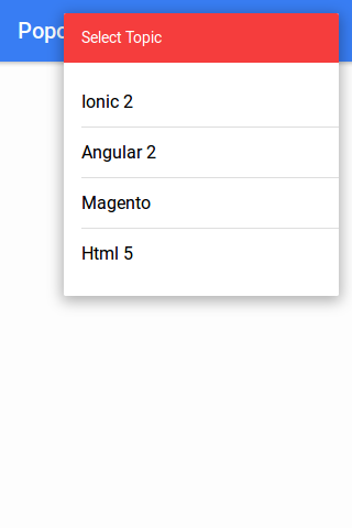
<ion-header>
  <ion-navbar color="primary">
    <ion-title>Popovers</ion-title>
    <ion-buttons end>
     <a ion-button icon-only (click)="openPopover($event)">
      <ion-icon name="more"></ion-icon>
    </a>
    </ion-buttons>
  </ion-navbar>
</ion-header>
|
Controller Part : demo.ts
Popover Controller Example
import { Component } from '@angular/core';
import { PopoverController} from 'ionic-angular';
import { PopoverContentPage } from './popover';
@Component({
  templateUrl: 'demo.html'
})

export class DemoPage {
 constructor(public popoverCtrl: PopoverController) { }

  openPopover(myEvent) {
    let popover = this.popoverCtrl.create(PopoverContentPage);
    popover.present({
      ev: myEvent
    });
  }
  }
|
If you run the above example it will produce the following output-
Now let us define the popover component
Controller Part : popover.ts
Create popover.ts file and add the following script-
Popover Controller Example:
import { Component } from '@angular/core';
import { ViewController } from 'ionic-angular';
@Component({
  templateUrl: 'popover.html'
})

export class PopoverContentPage {
constructor(public viewCtrl: ViewController) {}
close() {
    this.viewCtrl.dismiss();
  }
}
|
Html Part : popover.html
Create popover.html file and add the content which will be displayed in popover. Here is an example of popover template-
Popover Controller Example:
<ion-list>
      <ion-list-header color="danger">Select Topic</ion-list-header>
      <button ion-item (click)="close()">Ionic 2</button>
      <button ion-item (click)="close()">Angular 2</button>
      <button ion-item (click)="close()">Magento</button>
      <button ion-item (click)="close()">Html 5</button>
</ion-list>
|
Add Popover Config in app.module.ts
Add the configuration for PopoverContentPage, import { PopoverContentPage } from ‘../pages/demo/popover’; and add declaration, entryComponents for PopoverContentPage.-
Popover app.module.ts configuration Example:
import { NgModule, ErrorHandler } from '@angular/core';
import { IonicApp, IonicModule, IonicErrorHandler } from 'ionic-angular';
import { MyApp } from './app.component';
import { DemoPage } from '../pages/demo/demo';
import { PopoverContentPage } from '../pages/demo/popover';

@NgModule({
  declarations: [
    MyApp,
    DemoPage,
    PopoverContentPage
  ],
  imports: [
    IonicModule.forRoot(MyApp)
  ],
  bootstrap: [IonicApp],
  entryComponents: [
    MyApp,
    DemoPage,
    PopoverContentPage

  ],
  providers: [{provide: ErrorHandler, useClass: IonicErrorHandler}]
})
export class AppModule {}
|
Download Code
file_download Popovers
Options Available
Instance Methods
Popover Create Method Options:
create(component, data, opts); |
| Param | Type | Details |
|---|---|---|
| component | object | The Popover view |
| data | object | Any data to pass to the Popover view |
| opts | object | Popover options |
Advanced
| Option | Type | Description |
|---|---|---|
| cssClass | String | Css class for custom styling. |
| showBackdrop | boolean | Whether to show the backdrop. Default is true. |
| enableBackdropDismiss | boolean | Whether the popover should be dismissed by tapping the backdrop. Default is true. |
Ionic 2 Modals
Ionic 2 Modals– Modals are basically pane area that appears above the content area. Modals are important component that can be use in different ways such as – show form to edit information, show login form, registration form etc. It is very easy to create Modals in Ionic 2. Here in this tutorial we are going to explain how you can create modals in Ionic 2. You can also use our online editor to run and see the output of the example.
Ionic 2 Modals Example
ModalController is used to create Modals in Ionic 2 so it should be imported first. Let us create a simple modal in Ionic 2-
- Html Part
- Controller Part
Html Part : demo.html
Ionic 2 Modals Html Part Example:
|
Html part contains button which will call function to open modal. Now let define the modal in controller part.
Controller Part: demo.ts
Ionic 2 Modals Simple Example:
import { Component } from '@angular/core';
import { ModalController, Platform, NavParams, ViewController } from 'ionic-angular';
import { ModalContentPage } from './modal';
@Component({
  templateUrl: 'demo.html'
})

export class DemoPage {
 constructor(public modalCtrl: ModalController) { }

  openModal(characterNum) {

    let modal = this.modalCtrl.create(ModalContentPage,characterNum);
    modal.present();
  }
  }
|
Now let us define the modal component for ModalContentPage.
Modal Controller Part : Modal.ts
Modal.ts Script Part Example:
import { Component } from '@angular/core';
import { ModalController, Platform, NavParams, ViewController } from 'ionic-angular';
@Component({
  templateUrl: 'modal.html'
})

export class ModalContentPage {

character;

  constructor(
    public platform: Platform,
    public params: NavParams,
    public viewCtrl: ViewController
  ) {
    var character = [
      {
        image:'https://www.tutorialsplane.com/wp-content/uploads/2017/02/girl.1361906__180.png',
        name: 'Kelly',
        text: 'This is kelly from USA.'
      }
    ];
    this.character = character[this.params.get('charNum')];
  }

  dismiss() {
    this.viewCtrl.dismiss();
  }
}
|
Template Part : modal.html
Modal Template Part Example:
<ion-header>
  <ion-toolbar>
    <ion-title>
      Profile
    </ion-title>
    <ion-buttons start>
      <button ion-button (click)="dismiss()">
       Close
      </button>
    </ion-buttons>
  </ion-toolbar>
</ion-header>

<ion-content>
  <ion-list>
      <ion-item>
        <ion-avatar item-left>
        <img src="{{character.image}}">
        </ion-avatar>
        <h2>{{character.name}}</h2>
        <p>{{character.text}}</p>
      </ion-item>
  </ion-list>
</ion-content>
|
Add Modal Config in app.module.ts
Add the configuration for ModalContentPage, import { ModalContentPage } from ‘../pages/demo/modal’; and add declaration, entryComponents for ModalContentPage.
app.module.ts Configuration:
import { NgModule, ErrorHandler } from '@angular/core';
import { IonicApp, IonicModule, IonicErrorHandler } from 'ionic-angular';
import { MyApp } from './app.component';
import { DemoPage } from '../pages/demo/demo';
import { ModalContentPage } from '../pages/demo/modal';

@NgModule({
  declarations: [
    MyApp,
    DemoPage,
    ModalContentPage
  ],
  imports: [
    IonicModule.forRoot(MyApp)
  ],
  bootstrap: [IonicApp],
  entryComponents: [
    MyApp,
    DemoPage,
    ModalContentPage

  ],
  providers: [{provide: ErrorHandler, useClass: IonicErrorHandler}]
})
export class AppModule {}
|
If you run the above example it will create output something like this –

Download Code
file_download Download Sample
Options Available
Instance Methods
Modal Create Method Example:
create(component, data, opts); |
| Param | Type | Details |
|---|---|---|
| component | object | The Modal view |
| data | object | Any data to pass to the Modal view |
| opts | object | Modal options |
Advanced
| Option | Type | Description |
|---|---|---|
| showBackdrop | boolean | Whether to show the backdrop. Default is true. |
| enableBackdropDismiss | boolean | Whether the popover should be dismissed by tapping the backdrop. Default is true. |
ModalCmp ionViewPreLoad error: No component factory found for ModalContentPage
This error comes when you have not created the ModalContentPage module so make sure you have created module correctly.
Ionic 2 Menus
Ionic 2 Menus – Menu component enables us to create side-menus. Menu is basically side-menu which is displayed on button click or on drag out. Menus are displayed differently depending
upon the mode and this can be changed to any available menu types.
It is very simple to create side menu in Ionic 2.
Here in this tutorial we are going to explain how you can create side menus in ionic 2. You can also use our online editor to run the code online.
Ionic 2 Menus | Side Menus Example
Let us first create very basic menu-
Side Menu
You can create side menus simply as below-
Ionic 2 Menus Example:
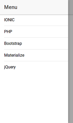
<ion-header>
  <ion-navbar>
   <ion-nav id="nav" #content [root]="rootPage"></ion-nav>
    <button ion-button menuToggle icon-only>
      <ion-icon name='menu' ></ion-icon>
    </button>
    <ion-title>
      Tutorialsplane
    </ion-title>
  </ion-navbar>
</ion-header>
<ion-menu [content]="content">
  <ion-header>
    <ion-toolbar>
      <ion-title>Menu</ion-title>
    </ion-toolbar>
  </ion-header>
  <ion-content>
    <ion-list>
      <ion-item>
        IONIC
    </ion-item>
    <ion-item>
        PHP
    </ion-item>
    <ion-item>
        Bootstrap
    </ion-item>
    <ion-item>
        Materialize
    </ion-item>
    <ion-item>
        jQuery
    </ion-item>
    </ion-list>
  </ion-content>
</ion-menu>
|
If you run the above example it will produce the output something like this-
Menu Options
Following Options are available for the menu options.
| Option | Type | Description |
|---|---|---|
| content | any | A reference to the content element the menu should use. |
| id | string | Menu id. |
| side | string | This is used assign the side where menu will be placed, there are basically two positions – “left” and “right” . Default is “left”. |
| type | string | You can set the menu type as – “overlay”, “reveal” or “push”. |
| enabled | boolean | This is used to enable/disable menus. Default is true. |
| swipeEnabled | boolean | This is used to enable/disable menus. Default is true. |
| persistent | string | Whether or not the menu should persist on child pages. Default is false. |
Events
Following events are avilable-
| Attribute | Description |
|---|---|
| ionDrag | When menu dragged open. |
| ionOpen | When menu opened. |
| ionClose | When menu closed. |
Ionic 2 Loading
Ionic 2 Loading: Loading is used to indicate that some background activity is going on and it prevents the user interaction during the activity. By default spinner is displayed, you can also pass custom content to the spinner. Spinner is displayed on the top of the application. It is very easy to create Loading in Ionic 2. Here in this tutorial we are going to explain how you can create loaders in Ionic 2 with different-different options. You can also use our online editor to see the output of the example.
Ionic 2 Loading | Loader | Spinner Example
Let us create the very simple loader in Ionic 2.
Html Part: demo.html
Ionic 2 Loading Html Part :
|
|
In html part we have created a simple button and called function presentLoading() on click event. Now let us define this function in controller simply as below.
Controller Part: demo.ts
LoadingController is used to create loading in Ionic 2 so import LoadingController to create loader simply as below-
Ionic 2 Loading Controller Example:
import { Component } from '@angular/core';
import { LoadingController } from 'ionic-angular';

@Component({
  templateUrl: 'demo.html'
})
export class DemoPage {
  constructor(public loadingCtrl: LoadingController) {
  }
  presentLoading() {
    let loader = this.loadingCtrl.create({
      content: "Loading..",
      duration: 3000
    });
    loader.present();
  }
}
|
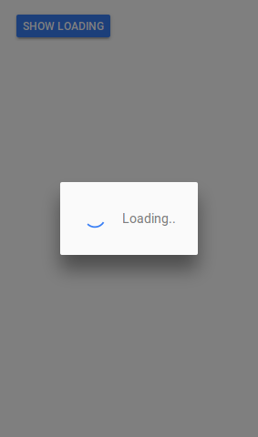
In the above example we have passes content as Text “Loading..” and set the duration 3000ms ie 3 seconds, the loader will automatically disappear after 3 seconds.
If you run the above example it will produce the output something like this-
Loading Options
Following Options are available for the loading spinner.
| Option | Type | Description |
|---|---|---|
| spinner | string | SVG spinner Name for the loading indicator. |
| content | string | This is used to add the content for loading indicator. |
| cssClass | string | This is used to add custom classes to indicator. You can add multiple classes separeated by space. |
| showBackdrop | boolean | Whether to show the backdrop. Default true. |
| dismissOnPageChange | boolean | Whether to dismiss the indicator when navigating to other page. Default false. |
| duration | number | Milliseconds to show loader. By default, it will show until dismiss() is called. |
Ionic 2 Lists
Ionic 2 Lists : Lists are great way display data in row format, Ionic 2 provides various predefined which we can use easily. Here in this tutorial we are going to explain how you can create & use various lists in Ionic 2. You can also use our online editor to run the example online.
Ionic 2 Lists Example
There are following types of Lists available in Ionic 2.
- 1. Basic Lists
- 2. Inset List
- 3. List Dividers
- 4. List Headers
- 5. Icon List
- 6. Avatar List
- 7. Multi-line List
- 8. Sliding List
- 9. Thumbnail List
Let us go one by one to understand the lists in Ionic 2.
Basic Lists
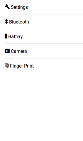
To create basic list ion-list and ion-item is used to item in the list and each items are separated by dividers.
Here is an example of basic lists –
Ionic 2 Basic Lists Example-
<ion-list>
   <ion-item>
      <ion-icon name="build"></ion-icon>
      Settings
   </ion-item>
   <ion-item>
      <ion-icon name="bluetooth"></ion-icon>
      Bluetooth
   </ion-item>
   <ion-item>
      <ion-icon name="battery-full"></ion-icon>
      Battery
   </ion-item>
   <ion-item>
      <ion-icon name="camera"></ion-icon>
      Camera
   </ion-item>
   <ion-item>
      <ion-icon name="finger-print"></ion-icon>
      Finger Print
   </ion-item>
</ion-list>
|
If you run the above example it will produce the output something like this –
Inset Lists
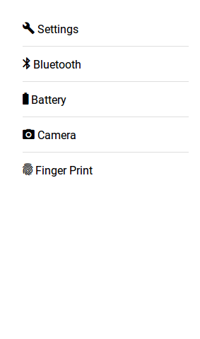
Inset list adds margin outside the list, add inset attribute to ion-list.
Here is an example of Inset list –
Ionic 2 Inset Lists Example-
<ion-list inset>
   <ion-item>
      <ion-icon name="build"></ion-icon>
      Settings
   </ion-item>
   <ion-item>
      <ion-icon name="bluetooth"></ion-icon>
      Bluetooth
   </ion-item>
   <ion-item>
      <ion-icon name="battery-full"></ion-icon>
      Battery
   </ion-item>
   <ion-item>
      <ion-icon name="camera"></ion-icon>
      Camera
   </ion-item>
   <ion-item>
      <ion-icon name="finger-print"></ion-icon>
      Finger Print
   </ion-item>
</ion-list>
|
If you run the above example it will produce the output something like this –
List Dividers
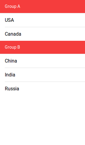
List dividers are used to divide items into groups, ion-item-group is used insted of ion-list. ion-item-divider component is used to divide the group into section.
Ionic 2 List Dividers Example-
<ion-content>
  <ion-item-group>
    <ion-item-divider color="danger">Group A</ion-item-divider>
    <ion-item>USA</ion-item>
    <ion-item>Canada</ion-item>
  </ion-item-group>
  <ion-item-group>
    <ion-item-divider color="danger">Group B</ion-item-divider>
    <ion-item>China</ion-item>
    <ion-item>India</ion-item>
    <ion-item>Russia</ion-item>
  </ion-item-group>
</ion-content>
|
If you run the above example it will produce the output something like this –
List Headers
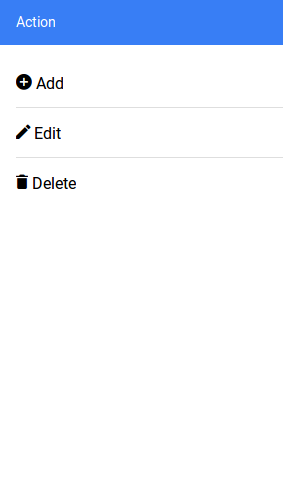
ion-list-header is used to add header in the List. Here is simple example of header in Lists-
Ionic 2 List Headerss Example-
<ion-list>
  <ion-list-header color="primary">
    Action
  </ion-list-header>
  <ion-item><ion-icon name="add-circle"></ion-icon> Add</ion-item>
  <ion-item><ion-icon name="create"></ion-icon> Edit</ion-item>
  <ion-item><ion-icon name="trash"></ion-icon> Delete</ion-item>
</ion-list>
|
If you run the above example it will produce the output something like this –
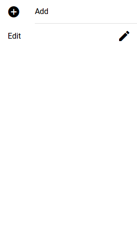
Icon List
You can also add icons in lists using Ionic 2 icons ie- ion-icon. You can also assign the position of icon using
item-left and item-right attributes. You can also set the size of the icons using the small and large
attributes, default size is small. Here is an example of Icons in Lists-
Ionic 2 Icons in list Example-
<ion-list> <ion-item><ion-icon name="add-circle" item-left></ion-icon> Add</ion-item> <ion-item><ion-icon name="create" item-right></ion-icon> Edit</ion-item> </ion-list> |
If you run the above example it will produce the output something like this –
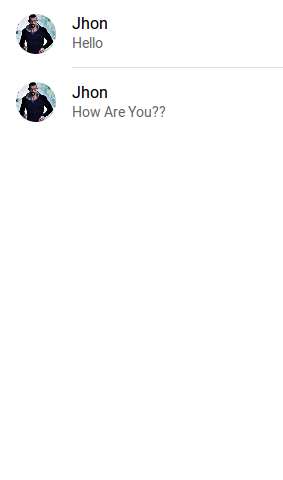
Avatar List
ion-avatar Component is used to create avatar list in ionic 2. item-left and item-right attributes are used to
add the position of the avatar.
Ionic 2 Avatar List | Image Example-
<ion-list>
  <ion-item>
    <ion-avatar item-left>
      <img src="//tutorialsplane.com/runtest/ionic/img/profile.jpg">
    </ion-avatar>
    <h2>Jhon</h2>
    <p>Hello </p>
  </ion-item>
  <ion-item>
    <ion-avatar item-left>
      <img src="//tutorialsplane.com/runtest/ionic/img/profile.jpg">
    </ion-avatar>
    <h2>Jhon</h2>
    <p>How Are You?? </p>
  </ion-item>
</ion-list>
|
If you run the above example it will produce the output something like this –
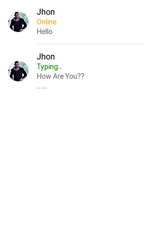
Multiline List
Multiline list contains the multiple lines of text. You can create multiline text list simply as below-
Ionic 2 Multiline List Example-
<ion-list>
  <ion-item>
    <ion-avatar item-left>
      <img src="//tutorialsplane.com/runtest/ionic/img/profile.jpg">
    </ion-avatar>
    <h2>Jhon</h2>
    <h3 style="color:orange;">Online</h3>
    <p>Hello </p>
  </ion-item>
  <ion-item>
    <ion-avatar item-left>
      <img src="//tutorialsplane.com/runtest/ionic/img/profile.jpg">
    </ion-avatar>
    <h2>Jhon</h2>
    <h3 style="color:green;">Typing..</h3>
    <p>How Are You?? </p>
    <p>..... </p>
  </ion-item>
</ion-list>
|
If you run the above example it will produce the output something like this –
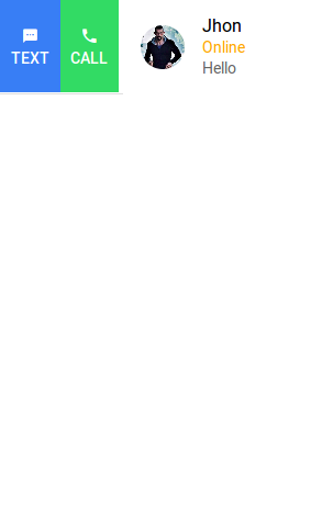
Sliding List
Sliding list is used to create list items that can be swipped left or right. ion-item-sliding component is used to create
sliding list and ion-item-options component is used to add options. Here is an example of sliding List –
Ionic 2 Sliding List Example-
<ion-list>
<ion-item-sliding>
  <ion-item>
    <ion-avatar item-left>
      <img src="//tutorialsplane.com/runtest/ionic/img/profile.jpg">
    </ion-avatar>
    <h2>Jhon</h2>
    <h3 style="color:orange;">Online</h3>
    <p>Hello </p>
  </ion-item>
  <ion-item-options side="left">
      <button ion-button color="primary">
        <ion-icon name="text"></ion-icon>
        Text
      </button>
      <button ion-button color="secondary">
        <ion-icon name="call"></ion-icon>
        Call
      </button>
    </ion-item-options>
    <ion-item-options side="right">
      <button ion-button color="primary">
        <ion-icon name="mail"></ion-icon>
        Email
      </button>
    </ion-item-options>
</ion-item-sliding>
</ion-list>
|
If you run the above example it will produce the output something like this –
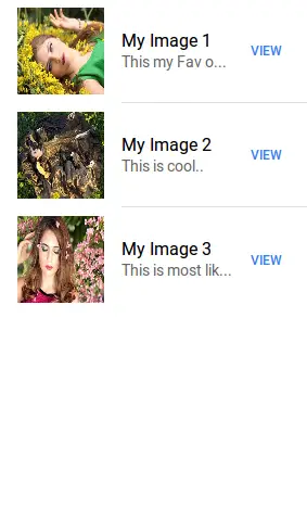
Thumbnail List
ion-thumbnail component is used to create Thumbnail list. Here is simple example of thumbnail list-
Ionic 2 thumbnail List Example-
<ion-list>
  <ion-item>
    <ion-thumbnail item-left>
      <img src="//www.tutorialsplane.com/wp-content/uploads/2017/01/girl-1319114__180.jpg">
    </ion-thumbnail>
    <h2>My Image 1</h2>
    <p> This my Fav one..</p>
    <button ion-button clear item-right>View</button>
  </ion-item>
  <ion-item>
    <ion-thumbnail item-left>
      <img src="//www.tutorialsplane.com/wp-content/uploads/2017/01/girl-1349262__180.jpg">
    </ion-thumbnail>
    <h2>My Image 2</h2>
    <p> This is cool..</p>
    <button ion-button clear item-right>View</button>
  </ion-item>
  <ion-item>
    <ion-thumbnail item-left>
      <img src="//www.tutorialsplane.com/wp-content/uploads/2017/01/girl-1361906__180.jpg">
    </ion-thumbnail>
    <h2>My Image 3</h2>
    <p> This is most liked..</p>
    <button ion-button clear item-right>View</button>
  </ion-item>
</ion-list>
|
If you run the above example it will produce the output something like this –
Ionic 2 Inputs
Ionic 2 Inputs Inputs are an important component of any framework, Inputs are used to collect and handle the user data. Ionic 2 provides the rich inputs that can be used easily. Ionic 2 uses Angular 2’s form library for the form controls. Here in this tutorial we are going to explain how you can create form inputs in Ionic 2. You can also use our online editor to run the online demo.
Ionic 2 Inputs | Form Example
ion-input is used to create inputs such as -text, email, password, number, search, telephone and url. ion-textarea is used to create textarea.
ion-input is not used for non-text type such as-
checkbox, radio, range, select, toggle etc.
There are Following types of labels in Ionic 2 form Inputs-
- 1. Fixed Inline Labels
- 2. Floating Labels
- 3. Inline Labels
- 4. Inset Labels
- 5. Placeholder Labels
- 6. Stacked Labels
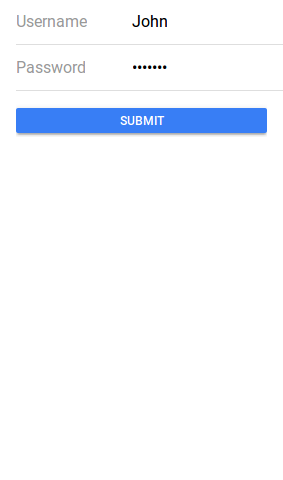
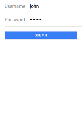
Fixed Inline Labels
To create fixed inline lables fixed attribute is used. Fixed inline lables are fixed to its position although you enter some text in the text input field, you can also add the placeholder for input field. Here in an example of the fixed inline label-
Ionic 2 Inputs Example: Inline lables Example-
<ion-list>

  <ion-item>
    <ion-label fixed>Username</ion-label>
    <ion-input type="text" value=""></ion-input>
  </ion-item>

  <ion-item>
    <ion-label fixed>Password</ion-label>
    <ion-input type="password"></ion-input>
  </ion-item>
  <ion-item>
    <button ion-button block>Submit</button>
  </ion-item>

</ion-list>
|
If you run the above example it will produce the output something like this –
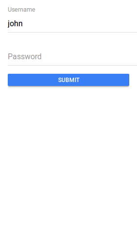
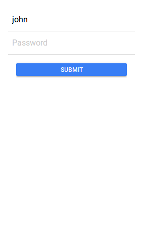
Floating Labels
Floating labels are basically “float”(animates) Up when user selects the input. To create floating label add floating attribute to ion-label. Here in an example of the floating inline label-
Ionic 2 Inputs: Floating lables Example-
<ion-list>

  <ion-item>
    <ion-label floating>Username</ion-label>
    <ion-input type="text" value=""></ion-input>
  </ion-item>

  <ion-item>
    <ion-label floating>Password</ion-label>
    <ion-input type="password"></ion-input>
  </ion-item>
  <ion-item>
    <button ion-button block>Submit</button>
  </ion-item>

</ion-list>
|
If you run the above example it will produce the output something like this –
Inline Labels
An ion-label without any attribute is inline, Inline label does not hide when you enter text. You can also add placeholder in the text field. Here is an example of inline label-
Inline lables Example-
<ion-list>

  <ion-item>
    <ion-label>Username</ion-label>
    <ion-input type="text" value=""></ion-input>
  </ion-item>

  <ion-item>
    <ion-label>Password</ion-label>
    <ion-input type="password"></ion-input>
  </ion-item>
  <ion-item>
    <button ion-button block>Submit</button>
  </ion-item>

</ion-list>
|
If you run the above example it will produce the output something like this –
Inset Labels
By default each input field’s width is 100% of its parent container, You can make input inset by adding attribute inset to ion-list simply as below –
Ionic 2 Inset lables Example-
<ion-list inset>

  <ion-item>
    <ion-label>Username</ion-label>
    <ion-input type="text" value=""></ion-input>
  </ion-item>

  <ion-item>
    <ion-label>Password</ion-label>
    <ion-input type="password"></ion-input>
  </ion-item>
  <ion-item>
    <button ion-button block>Submit</button>
  </ion-item>

</ion-list>
|
Placeholder Labels
To create placeholder lables placeholder attribute is added to the input element. –
Ionic 2 Placeholder lables Example-
<ion-list inset>

  <ion-item>
    <ion-input type="text" placeholder="Username"></ion-input>
  </ion-item>
  <ion-item>
    <ion-input type="password" placeholder="Password"></ion-input>
  </ion-item>
  <ion-item>
    <button ion-button block>Submit</button>
  </ion-item>

</ion-list>
|
If you run the above example it will produce the output something like this –
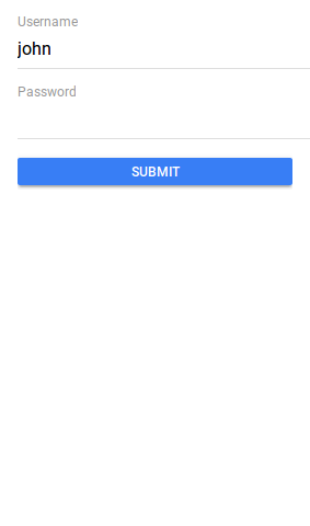
Stacked Labels
To create stacked labels add stacked attribute to ion-label. Stacked labels always appear above the input field-
Ionic 2 Stacked lables Example-
<ion-list>

  <ion-item>
    <ion-label stacked>Username</ion-label>
    <ion-input type="text"></ion-input>
  </ion-item>

  <ion-item>
    <ion-label stacked>Password</ion-label>
    <ion-input type="password"></ion-input>
  </ion-item>
  <ion-item>
    <button ion-button block>Submit</button>
  </ion-item>

</ion-list>
|
If you run the above example it will produce the output something like this –
Ionic 2 Grid
Ionic 2 Grid: Ionic Grid system is basically based on CSS flexbox. It is supported across all devices, Here in this tutorial we are going to explain how you can use grid in Ionic 2. You can also use our online editor run and see the output of the example.
Ionic 2 Grid Example
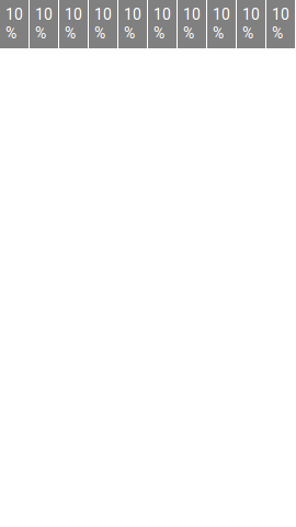
Let us first create very basic example of grid. Ionic 2 rows have no margin or padding by default so to add the padding to rows ion-grid is used.
ion-col is used to create column and width attribute is used to set the width of the grid columns.
Ionic 2 Grid Example:
<ion-grid> <ion-row> <ion-col width-10 >10%</ion-col> <ion-col width-10 >10%</ion-col> <ion-col width-10 >10%</ion-col> <ion-col width-10 >10%</ion-col> <ion-col width-10 >10%</ion-col> <ion-col width-10 >10%</ion-col> <ion-col width-10 >10%</ion-col> <ion-col width-10 >10%</ion-col> <ion-col width-10 >10%</ion-col> <ion-col width-10 >10%</ion-col> </ion-row> </ion-grid> |
In the above example width1-10 attribute is used to create columns, this makes columns of 10% width of the total width(screen). Using this attribute we have created 10 columns layout.
If you run the above example it will produce the output something like this –
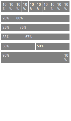
Explicit Column Percentage Attributes Example
Let us create an example of explicit column percentage attributes-
Explicit Column Sizes in Ionic 2 Grid Example:
|
If you run the above example it will produce the output something like this-
Attributes
You can use following percentage attributes as per your requirement-
| Attr | % Width |
|---|---|
| width-10 | 10% |
| width-20 | 20% |
| width-25 | 25% |
| width-33 | 33.3333% |
| width-50 | 50% |
| width-67 | 66.6666% |
| width-75 | 75% |
| width-80 | 80% |
| width-90 | 90% |
Column Offset In Grid
You can use offset attribute to set offset in column for example offset-25 will set offset 25% from left.
How to set Column Offset in Grid Ionic 2 Example:
<ion-col width-10 offset-25>Offset 25</ion-col> |
You can add offset-10, offset-20, offset-25, offset-33, offset-50, offset-67, offset-75, offset-80 and offset-90 on the same way.


