Ionic 2 Buttons
Ionic 2 Buttons: Buttons play an important role in navigation of any app, Ionic 2 provides predefined classes to create different-different buttons. Buttons can contain the text and icons which can be enhanced with different-different attributes. Here in this tutorial we are going to explain how you can create buttons in Ionic 2, you can also use our online editor to run and see the output of the example.
Ionic 2 Buttons | Example & Demo
Ionic uses standard html button <button> element to create buttons and ion-button directive to enhance the properties.
Following Buttons are available in Ionic 2-
- 1. Default Style
- 2. Outline Style
- 3. Clear Style
- 4. Round Buttons
- 5. Block Buttons
- 6. Full Buttons
- 7. Button Sizes
- 8. Icon Buttons
- 9. Buttons In Components
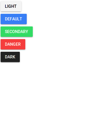
Default Style Button
To create default Style add ion-button attribute to the button Add color using color attribute simply as below –
Ionic 2 Default Style Button Example
<button ion-button color="light">Light</button><br> <button ion-button>Default</button><br> <button ion-button color="secondary">Secondary</button><br> <button ion-button color="danger">Danger</button><br> <button ion-button color="dark">Dark</button><br> |
If you run the above example it will produce output something like this –
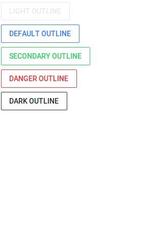
Outline Style Button
To create outline Style add outline property to the button simply as below-
Ionic 2 Outline Style Button Example
<button ion-button color="light" outline>Light Outline</button><br> <button ion-button outline>Default Outline</button><br> <button ion-button color="secondary" outline>Secondary Outline</button><br> <button ion-button color="danger" outline>Danger Outline</button><br> <button ion-button color="dark" outline>Dark Outline</button><br> |
If you run the above example it will produce output something like this –
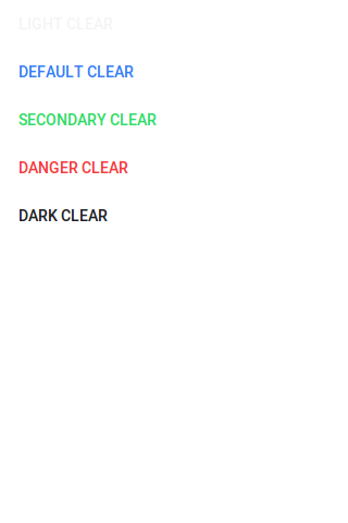
Clear Style Button
If You want to create Clear Style Button just add clear property simply as below-
Ionic 2 Clear Style Button Example
<button ion-button color="light" clear>Light Clear </button><br> <button ion-button clear>Default Clear</button><br> <button ion-button color="secondary" clear>Secondary Clear</button><br> <button ion-button color="danger" clear>Danger Clear</button><br> <button ion-button color="dark" clear>Dark Clear</button><br> |
If you run the above example it will produce output something like this –
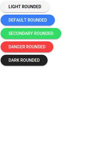
Rounded Buttons
If You want to create rounded Buttons just add round property to button simply as below-
Ionic 2 Rounded Button Example
<button ion-button color="light" round>Light Rounded </button><br> <button ion-button round>Default Rounded</button><br> <button ion-button color="secondary" round>Secondary Rounded</button><br> <button ion-button color="danger" round>Danger Rounded</button><br> <button ion-button color="dark" round>Dark Rounded</button><br> |
If you run the above example it will produce output something like this –
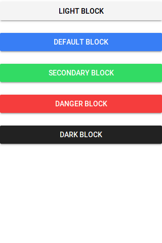
Block Buttons
Add block property to button to make the block level, it will make button 100% of its parent container. Here is an example of block level button-
Ionic 2 Rounded Button Example
<button ion-button color="light" block>Light Block </button><br> <button ion-button block>Default Block</button><br> <button ion-button color="secondary" block>Secondary Block</button><br> <button ion-button color="danger" block>Danger Block</button><br> <button ion-button color="dark" block>Dark Block</button><br> |
If you run the above example it will produce output something like this –
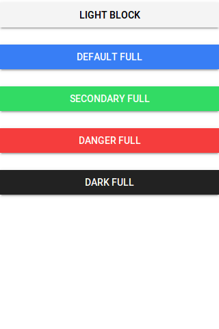
Full Buttons
Add full property to button create Full width button. Full button will be 100% of it’s parent. It removes the left and right borders of the button. Here is an example of block level button-
Ionic 2 Full Buttons Example
<button ion-button color="light" full>Light Block </button><br> <button ion-button full>Default full</button><br> <button ion-button color="secondary" full>Secondary full</button><br> <button ion-button color="danger" full>Danger full</button><br> <button ion-button color="dark" full>Dark full</button><br> |
If you run the above example it will produce output something like this –
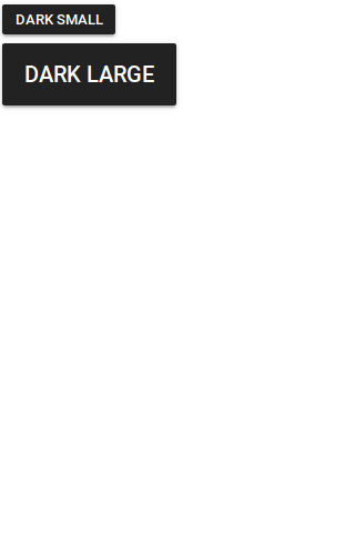
Button Sizes
You can add large attribute to make the buttons large and small to make the buttons small-
Ionic 2 Small | Large Button Example
<button ion-button color="dark" small>Dark Small</button><br> <button ion-button color="dark" large>Dark Large</button><br> |
The output of the above example will look something like this –
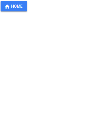
Icon Buttons
You can create icon buttons using ionic icons simply as in the example below –
Ionic 2 Small | Large Button Example
<button ion-button icon-left> <ion-icon name="home"></ion-icon> Home </button> |
The output of the above example will look something like this –
Buttons In Component
You can easily add the buttons in components such as header, footer or list items. Here is an example of a simple search button in header-
Buttons In Component Example
<ion-header>
  <ion-navbar>
    <ion-buttons end>
      <button ion-button icon-only>
        <ion-icon name="search"></ion-icon>
      </button>
    </ion-buttons>
  </ion-navbar>
</ion-header>
|
The output of the above example will look something like this –
Input Properties
| Attribute | Type | Description |
|---|---|---|
| large | boolean | Used to Create Large button. |
| small | boolean | Used to Create Small button. |
| default | boolean | Used to Create Default button. |
| outline | boolean | This creates transparent button with a border. |
| clear | boolean | This creates transparent button without a border. |
| solid | boolean | This is used to force a solid button. Useful for buttons within an item. |
| round | boolean | This creates button with rounded corners. |
| block | boolean | This creates button that fills its parent container with a border-radius. |
| full | boolean | This creates button that fills its parent container without a border-radius or borders on th |
| strong | boolean | This is used to represent the important action. |
| mode | string | The mode to apply to this component. |
| color | string | The predefined color to use. For example: |
Advertisements
Add Comment
📖 Read More
- 1. Ionic 2 Cards
- 2. Ionic 2 Checkbox
- 3. Ionic 2 DateTime
- 4. Ionic 2 Fabs
- 5. Ionic 2 Grid
- 6. Ionic 2 Inputs
- 7. Ionic 2 Lists
- 8. Ionic 2 Loading
- 9. Ionic 2 Menus
- 10. Ionic 2 Modals


