Tag Archives: ionic 2 framework tutorial
Ionic 2 Lists
Ionic 2 Lists : Lists are great way display data in row format, Ionic 2 provides various predefined which we can use easily. Here in this tutorial we are going to explain how you can create & use various lists in Ionic 2. You can also use our online editor to run the example online.
Ionic 2 Lists Example
There are following types of Lists available in Ionic 2.
- 1. Basic Lists
- 2. Inset List
- 3. List Dividers
- 4. List Headers
- 5. Icon List
- 6. Avatar List
- 7. Multi-line List
- 8. Sliding List
- 9. Thumbnail List
Let us go one by one to understand the lists in Ionic 2.
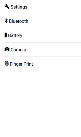
Basic Lists
To create basic list ion-list and ion-item is used to item in the list and each items are separated by dividers.
Here is an example of basic lists –
Ionic 2 Basic Lists Example-
<ion-list>
   <ion-item>
      <ion-icon name="build"></ion-icon>
      Settings
   </ion-item>
   <ion-item>
      <ion-icon name="bluetooth"></ion-icon>
      Bluetooth
   </ion-item>
   <ion-item>
      <ion-icon name="battery-full"></ion-icon>
      Battery
   </ion-item>
   <ion-item>
      <ion-icon name="camera"></ion-icon>
      Camera
   </ion-item>
   <ion-item>
      <ion-icon name="finger-print"></ion-icon>
      Finger Print
   </ion-item>
</ion-list>
|
If you run the above example it will produce the output something like this –
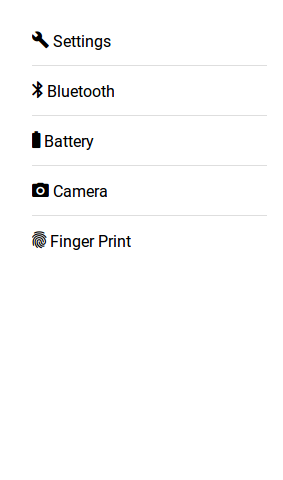
Inset Lists
Inset list adds margin outside the list, add inset attribute to ion-list.
Here is an example of Inset list –
Ionic 2 Inset Lists Example-
<ion-list inset>
   <ion-item>
      <ion-icon name="build"></ion-icon>
      Settings
   </ion-item>
   <ion-item>
      <ion-icon name="bluetooth"></ion-icon>
      Bluetooth
   </ion-item>
   <ion-item>
      <ion-icon name="battery-full"></ion-icon>
      Battery
   </ion-item>
   <ion-item>
      <ion-icon name="camera"></ion-icon>
      Camera
   </ion-item>
   <ion-item>
      <ion-icon name="finger-print"></ion-icon>
      Finger Print
   </ion-item>
</ion-list>
|
If you run the above example it will produce the output something like this –
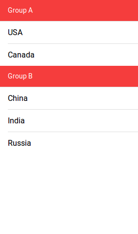
List Dividers
List dividers are used to divide items into groups, ion-item-group is used insted of ion-list. ion-item-divider component is used to divide the group into section.
Ionic 2 List Dividers Example-
<ion-content>
  <ion-item-group>
    <ion-item-divider color="danger">Group A</ion-item-divider>
    <ion-item>USA</ion-item>
    <ion-item>Canada</ion-item>
  </ion-item-group>
  <ion-item-group>
    <ion-item-divider color="danger">Group B</ion-item-divider>
    <ion-item>China</ion-item>
    <ion-item>India</ion-item>
    <ion-item>Russia</ion-item>
  </ion-item-group>
</ion-content>
|
If you run the above example it will produce the output something like this –
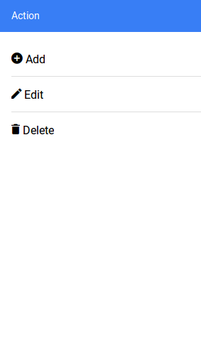
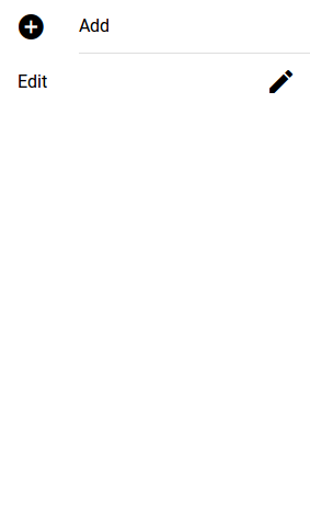
List Headers
ion-list-header is used to add header in the List. Here is simple example of header in Lists-
Ionic 2 List Headerss Example-
<ion-list>
  <ion-list-header color="primary">
    Action
  </ion-list-header>
  <ion-item><ion-icon name="add-circle"></ion-icon> Add</ion-item>
  <ion-item><ion-icon name="create"></ion-icon> Edit</ion-item>
  <ion-item><ion-icon name="trash"></ion-icon> Delete</ion-item>
</ion-list>
|
If you run the above example it will produce the output something like this –
Icon List
You can also add icons in lists using Ionic 2 icons ie- ion-icon. You can also assign the position of icon using
item-left and item-right attributes. You can also set the size of the icons using the small and large
attributes, default size is small. Here is an example of Icons in Lists-
Ionic 2 Icons in list Example-
<ion-list> <ion-item><ion-icon name="add-circle" item-left></ion-icon> Add</ion-item> <ion-item><ion-icon name="create" item-right></ion-icon> Edit</ion-item> </ion-list> |
If you run the above example it will produce the output something like this –
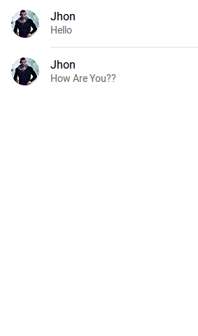
Avatar List
ion-avatar Component is used to create avatar list in ionic 2. item-left and item-right attributes are used to
add the position of the avatar.
Ionic 2 Avatar List | Image Example-
<ion-list>
  <ion-item>
    <ion-avatar item-left>
      <img src="//tutorialsplane.com/runtest/ionic/img/profile.jpg">
    </ion-avatar>
    <h2>Jhon</h2>
    <p>Hello </p>
  </ion-item>
  <ion-item>
    <ion-avatar item-left>
      <img src="//tutorialsplane.com/runtest/ionic/img/profile.jpg">
    </ion-avatar>
    <h2>Jhon</h2>
    <p>How Are You?? </p>
  </ion-item>
</ion-list>
|
If you run the above example it will produce the output something like this –
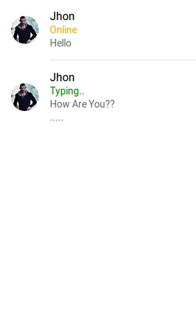
Multiline List
Multiline list contains the multiple lines of text. You can create multiline text list simply as below-
Ionic 2 Multiline List Example-
<ion-list>
  <ion-item>
    <ion-avatar item-left>
      <img src="//tutorialsplane.com/runtest/ionic/img/profile.jpg">
    </ion-avatar>
    <h2>Jhon</h2>
    <h3 style="color:orange;">Online</h3>
    <p>Hello </p>
  </ion-item>
  <ion-item>
    <ion-avatar item-left>
      <img src="//tutorialsplane.com/runtest/ionic/img/profile.jpg">
    </ion-avatar>
    <h2>Jhon</h2>
    <h3 style="color:green;">Typing..</h3>
    <p>How Are You?? </p>
    <p>..... </p>
  </ion-item>
</ion-list>
|
If you run the above example it will produce the output something like this –
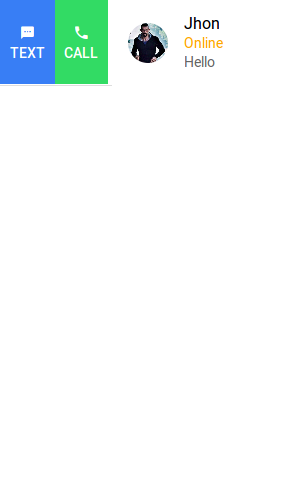
Sliding List
Sliding list is used to create list items that can be swipped left or right. ion-item-sliding component is used to create
sliding list and ion-item-options component is used to add options. Here is an example of sliding List –
Ionic 2 Sliding List Example-
<ion-list>
<ion-item-sliding>
  <ion-item>
    <ion-avatar item-left>
      <img src="//tutorialsplane.com/runtest/ionic/img/profile.jpg">
    </ion-avatar>
    <h2>Jhon</h2>
    <h3 style="color:orange;">Online</h3>
    <p>Hello </p>
  </ion-item>
  <ion-item-options side="left">
      <button ion-button color="primary">
        <ion-icon name="text"></ion-icon>
        Text
      </button>
      <button ion-button color="secondary">
        <ion-icon name="call"></ion-icon>
        Call
      </button>
    </ion-item-options>
    <ion-item-options side="right">
      <button ion-button color="primary">
        <ion-icon name="mail"></ion-icon>
        Email
      </button>
    </ion-item-options>
</ion-item-sliding>
</ion-list>
|
If you run the above example it will produce the output something like this –
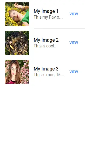
Thumbnail List
ion-thumbnail component is used to create Thumbnail list. Here is simple example of thumbnail list-
Ionic 2 thumbnail List Example-
<ion-list>
  <ion-item>
    <ion-thumbnail item-left>
      <img src="//www.tutorialsplane.com/wp-content/uploads/2017/01/girl-1319114__180.jpg">
    </ion-thumbnail>
    <h2>My Image 1</h2>
    <p> This my Fav one..</p>
    <button ion-button clear item-right>View</button>
  </ion-item>
  <ion-item>
    <ion-thumbnail item-left>
      <img src="//www.tutorialsplane.com/wp-content/uploads/2017/01/girl-1349262__180.jpg">
    </ion-thumbnail>
    <h2>My Image 2</h2>
    <p> This is cool..</p>
    <button ion-button clear item-right>View</button>
  </ion-item>
  <ion-item>
    <ion-thumbnail item-left>
      <img src="//www.tutorialsplane.com/wp-content/uploads/2017/01/girl-1361906__180.jpg">
    </ion-thumbnail>
    <h2>My Image 3</h2>
    <p> This is most liked..</p>
    <button ion-button clear item-right>View</button>
  </ion-item>
</ion-list>
|
If you run the above example it will produce the output something like this –
Ionic 2 Inputs
Ionic 2 Inputs Inputs are an important component of any framework, Inputs are used to collect and handle the user data. Ionic 2 provides the rich inputs that can be used easily. Ionic 2 uses Angular 2’s form library for the form controls. Here in this tutorial we are going to explain how you can create form inputs in Ionic 2. You can also use our online editor to run the online demo.
Ionic 2 Inputs | Form Example
ion-input is used to create inputs such as -text, email, password, number, search, telephone and url. ion-textarea is used to create textarea.
ion-input is not used for non-text type such as-
checkbox, radio, range, select, toggle etc.
There are Following types of labels in Ionic 2 form Inputs-
- 1. Fixed Inline Labels
- 2. Floating Labels
- 3. Inline Labels
- 4. Inset Labels
- 5. Placeholder Labels
- 6. Stacked Labels
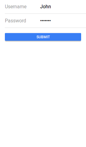
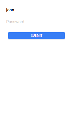
Fixed Inline Labels
To create fixed inline lables fixed attribute is used. Fixed inline lables are fixed to its position although you enter some text in the text input field, you can also add the placeholder for input field. Here in an example of the fixed inline label-
Ionic 2 Inputs Example: Inline lables Example-
<ion-list>

  <ion-item>
    <ion-label fixed>Username</ion-label>
    <ion-input type="text" value=""></ion-input>
  </ion-item>

  <ion-item>
    <ion-label fixed>Password</ion-label>
    <ion-input type="password"></ion-input>
  </ion-item>
  <ion-item>
    <button ion-button block>Submit</button>
  </ion-item>

</ion-list>
|
If you run the above example it will produce the output something like this –
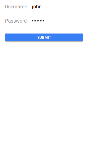
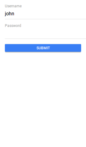
Floating Labels
Floating labels are basically “float”(animates) Up when user selects the input. To create floating label add floating attribute to ion-label. Here in an example of the floating inline label-
Ionic 2 Inputs: Floating lables Example-
<ion-list>

  <ion-item>
    <ion-label floating>Username</ion-label>
    <ion-input type="text" value=""></ion-input>
  </ion-item>

  <ion-item>
    <ion-label floating>Password</ion-label>
    <ion-input type="password"></ion-input>
  </ion-item>
  <ion-item>
    <button ion-button block>Submit</button>
  </ion-item>

</ion-list>
|
If you run the above example it will produce the output something like this –
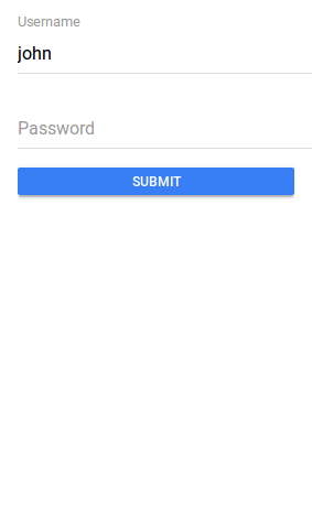
Inline Labels
An ion-label without any attribute is inline, Inline label does not hide when you enter text. You can also add placeholder in the text field. Here is an example of inline label-
Inline lables Example-
<ion-list>

  <ion-item>
    <ion-label>Username</ion-label>
    <ion-input type="text" value=""></ion-input>
  </ion-item>

  <ion-item>
    <ion-label>Password</ion-label>
    <ion-input type="password"></ion-input>
  </ion-item>
  <ion-item>
    <button ion-button block>Submit</button>
  </ion-item>

</ion-list>
|
If you run the above example it will produce the output something like this –
Inset Labels
By default each input field’s width is 100% of its parent container, You can make input inset by adding attribute inset to ion-list simply as below –
Ionic 2 Inset lables Example-
<ion-list inset>

  <ion-item>
    <ion-label>Username</ion-label>
    <ion-input type="text" value=""></ion-input>
  </ion-item>

  <ion-item>
    <ion-label>Password</ion-label>
    <ion-input type="password"></ion-input>
  </ion-item>
  <ion-item>
    <button ion-button block>Submit</button>
  </ion-item>

</ion-list>
|
Placeholder Labels
To create placeholder lables placeholder attribute is added to the input element. –
Ionic 2 Placeholder lables Example-
<ion-list inset>

  <ion-item>
    <ion-input type="text" placeholder="Username"></ion-input>
  </ion-item>
  <ion-item>
    <ion-input type="password" placeholder="Password"></ion-input>
  </ion-item>
  <ion-item>
    <button ion-button block>Submit</button>
  </ion-item>

</ion-list>
|
If you run the above example it will produce the output something like this –
Stacked Labels
To create stacked labels add stacked attribute to ion-label. Stacked labels always appear above the input field-
Ionic 2 Stacked lables Example-
<ion-list>

  <ion-item>
    <ion-label stacked>Username</ion-label>
    <ion-input type="text"></ion-input>
  </ion-item>

  <ion-item>
    <ion-label stacked>Password</ion-label>
    <ion-input type="password"></ion-input>
  </ion-item>
  <ion-item>
    <button ion-button block>Submit</button>
  </ion-item>

</ion-list>
|
If you run the above example it will produce the output something like this –
Ionic 2 Grid
Ionic 2 Grid: Ionic Grid system is basically based on CSS flexbox. It is supported across all devices, Here in this tutorial we are going to explain how you can use grid in Ionic 2. You can also use our online editor run and see the output of the example.
Ionic 2 Grid Example
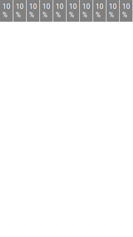
Let us first create very basic example of grid. Ionic 2 rows have no margin or padding by default so to add the padding to rows ion-grid is used.
ion-col is used to create column and width attribute is used to set the width of the grid columns.
Ionic 2 Grid Example:
<ion-grid> <ion-row> <ion-col width-10 >10%</ion-col> <ion-col width-10 >10%</ion-col> <ion-col width-10 >10%</ion-col> <ion-col width-10 >10%</ion-col> <ion-col width-10 >10%</ion-col> <ion-col width-10 >10%</ion-col> <ion-col width-10 >10%</ion-col> <ion-col width-10 >10%</ion-col> <ion-col width-10 >10%</ion-col> <ion-col width-10 >10%</ion-col> </ion-row> </ion-grid> |
In the above example width1-10 attribute is used to create columns, this makes columns of 10% width of the total width(screen). Using this attribute we have created 10 columns layout.
If you run the above example it will produce the output something like this –
Explicit Column Percentage Attributes Example
Let us create an example of explicit column percentage attributes-
Explicit Column Sizes in Ionic 2 Grid Example:
|
If you run the above example it will produce the output something like this-
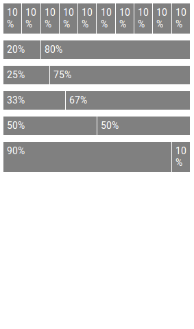
Attributes
You can use following percentage attributes as per your requirement-
| Attr | % Width |
|---|---|
| width-10 | 10% |
| width-20 | 20% |
| width-25 | 25% |
| width-33 | 33.3333% |
| width-50 | 50% |
| width-67 | 66.6666% |
| width-75 | 75% |
| width-80 | 80% |
| width-90 | 90% |
Column Offset In Grid
You can use offset attribute to set offset in column for example offset-25 will set offset 25% from left.
How to set Column Offset in Grid Ionic 2 Example:
<ion-col width-10 offset-25>Offset 25</ion-col> |
You can add offset-10, offset-20, offset-25, offset-33, offset-50, offset-67, offset-75, offset-80 and offset-90 on the same way.
Ionic 2 Fabs
Ionic 2 Fabs : Fabs Stands for Floating Action Buttons. Fabs are basically Material design Component which are used frequently in mobile devices. Fabs are buttons which prompts set of actions when you click/hover on it. Fabs are placed on the top of the content and their position is fixed when you scroll the page. It is very simple to create fabs in Ionic 2. Here in this tutorial we are going to explain how you can create fabs in Ionic, You can also use our online editor to see the demo.
Ionic 2 Fabs | Buttons | Actions | Icons Example
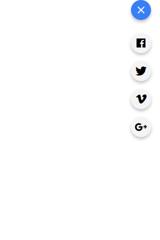
Let us create first Fabs, this fab will be placed at the top right corner(edge) of the page however you can place it at other corners. –
Ionic 2 Fabs Example:
<ion-content>
  <ion-fab top right edge>
    <button ion-fab mini><ion-icon name="add"></ion-icon></button>
    <ion-fab-list>
      <button ion-fab><ion-icon name="logo-facebook"></ion-icon></button>
      <button ion-fab><ion-icon name="logo-googleplus"></ion-icon></button>
      <button ion-fab><ion-icon name="logo-twitter"></ion-icon></button>
      <button ion-fab><ion-icon name="logo-vimeo"></ion-icon></button>
    </ion-fab-list>
  </ion-fab>
</ion-content>
|
If you run the above example it will produce the output something like this –
Attributes
| Attribute | Description |
|---|---|
| mini | This reduces the size of the Fab button |
Input Properties
| Attr | Type | Details |
|---|---|---|
| color | string | You can change the fab button colors using the predefined colors. For example: “primary”, “secondary”, “danger”. |
| mode | string | The mode to apply to this component. Mode can be ios, wp, or md. |
Learn More
Let us create some more examples on Fabs.
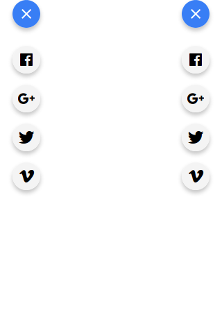
Fab Position – Left Edge | Right Edge
You can place the fab to the left edge or right edge(corner) simply as below –
Place Fab Button to Left Edge | Right Edge Example:
<ion-content>
  <ion-fab top left edge style="margin-top:20px;">
    <button ion-fab mini><ion-icon name="add"></ion-icon></button>
    <ion-fab-list>
      <button ion-fab><ion-icon name="logo-facebook"></ion-icon></button>
      <button ion-fab><ion-icon name="logo-googleplus"></ion-icon></button>
      <button ion-fab><ion-icon name="logo-twitter"></ion-icon></button>
      <button ion-fab><ion-icon name="logo-vimeo"></ion-icon></button>
    </ion-fab-list>
  </ion-fab>
 <ion-fab top right edge style="margin-top:20px;">
    <button ion-fab mini><ion-icon name="add"></ion-icon></button>
    <ion-fab-list>
      <button ion-fab><ion-icon name="logo-facebook"></ion-icon></button>
      <button ion-fab><ion-icon name="logo-googleplus"></ion-icon></button>
      <button ion-fab><ion-icon name="logo-twitter"></ion-icon></button>
      <button ion-fab><ion-icon name="logo-vimeo"></ion-icon></button>
    </ion-fab-list>
  </ion-fab>
</ion-content>
|
The output of the above example will be something like this –
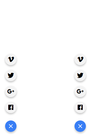
Fab Position – Left Bottom | Right Bottom
You can place the fab to the left bottom and right bottom simply as below-
| Example:
<ion-content>
  <ion-fab left bottom >
    <button ion-fab mini><ion-icon name="add"></ion-icon></button>
    <ion-fab-list side="top">
      <button ion-fab><ion-icon name="logo-facebook"></ion-icon></button>
      <button ion-fab><ion-icon name="logo-googleplus"></ion-icon></button>
      <button ion-fab><ion-icon name="logo-twitter"></ion-icon></button>
      <button ion-fab><ion-icon name="logo-vimeo"></ion-icon></button>
    </ion-fab-list>
  </ion-fab>
 <ion-fab right bottom >
    <button ion-fab mini><ion-icon name="add"></ion-icon></button>
    <ion-fab-list side="top">
      <button ion-fab><ion-icon name="logo-facebook"></ion-icon></button>
      <button ion-fab><ion-icon name="logo-googleplus"></ion-icon></button>
      <button ion-fab><ion-icon name="logo-twitter"></ion-icon></button>
      <button ion-fab><ion-icon name="logo-vimeo"></ion-icon></button>
    </ion-fab-list>
  </ion-fab>
</ion-content>
|
The output of the above example will be something like this –
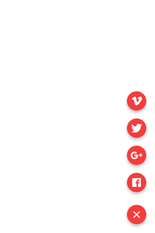
Change Fab Button Color
To change the background color of the Fab Button you can use the input property color to set the predefined color.
How to Change Fab Button Color In Ionic 2 Example:
<ion-content>
 <ion-fab right bottom>
    <button ion-fab mini color="danger"><ion-icon name="add"></ion-icon></button>
    <ion-fab-list side="top">
      <button ion-fab color="danger"><ion-icon name="logo-facebook"></ion-icon></button>
      <button ion-fab color="danger"><ion-icon name="logo-googleplus"></ion-icon></button>
      <button ion-fab color="danger"><ion-icon name="logo-twitter"></ion-icon></button>
      <button ion-fab color="danger"><ion-icon name="logo-vimeo"></ion-icon></button>
    </ion-fab-list>
  </ion-fab>
</ion-content>
|
The output of the above example will be something like this –
Ionic 2 DateTime
Ionic 2 DateTime DateTime component is used to create datepicker which enables user to select dates and times. Ionic’s datetime component enables us to create the datetime picker in preferred format. Here in this tutorial we are going to explain how you can create date time picker in Ionic 2. You can also use our online editor to edit and run the code online.
Ionic 2 DateTime Example
Let us first create very simple example of the DateTime –
Basic DateTime
It Contains two parts Html and JavaScript, Let us create one by one –
- 1. HTML Part – It contains the Html Part.
- 2. Script Part – This contains typescript code for the Alerts.
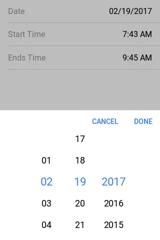
Html Part : demo.html
Ionic 2 DateTime Basic Eaxmple : Html
<ion-item> <ion-label>Date</ion-label> <ion-datetime displayFormat="MM/DD/YYYY" [(ngModel)]="event.month"></ion-datetime> </ion-item> <ion-item> <ion-label>Start Time</ion-label> <ion-datetime displayFormat="h:mm A" pickerFormat="h mm A" [(ngModel)]="event.timeStarts"></ion-datetime> </ion-item> <ion-item> <ion-label>Ends Time</ion-label> <ion-datetime displayFormat="h:mm A" pickerFormat="h mm A" [(ngModel)]="event.timeEnds"></ion-datetime> </ion-item> |
JavaScript Part : demo.ts
Now let us create event function Which will add the default time, month and timeEnds in the dateTime Picker-
Ionic 2 DateTime Basic Eaxmple : Html
import { Component } from '@angular/core';

@Component({
  templateUrl: 'demo.html'
})
export class DemoPage {
 public event = {
   month: '2017-02-19',
    timeStarts: '07:43',
    timeEnds: '09:45'
  }
}
|
The output of the above example will look something like this –
Options For Display & Picker
Following Options are available for display and picker of DatTime which can used easily to format the options –
| Format | Description | Example |
|---|---|---|
| YYYY | Year, 4 digits | 2018 |
| YY | Year, 2 digits | 18 |
| M | Month | 1 … 12 |
| MM | Month, leading zero | 01 … 12 |
| MMM | Month, short name | Jan |
| MMMM | Month, full name | January |
| D | Day | 1 … 31 |
| DD | Day, leading zero | 01 … 31 |
| DDD | Day, short name | Fri |
| DDDD | Day, full name | Friday |
| H | Hour, 24-hour | 0 … 23 |
| HH | Hour, 24-hour, leading zero | 00 … 23 |
| h | Hour, 12-hour | 1 … 12 |
| hh | Hour, 12-hour, leading zero | 01 … 12 |
| a | 12-hour time period, lowercase | am pm |
| A | 12-hour time period, uppercase | AM PM |
| m | Minute | 1 … 59 |
| mm | Minute, leading zero | 01 … 59 |
| s | Second | 1 … 59 |
| ss | Second, leading zero | 01 … 59 |
| Z | UTC Timezone Offset | Z or +HH:mm or -HH:mm |
Ionic 2 Checkbox
Ionic 2 Checkbox Checkbox is an input component which enables user to select one or more items. Checkboxes in Ionic 2 are same as Html input. It is very simple to create Checkboxes in Ionic 2. Here in this tutorial we are going to explain how you can create Checkboxes In Ionic 2. You can also use our online editor to see the output of the example.
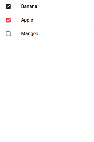
Ionic 2 Checkbox | Change Color | Disabled | Checked Example
Checkbox holds Boolean(true/false) values when you check or uncheck it.
Checkbox | Checked | Eaxmple
Here we are going to create simple checheckboxes with default checked & unchecked.
Ionic 2 Checkbox | Check | Uncheck Example
<ion-list> <ion-item> <ion-label>Banana</ion-label> <ion-checkbox color="dark" checked="true"></ion-checkbox> </ion-item> <ion-item> <ion-label>Apple</ion-label> <ion-checkbox color="danger" checked="true"></ion-checkbox> </ion-item> <ion-item> <ion-label>Mangeo</ion-label> <ion-checkbox></ion-checkbox> </ion-item> </ion-list> |
The output of the above example will look something like this –
Options Available
| Attribute | Type | Description |
|---|---|---|
| color | string | This is used to add/change the checkbox color. For example: “primary”, “secondary”, “danger”. |
| mode | string | The mode to apply to this component. |
| checked | boolean | This is used to set the check/uncheck property of checkbox(default is false). |
| disabled | boolean | This is used to disable the checkbox. |
Learn More
Let us have some More example and demo about the Ionic 2 Checkboxes.
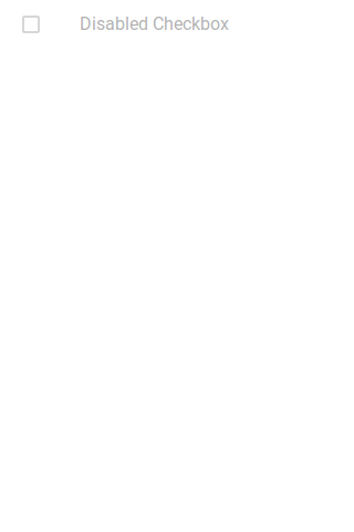
Ionic 2 Disabled Checkbox Eaxmple
To disable the checkbox in Ionic 2 Add attribute disabled=”true”.
How to disable Checkbox in Ionic 2 Example
<ion-list> <ion-item> <ion-label>Disabled Checkbox</ion-label> <ion-checkbox checked="ture" disabled="true"></ion-checkbox> </ion-item> </ion-list> |
The output of the above example will look something like this –
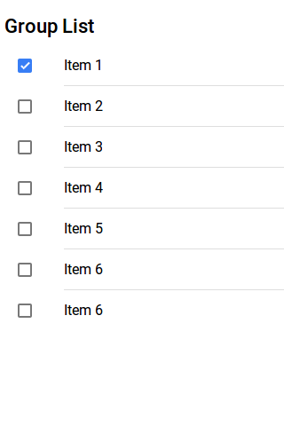
Ionic 2 Checkbox Group | Lists Eaxmple
Sometimes we need to create group of checkbox lists which enables user to select one or more than one item from the list. Here is simple example of the Ionic 2 Group.
Ionic 2 Group | Lists Eaxmple
<h3> Group List</h3> <ion-list> <ion-item> <ion-label>Item 1</ion-label> <ion-checkbox checked="true"></ion-checkbox> </ion-item> <ion-item> <ion-label>Item 2</ion-label> <ion-checkbox></ion-checkbox> </ion-item> <ion-item> <ion-label>Item 3</ion-label> <ion-checkbox></ion-checkbox> </ion-item> <ion-item> <ion-label>Item 4</ion-label> <ion-checkbox></ion-checkbox> </ion-item> <ion-item> <ion-label>Item 5</ion-label> <ion-checkbox></ion-checkbox> </ion-item> <ion-item> <ion-label>Item 6</ion-label> <ion-checkbox></ion-checkbox> </ion-item> <ion-item> <ion-label>Item 6</ion-label> <ion-checkbox></ion-checkbox> </ion-item> </ion-list> |
The output of the above example will look something like this –
Ionic 2 Cards
Ionic 2 Cards : Cards are basically used to display the important pieces of content, and emerging as the core design pattern for apps. Cards are great way to display the information in organised format. Cards are widely used by companies like – google, twitter and have become one of the most popular design pattern. Here in this tutorial we are going to explain how to create cards in Ionic 2. You can also use our Online tool to run the example and see the output.
Ionic 2 Cards Example
Cards are important component of the apps, it allows to display the same information on different size of screens. It is very simple to create Cards in Ionic 2. Let us understand the cards one by one-
- 1. Basic Cards
- 2. Card Headers
- 3. Card Lists
- 4. Card Images
- 5. Background Images
- 6. Advanced Cards
Let us go one by one to understand the Ionic 2 Cards-
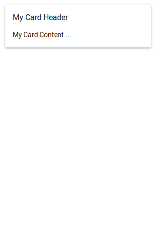
Basic Cards
Cards are basically css component. You can create basic cards simply as below-
Basic Card Header Example
<ion-card> <ion-card-header> My Card Header </ion-card-header> <ion-card-content> <p>My Card Content …</p> </ion-card-content> </ion-card> |
The output of the above example will look something like this –
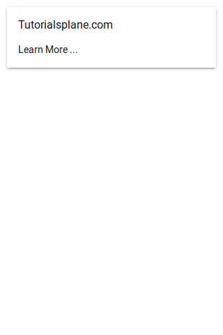
Card Headers
ion-card-header component is used to add the Header in card. Here is simple example of card headers-
Card Headers Example
<ion-card> <ion-card-header> Tutorialsplane.com </ion-card-header> <ion-card-content> <p>Learn More …</p> </ion-card-content> </ion-card> |
The output of the above example will look something like this –
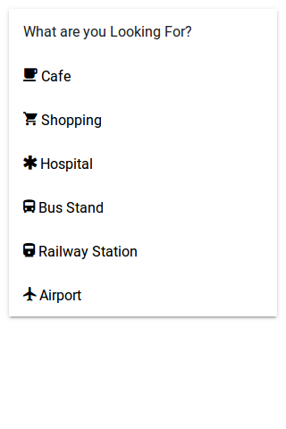
Lists In Cards
ion-list component is used to create card lists in Ionic 2. Here is simple example of Lists In Cards-
Lists In Card Headers Example
<ion-card>
  <ion-card-header>
    What are you Looking For?
  </ion-card-header>
  <ion-list>
    <button ion-item>
      <ion-icon name="cafe"></ion-icon> Cafe
    </button>
    <button ion-item>
      <ion-icon name="cart"></ion-icon> Shopping
    </button>
    <button ion-item>
      <ion-icon name="medical" ></ion-icon> Hospital
    </button>
    <button ion-item>
      <ion-icon name="bus"></ion-icon> Bus Stand
    </button>
    <button ion-item>
      <ion-icon name="train" ></ion-icon> Railway Station
    </button>
    <button ion-item>
      <ion-icon name="plane"></ion-icon> Airport
    </button>
   </ion-list>
</ion-card>
|
The output of the above example will look something like this –
Images In Cards
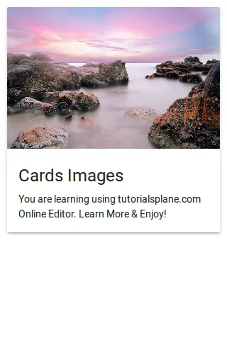
We sometimes need to add images in cards, It is very simple to add images in Cards. Here is an example of Images in Cards.
Ionic 2 Card Images Example
<ion-card>
  <img src="//tutorialsplane.com/wp-content/uploads/2017/01/cothach-1790701_640.jpg"/>
  <ion-card-content>
    <ion-card-title>
      Cards Images
      </ion-card-title>
    <p>
      You are learning using tutorialsplane.com Online Editor. Learn More & Enjoy!
    </p>
  </ion-card-content>
</ion-card>
|
The output of the above example will look something like this –
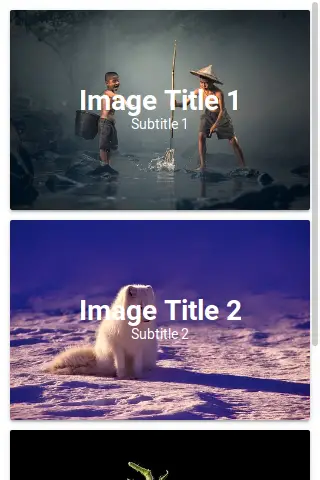
Background Images In Cards
You can set background images in Cards simply adding the image source url as below-
Background Images in Cardss Example
<ion-content class="card-background-page">

  <ion-card>
    <img src="//tutorialsplane.com/wp-content/uploads/2017/01/ace-1807511__340.jpg"/>
    <div class="card-title">Image Title 1</div>
    <div class="card-subtitle">Subtitle 1</div>
  </ion-card>a

  <ion-card>
    <img src="//tutorialsplane.com/wp-content/uploads/2017/01/norway-1758183__340.jpg"/>
    <div class="card-title">Image Title 2</div>
    <div class="card-subtitle">Subtitle 2</div>
  </ion-card>

  <ion-card>
    <img src="//tutorialsplane.com/wp-content/uploads/2017/01/tomato-1862857__340.jpg"/>
    <div class="card-title">Image Title 3</div>
    <div class="card-subtitle">Subtitle 3</div>
  </ion-card>
</ion-content>
|
The css used in the above example is given below, please don’t forget to add this to add the styles for title and subtitle.
Card Background Image Css:
.card-background-page {

  ion-card {
    position: relative;
    text-align: center;
  }

  .card-title {
    position: absolute;
    top: 37%;
    font-size: 2.0em;
    width: 100%;
    font-weight: bold;
    color: #fff;
  }

  .card-subtitle {
    font-size: 1.0em;
    position: absolute;
    top: 53%;
    width: 100%;
    color: #fff;
  }

}
|
The output of the above example will look something like this –
Ionic 2 Buttons
Ionic 2 Buttons: Buttons play an important role in navigation of any app, Ionic 2 provides predefined classes to create different-different buttons. Buttons can contain the text and icons which can be enhanced with different-different attributes. Here in this tutorial we are going to explain how you can create buttons in Ionic 2, you can also use our online editor to run and see the output of the example.
Ionic 2 Buttons | Example & Demo
Ionic uses standard html button <button> element to create buttons and ion-button directive to enhance the properties.
Following Buttons are available in Ionic 2-
- 1. Default Style
- 2. Outline Style
- 3. Clear Style
- 4. Round Buttons
- 5. Block Buttons
- 6. Full Buttons
- 7. Button Sizes
- 8. Icon Buttons
- 9. Buttons In Components
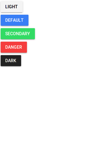
Default Style Button
To create default Style add ion-button attribute to the button Add color using color attribute simply as below –
If you run the above example it will produce output something like this –
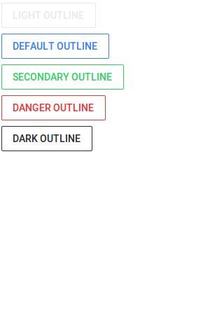
Outline Style Button
To create outline Style add outline property to the button simply as below-
If you run the above example it will produce output something like this –
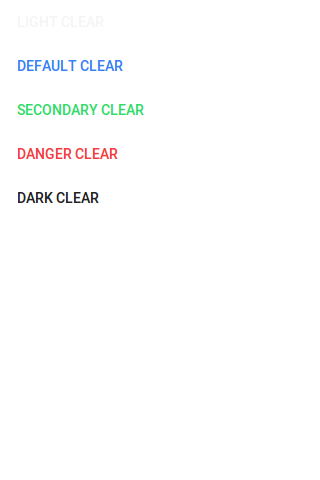
Clear Style Button
If You want to create Clear Style Button just add clear property simply as below-
If you run the above example it will produce output something like this –
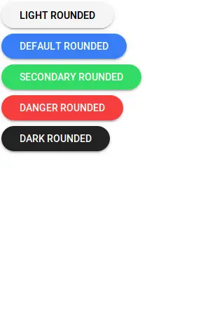
Rounded Buttons
If You want to create rounded Buttons just add round property to button simply as below-
If you run the above example it will produce output something like this –
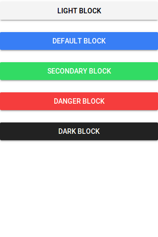
Block Buttons
Add block property to button to make the block level, it will make button 100% of its parent container. Here is an example of block level button-
If you run the above example it will produce output something like this –
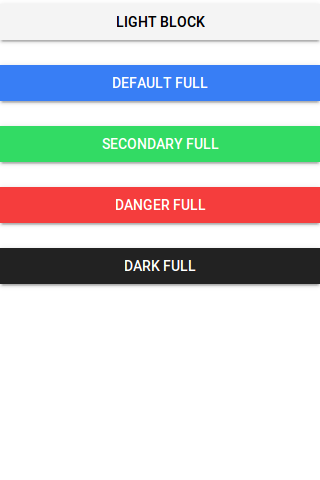
Full Buttons
Add full property to button create Full width button. Full button will be 100% of it’s parent. It removes the left and right borders of the button. Here is an example of block level button-
Ionic 2 Full Buttons Example
|
|
If you run the above example it will produce output something like this –
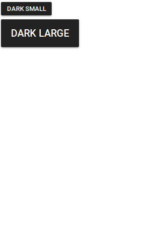
Button Sizes
You can add large attribute to make the buttons large and small to make the buttons small-
Ionic 2 Small | Large Button Example
|
|
The output of the above example will look something like this –
Icon Buttons
You can create icon buttons using ionic icons simply as in the example below –
Ionic 2 Small | Large Button Example
|
|
The output of the above example will look something like this –
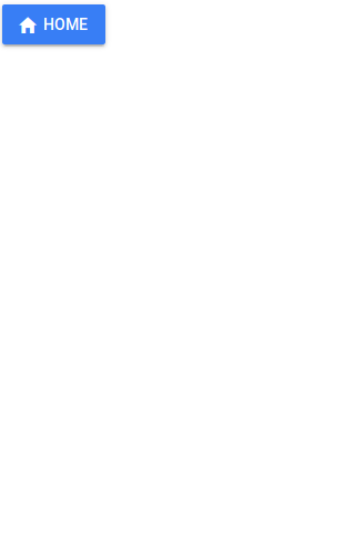
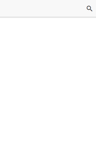
Buttons In Component
You can easily add the buttons in components such as header, footer or list items. Here is an example of a simple search button in header-
Buttons In Component Example
|
|
The output of the above example will look something like this –
Input Properties
| Attribute | Type | Description |
|---|---|---|
| large | boolean | Used to Create Large button. |
| small | boolean | Used to Create Small button. |
| default | boolean | Used to Create Default button. |
| outline | boolean | This creates transparent button with a border. |
| clear | boolean | This creates transparent button without a border. |
| solid | boolean | This is used to force a solid button. Useful for buttons within an item. |
| round | boolean | This creates button with rounded corners. |
| block | boolean | This creates button that fills its parent container with a border-radius. |
| full | boolean | This creates button that fills its parent container without a border-radius or borders on th |
| strong | boolean | This is used to represent the important action. |
| mode | string | The mode to apply to this component. |
| color | string | The predefined color to use. For example: |
Ionic 2 Badges
Ionic 2 Badges: Badges are basically numerical representaion of message that needs to be conveyed to the user. It is very easy to create Badges in Ionic 2. Here in this tutorial we are going to explain how you can create badges in Ionic 2 Framework. You can also use online editor to see the output of the example.
Ionic 2 Badges Example
You can create badge simply using ion-badge tag as in example below –
If you run the above example it will produce output something like this –
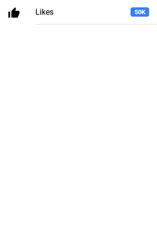
Attributes
Following Attributes can be used for badges-
| Attribute | Type | Description |
|---|---|---|
| color | string | You can use this to add predefined colors such as “primary”, “danger”. |
| mode | string | Mode to apply to this component. |
Learn More About Badges
Let us have some More example and demo about the Badges.
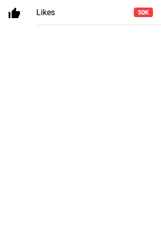
Change Badge Color
Some times we need to change the badge color, you can change color using color attribute simply as below –
If you run the above example it will produce output something like this –


