Angular Material Input
Angular Material Input: Angular Material provides md-input-container directory which allows us to create form data. You can add validation and display error messages using for input fields. Here in this tutorial we are going to explain how you can create form elements using this directory. You can also use our online editor to edit and run the code online.
Angular Material Input Example
Let us first create a very basic example-
Form Validation With Error Messages
Here is a simple form with validation and error messages –
Angular Material Input | Form Validation With Error Messages Example:
<form name="userForm">

      <md-input-container class="md-block" flex="50">
        <label>Name</label>
        <input md-maxlength="15" required md-no-asterisk name="name" ng-model="name">
        <div ng-messages="userForm.name.$error">
          <div ng-message="required">This is required.</div>
          <div ng-message="md-maxlength">The name must be less than 20 characters long.</div>
        </div>
      </md-input-container>

        <md-input-container class="md-block"  flex="50">
          <label>Email</label>
          <input required name="email" ng-model="email">
          <div ng-messages="userForm.email.$error">
            <div ng-message="required">This is required.</div>
          </div>
        </md-input-container>

      <div>
        <md-button type="submit">Submit</md-button>
      </div>
      <br>
    </form>
|
| Try It On → |
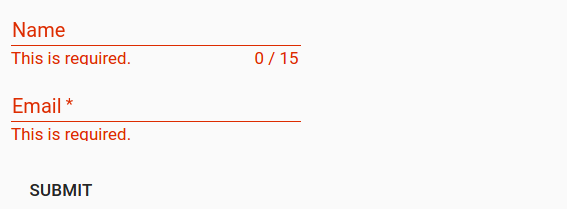
If you run the above example it will produce output something like this –
ng-message – displays the error message when the validation is failed and it automatically hides error message when the input field has valid data.
Attributes
Following Attributes are available –
- md-maxlength(number): Maximum number of characters allowed in input field. The counter will be displayed under the input field.
-
aria-label(string):
Aria-label is required when no label is present. A warning message is logged in the console if Area-label is not found. -
placeholder(string):
This is used to add placeholder. If area-label is not present then placeholder text will be copied to area-label. -
md-no-autogrow(boolean):
If this is available the text-area will not grow automatically. -
md-no-asterisk(boolean):
This is used when you do not want to append asterisk to input field. -
md-no-resize(boolean):
This is used to diable the textarea resize handle. -
max-rows(number):
This is used to add maximum number of rows for a textarea. -
md-detect-hidden(boolean):
If this is added to input then textareas will be sized properly when revealed after being hidden. This is off by default.
Advertisements


