Tag Archives: angular material tutorial
Angular Material Toast
Angular Material Toast: The service $mdToast is used to build to toast notification which can be placed anywhere on the screen. Here in this tutorial we are going to explain how you can create toast notification and place them on screen. You can also use our online editor to edit and run the code online.
Angular Material Toast Example
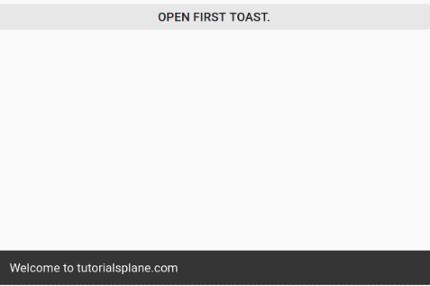
By default toasts are placed at the bottom when screen size is between 600px and 959px. Let us create a simple example using this service($mdToast)-
In the above example we have created a simple toast with default position which will display information at the default position ie. bottom.
If you run the above example it produce output something like this –
Angular Material Toolbar
Angular Material Toolbar : md-toolbar directive is used to create toolbar in Angular Material. Here in this tutorial we are going to explain how you can create toolbars in Angular Material. You can also use our online editor to edit and run the code online.
Angular Material Toolbar Example
Toolbars are basically used above the content are which displays the title of the page and shows related Action Buttons. Let us first create simple tool bar using md-toolbar directive.
If You run the above example it will produce the output something like this –

Angular Material Tabs
Angular Material Tabs: The directive md-tabs is used to create tabs in Angular Material. It works as container for the child elements md-tab. Here in this tutorial we are going to explain how you can create tabs in Angular Material. You can also use our online editor to edit and run the code online.
Angular Material Tabs Example
Let us first create a simple tab using the md-tabs and md-tab directive.
Angular Material Tabs Example:
|
| Try It On → |
If you run the above example it will produce output something like this –

Attributes
Following Attributes are available which are useful when working with tabs.
md-selected(integer):
This is index of selected/active tab.
md-no-ink(boolean):
If this is present then it will disable the ripple effect.
md-no-ink-bar(boolean):
If this is present then it will disable the selection ink bar.
md-align-tabs(string):
This is used to set the position of the button ie. top, bottom. Default position of button is top.
md-stretch-tabs(string):
This attribute is used to set whether to make tab stretchible or not.
md-dynamic-height(boolean):
To set the dynamic height.
md-border-bottom(boolean):
This is used to show a solid 1px border between the tabs and their content.
md-center-tabs(boolean):
When this is enabled, tabs will be centered if there is no need for pagination.
md-no-pagination(boolean):
If this is enabled, pagination will remain off.
md-swipe-content(boolean):
If this is enabled, swipe will work to jump between tabs.
md-enable-disconnect(boolean):
If this is enabled, scopes will be disconnected for tabs that are not being displayed cureently. This boosts the performance.
md-autoselect(boolean):
You can use this to autoselect any tab after initial load.
md-no-select-click(boolean):
This is used to disable the click event.
Angular Material Tooltip
Angular Material Tooltip: Tooltips are basically used to provide extra information about the link, icon or buttons etc. md-tooltip is used to create tooltips in Angular Material. Here in this tutorial we are going to explain how you can add tooltip to the links, icons etc. You can also use our online editor to edit and run the code online.
Angular Material Tooltip Example
Tooltip is activated when user focuses, hovers or touches. Let us create a simple example to understand the tooltip functionality.
Angular Material Tooltip Example:
|
| Try It On → |
In the above example we have added tooltip for buttons, you can add for links, icons on the same way. The tooltip will be triggered when you hover or click on the button.
If you run the above example it will produce the output something like this –
md-visible(expression):
This is used to set whether the tooltip is currently visible or not.
md-delay(number):
If you want to add some delay in showing the tooltip, you can use this.- md-autohide(boolean):
This is used to set whether autohide the tooltip on mouseleave. - md-direction(string):
You can use this to set the direction of the tooltip.Defaults posittion is bottom. Following direction are available –Tooltip Direction : Top
You can add direction top simply as –
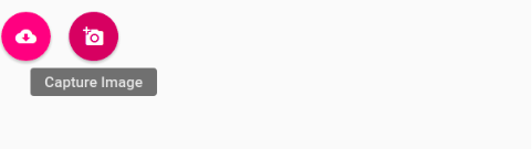
          Capture Image

	  add_a_photo
Tooltip Direction : Left
You can add direction left simply as –
          Capture Image

	  add_a_photo
Tooltip Direction : Right
You can add direction right simply as –
          Capture Image

	  add_a_photo
Tooltip Direction : Bottom
You can add direction Bottom simply as –
          Capture Image

	  add_a_photo
Angular Material Switch
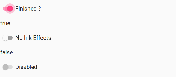
Angular Material Switch Button: mdSwitch directive is used to create switch button in Angular Material. It is very simple to use this directive. Here in this tutorial we are going to explain how you can create switch button in Angular Material. You can also use our online editor to edit and run the code online.
Angular Material Switch Button | On | Off Example
Let us first create basic switch button using the mdSwitch directive –
Angular Material Switch Button Example:
|
| Try It On → |
If you run the above example it will produce output something like this –
Options Available
Following options are available which can help us while dealing with switch buttons-
- * ng-model(string):
Assignable angular expression for data-bind.
name(string):
This is property name of the form.
ng-true-value(expression):
This is the which is set when swith button is selected(true), you can add custom value.
ng-false-value(expression):
This is the which is set when swith button is not selected(false), you can add custom value.
ng-change(string):
Angular expression to be executed when input changes when user interacts it.
ng-disabled(expression):
This is used to enable and disable the switch button based on the expression.
md-no-ink(boolean):
This is for ripple effect enable-disable.
aria-label(string):
Area Lable for user access.
Learn More
Let us have some example and demo about the Angular Material Switch Button.
More examples coming soon…
Angular Material Subheader
Angular Material Subheader: It is very simple and easy to create a stickey header in Angular Material. md-subheader directive is used to create subheaer. Here in this tutorial we are going to explain how you can create Subheader in Angular Material. You can also use our online editor to edit and run the code online.
Angular Material Subheader Example
Let us create a simple example for Angular Material Subheader. You can subheader in any section simply as below –
By default the subheader will be sticky, if you want to disable the sticky header you can add the class class=”md-no-sticky” to the directive md-subheader.
If you run the above example it will produce the output something like this –

Learn More
Let us have some example and demo about the Angular Material Subheader.
Angular Material Disable Stickiness of Subheader
Sometimes we need to disable stickiness of the subheader, to disable the stikiness of subheader just add the following the class=”md-no-sticky” to the subheader directive.
Here is an example to disable the stikiness of the subheader –
Angular Material Subheader Example:
|
Angular Material Slider
Angular Material Slider: md-slider directive is used to create slider in Angular Material. This is an important component of Angular Material, As the web app development trend is changing day by day everyone wants mobile first application so it is new presentation to select range. Here in this tutorial we are going to explain how you can create slider in Angular Material. You can also use our online editor to edit and run the code online.
Angular Material Slider Example
Let us create a simple example to understand how Angular Material slider works.
In the above example md-slider directive is used to create the slider. ng-model is used to assign the myRange Model which will handle the slider actions. Min and max attributes are used to set the maximun and minimum value.
If you run the above example it produce the output something like this –

Options Available
Options available for this are –
md-discrete(boolean):
This is used to enable the discrete mode.
md-invert(boolean):
This is used to enable the invert mode.
step(number):
The distance between values the user is allowed to pick. Default 1.
min(number)
The minimum value allowed to select and the Default value for it is 0.
max(number):
The maximum value allowed to select and the Default value for it is 100.
round(number)
This is used to round the decimal numbers the Default value is 3.
Learn More
Let us have some example and demo about the Angular Material Sliders.
We will soon add some more examples & demo.
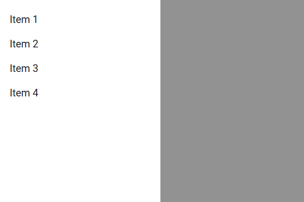
Angular Material Side Nav
Angular Material Side Nav: Sidenav is Angular Material component that is opened and closed and opened programatically. It is very easy to create side nav in Angular Material. Here in this tutorial we are going to explain how you can create Side Nav In Angular Material. You can also use our online editor to edit and run the code online.
Angular Material Side Nav | Side Menu Example
md-sidenav Directive and $mdSidenav service is used to create Side Nav, let us first create simple Side Nav to understand how it works.
If you run the above example it will produce output something like this –
Options Available
Following options are available for side nav which you can use as per your need-
md-is-open(expression):
Model to bind when nav bar is opened.
md-disable-backdrop(boolean):
You can use this to disable the backdrop. Backdrop will not be present if you set md-disable-backdrop to true.
md-component-id(string):
componentId which is used with $mdSidenav service.
md-is-locked-open(expression):
When this expression is evaluated to true, the nav ‘locks open’: it falls into the content’s flow instead of appearing over it. This overrides the md-is-open attribute.
md-disable-scroll-target(string):
This is used to disable the scrolling of the selector element. By default this is side nav’s parent.
Angular Material Select
Angular Material Select: <md-select> is used to create select box in Angular Material. This component is used within the <md-input-container> or it can be used standalone by using the class <md-no-underline>. Here in this tutorial we are going to explain how you can use <md-select> to create select dropdown. –
Angular Material Select Box Dropdown List Example
Let us create first select box to understand the how it works-

In the above example we have created very basic select box using md-select and md-option directive. However you can use this for static select dropdown list where you don’t need Dynamic options.
If you run the above example it will produce output something like this –

Options Available
Following Options are available which you can use as per your requirement-
- * ng-model(expression):The model to init.
multiple(boolean):
This is used to enable mulselection.
md-on-close(expression):
Expression is evaluated when close event is fired.
md-on-open(expression):
Expression to be evaluated when opening the select. Will hide the select options and show a spinner until the evaluated promise resolves.
md-selected-text(expression):
This Expression is evaluated and will return a string as a placeholder when closed.
placeholder(string):
Used to add placeholder.
md-no-asterisk(boolean):
Asterisk will not be appended to the floating label if it is set to true.
aria-label(string):
Label for accessibility.
md-container-class(string):
If you want custom styling then you can use this to apply to the class to .md-select-menu-container element.
Learn More About Select Box(DropDown)
Let us have some more example and demo about the Angular Material Select Dropdown Menu.
Dynamic Select Dropdown Using Object
It is very simple to create dynamic Select Dropdown Box. Here is an example –
Thus you can create any dynamic dropdown list, You can also fetch data from database and format them to display in dropdown list.
Angular Material Multiselect DropDown List | Multi Select Box
Sometimes we need multiselect dropdown menu, Angular Materiala provides (multiple) attribute which enables you to select multiple options from the list. Here is an example of multiple select dropdown example-
In the above example we have added attribute multiple which enables us to select multiple options from dropdown list
If you run the above example it will produce the output something like this –


