Angular Material Tooltip
Angular Material Tooltip: Tooltips are basically used to provide extra information about the link, icon or buttons etc. md-tooltip is used to create tooltips in Angular Material. Here in this tutorial we are going to explain how you can add tooltip to the links, icons etc. You can also use our online editor to edit and run the code online.
Angular Material Tooltip Example
Tooltip is activated when user focuses, hovers or touches. Let us create a simple example to understand the tooltip functionality.
Angular Material Tooltip Example:
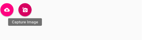
<md-button class="md-fab md-accent" aria-label="Download">
	  <md-tooltip>
	    Download Data
	  </md-tooltip>
	  <i class="material-icons">cloud_download</i>
</md-button>
<md-button class="md-fab md-accent" aria-label="Download">
	  <md-tooltip>
          Capture Image
	  </md-tooltip>
	  <i class="material-icons">add_a_photo</i>
</md-button>
|
| Try It On → |
In the above example we have added tooltip for buttons, you can add for links, icons on the same way. The tooltip will be triggered when you hover or click on the button.
If you run the above example it will produce the output something like this –
md-visible(expression):
This is used to set whether the tooltip is currently visible or not.
md-delay(number):
If you want to add some delay in showing the tooltip, you can use this.- md-autohide(boolean):
This is used to set whether autohide the tooltip on mouseleave. - md-direction(string):
You can use this to set the direction of the tooltip.Defaults posittion is bottom. Following direction are available –Tooltip Direction : Top
You can add direction top simply as –
    <md-button class="md-fab md-accent" aria-label="Download">
	  <md-tooltip md-direction="top">
          Capture Image
	  </md-tooltip>
	  <i class="material-icons">add_a_photo</i>
    </md-button>
Tooltip Direction : Left
You can add direction left simply as –
    <md-button class="md-fab md-accent" aria-label="Download">
	  <md-tooltip md-direction="left">
          Capture Image
	  </md-tooltip>
	  <i class="material-icons">add_a_photo</i>
    </md-button>
Tooltip Direction : Right
You can add direction right simply as –
    <md-button class="md-fab md-accent" aria-label="Download">
	  <md-tooltip md-direction="right">
          Capture Image
	  </md-tooltip>
	  <i class="material-icons">add_a_photo</i>
    </md-button>
Tooltip Direction : Bottom
You can add direction Bottom simply as –
    <md-button class="md-fab md-accent" aria-label="Download">
	  <md-tooltip md-direction="bottom">
          Capture Image
	  </md-tooltip>
	  <i class="material-icons">add_a_photo</i>
    </md-button>
Advertisements


