Angular Material Datepicker
Angular Material Datepicker(Calender) : <md-datepicker> directive is used to create a datepicker. Here in this tutorials we are going to explain how to use <md-datepicker> directive to create datepicker. You can use our online editor to edit and run the code online.
How to Create Angular Material Datepicker ? Calender
Let us go step by step to create Angular Material Datepicker.
<md-datepicker> Component supports AngularJs ngMessages Directive. Attributes supported are –
- required: This is used to set the field required or not.
- mindate: This is used to set the date range ie. minimum date allowed.
- maxdate:This is used to set the date range ie. maximum date allowed.
- debounceInterval: Miliseconds to delay in processing. Default value of delay time is 500ms.
Example
Now let us create very basic example using <md-datepicker> directive.
Angular Material Datepicker | Example:
<md-datepicker ng-model="birthDate"></md-datepicker> |
| Try It On → |

|

|
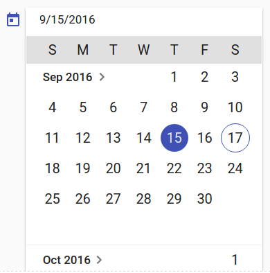
If you run the above example it will produce output something like this –
Options Available
Following options are available you can use them as per your requirement.
-
ng-model(stringobject):
A model which expects javascript date object. - ng-model-options(Object): This is used to define the way ng-model is being updated. This can also be used to define the timezone.
- ng-change(expression)
Called when the model value gets changed. - ng-focus(expression)
Called when the input is focused. - ng-blur(expression)
Called when focus is removed from the input. - md-min-date(Date)
This expression is used to represent a minimum date. - md-max-date(Date)
This expression is used to represent a maximum date. - md-date-filter(function(Date): boolean) :
Function expecting a date and returning a boolean whether it will be selectable or not. - md-placeholder(String)
The date input placeholder value. - md-open-on-focus(String)
Calender is opened on focus event. - md-is-open(Boolean)
Expression used to open the datepicker’s calendar on-demand. - md-current-view(String)
Calender’s default open view. It can be either “month” or “year”. - md-hide-icons(String)
Determines which datepicker icons to hide. Use at your own risk because may create alignment issue. Possible values are:“all” – Hides all icons.
“calendar” – Only hides the calendar icon.
“triangle” – Only hides the triangle icon. - ng-disabled(boolean)
This is used to disable the datepicker. - ng-required(boolean)
You can use to make an input field as required for the datepicker.
Learn More | Customized Datepicker Examples
Let us have some example and demo about the Angular Material Calender.
Disabled Datepicker
You can create disabled datepicker using the attribute ng-disabled. Here is an example.
Disabled Datepicker/Calender| Example:
<md-datepicker ng-disabled="true" ng-model="birthDate"></md-datepicker> |
Enable Datepicker
To enable the datepicker just set ng-disabled=”false”.
Set Minimum and Maximum | Range in Datepicker
If you want to set the minimum and maximum date selection criteria you can use md-min-date and md-max-date attribute. Here is an example.
Min and Max Datepicker/Calender| Example:
<md-datepicker md-min-date="minDate" md-max-date="maxDate" ng-model="birthday"></md-datepicker> |
Where minDate and maxDate are date objects declared in controller.
If you run the above example it will produce output something like this. Only the months within the provided date will be enabled other will be disabled –

Advertisements


