Tag Archives: angular material tutorial
Angular Material Radio Button
Angular Material Radio Button : <md-radio-button> is used to create radio button in Angular Material. <md-radio-button> is basically child directive which is used with <md-radio-group>. Here in this tutorial we are going to explain how to create radio buttons with various example and demo. You can also use our online editor which enables user to edit and run code online.
Angular Material Radio Button Example
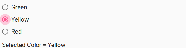
Let us create a simple Radio button using <md-radio-button> directive to understand this-
If you run the above example it will produce output which will look like this –
Options Available
Following options are available which you can use as per your requirement-
- * ngModel(string)
Assignable angular expression to data-bind to. -
* ngValue(string)
Angular expression which is used to set the value to which the expression should be set when selected. -
* value(string)
The value of radio button when selected. -
ngChange(string)
This is executed when change event occurrs. -
name(string)
Property name of the form in which the control is to be published. -
aria-label(string)
Adds label to radio button for accessibility. Default value is set to radio button’s text. If you have provided no text content then a warning will be logged.
Angular Material Progress Bar
Angular Material Progress Bar: There are basically two types of progress bar available in Angular Material – Circular and Linear. The directive <md-progress-circular> is used to create circular progress bar and directive <md-progress-linear< is used to create linear progress bar. Here in this tutorial we are going to explain how you can use progress bars in Angular Material. You can also use our online editor to edit and run the code online.
Angular Material Progress Bar – Circular | Linear Progress Bar Example
Progress bar is basically used as indicator which represents that some background activity is going for example when content is loading and user is asked to wait a moment till it finishes. There are following types of progress bars let us go step by step –
- Circular Progress Bar
- Linear Progress Bar
Circular Progress bar
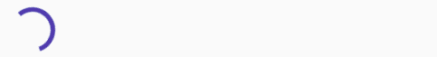
<md-progress-circular> directive is used to represent the content loading in your app. A circular loader is shown when some activity such as content loading is going on background. Let us first create a very basic example to understand how it works in real time.
In the above example we have created simple circular progress bar which is in indeterminate state.
If you run the above example the output will look something like this –
Options For Circular Progress Bar
Following options are available for circular progress bar-
-
* md-mode(string):
This is used to set one of the mode – determinate or indeterminate. -
value(number):
This is used to represent the % of the circular bar progress. Default value for this is 0. -
md-diameter(number):
This is used to set the diameter of circular progress bar. -
ng-diabaled(boolean):
This is used to disable the progress bar.
Linear Progress Bar
Linear Progress bar is also used to represent the loading state of content. The <md-progress-linear< directive is used to create the linear progress bar. Let us create a very basic example of linear progress bar-
The above example is simple linear progress bar which has indeterminate mode.
The output of the above example will look something like this –
Options for Linear Progress Bar
-
* md-mode(string):
This is used to set one of the mode – determinate or indeterminate. -
value(number):
This is used to represent the % of the linear bar progress. Default value for this is 0. -
md-buffer-value(number):
This is used to set the percentage of secondary progress bar. Default value for this 0. -
ng-diabaled(boolean):
This is used to disable the progress bar.
Learn More
Let us have some example and demo about the Angular Material Progress Bar.
We will be adding more example soon..
Angular Material Nav bar
Angular Material Nav bar: <md-nav-bar> Directive is used to create navbar in Angular Material. It uses inbuilt routing for page navigation.The events ng-href, ui-href and ng-click are supported. Here in this tutorial we are going to create Angular Material Navigation with example and demo. You can also use our online editor to edit and run the code online.
Angular Material Nav bar Example
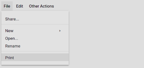
Let us first create a simple example of nav bar –
If you run the above example it will produce output something like this –

Angular Material Menu Bar
Angular Material Menu Bar : Menu Bars basically containers that contains multiple menus. <md-menu-bar> directive is used to create Menu bar which contains multiple menus and their items. Here in this tutorial we are going to explain how you can create Menu bar in Angular Material. You can also use our online editor to edit and run the code online.
Angular Material Menu Bar Example
Let us create a simple example to understand how we can use the <md-menu-bar> and <md-menu> directive-
Angular Material Menu Bar Example:
|
| Try It On → |
If you run the above example it will produce the output something like this –
The above example also contains the sub menu items which you can also use to create nested menus.
Angular Material Menu
Angular Material Menu : Menus are an important component of any framework and it provides interface for navigation. Here in this tutorial we are going to explain how you can create Angular Material Menu. You can also use our online editor to edit and run the code online.
Angular Material Menu Example
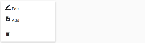
Menu elements are opened when clicked and provides additional options. Directive <md-menu> is used to create menu in Angular Material. <md-menu> contains two child elements : 1. First element used to open the menu options. 2. Second element is <md-menu-content> which contains the content of the menu element which is opened when clicked on menu button. Basically <md-menu-content> contains the <md-menu-item> but you can also add custom elements. Let us first create a basic example to understand how it works.
In the above example we have created a simple menu in which a list of actions is opened when you click on the settings icons. Here is the output of the above example when you click on the above demo –
-
* md-position-mode(string):
This is used for position mode using x, y axis. Default value for this is target,target. -
* md-offset(string):
If you want to add offset to apply in the dropdown after the position x, y. 0,0 is the default value.
Learn More
Let us have some example and demo about the Angular Material Menus.
Add Menu Width
If you want to add menu with, you can use width attribute to add width as following-
- Wide Menu(width=6) is used for wide menu.
- Medium Menu(width=4) is used for medium menu.
- Small Menu(width=2) is used for small menu.
Here is an example with width example-
Here is an example with width example:
|
| Try It On → |
If you run the above example it will produce the menus with three different width.
Angular Material List
Angular Material List: Angular Material Provides <md-list> directive which is used to create list and <md-list-item> is used to add the list items. Angular Material provides rich features related to lists which you can use easily. Here in this tutorial we are going to explain how you can create list in Angular Material. You can also use our online editor to edit and run the code online.
Angular Material List Example
Let us first create a simple list using <md-list> directive-
Angular Material List Example: 2 Line Item
|
| Try It On → |
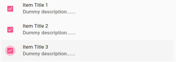
The above example contains two line simple list. First line contains the heading and second line contains the description. This example also contains checkbox which can be used to select the items. If you run the above example it will produce output something like this –
Learn More
Lists are used widely so Let us create some more example and demo on it.
3 Line Item
Let us create 3 line Item list with hover effect, to create 3 line item just add the class=”md-3-line” to the <md-list-item>-
3 Line Item List Example:
|
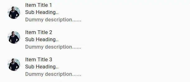
In the above example 3 line list(flex) is created, to add hover effect ng-click=”null” is used. If you do not add this no hover effect will appear.
If you run the above example it will produce output something like this –
Angular Material Input
Angular Material Input: Angular Material provides md-input-container directory which allows us to create form data. You can add validation and display error messages using for input fields. Here in this tutorial we are going to explain how you can create form elements using this directory. You can also use our online editor to edit and run the code online.
Angular Material Input Example
Let us first create a very basic example-
Form Validation With Error Messages
Here is a simple form with validation and error messages –
If you run the above example it will produce output something like this –
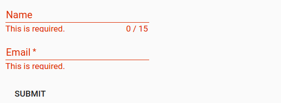
ng-message – displays the error message when the validation is failed and it automatically hides error message when the input field has valid data.
Attributes
Following Attributes are available –
- md-maxlength(number): Maximum number of characters allowed in input field. The counter will be displayed under the input field.
-
aria-label(string):
Aria-label is required when no label is present. A warning message is logged in the console if Area-label is not found. -
placeholder(string):
This is used to add placeholder. If area-label is not present then placeholder text will be copied to area-label. -
md-no-autogrow(boolean):
If this is available the text-area will not grow automatically. -
md-no-asterisk(boolean):
This is used when you do not want to append asterisk to input field. -
md-no-resize(boolean):
This is used to diable the textarea resize handle. -
max-rows(number):
This is used to add maximum number of rows for a textarea. -
md-detect-hidden(boolean):
If this is added to input then textareas will be sized properly when revealed after being hidden. This is off by default.
Angular Material Fab Toolbar
Angular Material Fab Toolbar : Angular Material Provides <md-fab-toolbar> directive which represents the toolbar of elements(Basically <md-button>). It provides the quick access for common actions. It is very simple to create Angular Material Fab toolbar. Here in this tutorial we are going to explain how you can create fab toolbar. You can also use our online editor to edit and run the code online.
Angular Material Fab Toolbar Example
Let us first create a simple Fab toolbar using <md-fab-toolbar> directive-
If You run the above example it will produce the output something like this-
Fab Toolbar Set Direction
Following directions are available for Fab Toolbar –
- Fab Toolbar Direction Left(md-direction=”left”): – md-direction=”left” is used to set the left direction for the Fab Toolbar.
- Fab Toolbar Direction Right(md-direction=”right”): – md-direction=”right” is used to set the right direction.
Fab Toolbar Trigger Position
If you want to set the trigger position for the Fab toolbar following options are available which you can use easily as per your need, Just add the class to <md-fab-toolbar>-
- Trigger Position Top Left(md-fab-top-left): – class=”md-fab-top-left” is used to add the top left position of trigger.
- Trigger Position Top Right(md-fab-top-right): – class=”md-fab-top-right” is used to add the top right position of trigger.
- Trigger Position Bottom Left(md-fab-bottom-left): – class=”md-fab-bottom-left” is used to add the bottom left position of trigger.
- Trigger Position Bottom Right(md-fab-bottom-right): – class=”md-fab-bottom-left” is used to add the bottom right position of trigger.
Example
Let us create a simple example for Trigger positions –
Fab Trigger positions Example:
|
Angular Material Fab Speed Dial
Angular Material Fab Speed Dial:<md-fab-speed-dial> directive is used to create fab speed dial in Angular Material. Speed dial basically represents the series of popup elements which provides the quick access for most common actions/tasks. Here in this tutorial we are going to explain how you can create Fab Speed Dial in Angular Material. You Can also use our online editor to edit and run the code online.
Angular Material Fab Speed Dial Example
Let us first create very basic Fab Speed Dial-
This is the very basic fab speed dial. If you run the above example it will produce output something like this –

Add Animation to Fab Speed Dial
Two animations(classes) are available for Fab Speed Dial.
- md-fling: The speed dial items will appear underneath the trigger button.
- md-scale: The speed dial items will scale 0% to 100% and will be placed at their appropriate position.
Let Us create an example to understand the both animations.
Fab Speed Dial Animation Example
Add animation classes – md-fling, md-scale to the directive md-fab-speed-dial. Here is an example of both animations –
md-fling | md-scale | Animation | Example:
|
| Try It On → |
Add Position Of Trigger
You can easily assign the trigger button position using the inbuilt classes. The following positions are available let us go one by one.
- Top Left Position(md-fab-top-left): Add class md-fab-top-left to the :<md-fab-speed-dial> for top left position.
.. - Top Right Position(md-fab-top-right): Add class md-fab-top-right to the :<md-fab-speed-dial> for top right position.
.. - Bottom Right Position(md-fab-bottom-right): Add class md-fab-bottom-right to the :<md-fab-speed-dial> for bottom right position.
.. - Bottom Left Position(md-fab-bottom-left): Add class md-fab-bottom-left to the :<md-fab-speed-dial> for bottom left position.
..
Set Direction
You can set the direction for items(direction in which speed dial appear relative to trigger button) using the attribute md-direction. Following Options are available.
- Speed Dial Direction Up:
Use md-direction=”up” for direction up. - Speed Dial Direction Down:
Use md-direction=”down” for direction down. - Speed Dial Direction Left:
Use md-direction=”left” for direction left. - Speed Dial Direction Right:
Use md-direction=”right” for direction right.
Now let us create an example to understand how these four directions works –


