Tag Archives: angular material tutorial
Angular Material Divider
Angular Material Divider: <mdDivider> directive is used to create divider in Angular Material. The Divider is basically a thin line to make a separation between the contents. Here in this tutorial we are going to explain how you can create divider in Angular Material Using the <mdDivider> directive. You can also use our online editor to edit and run the code online.
Angular Material Divider Example
Let us create a simple divider using the <mdDivider> directive-
Angular Material Divider | Example:
|
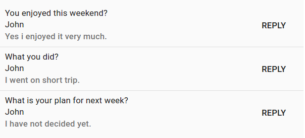
In the above example we have created a simple list and added divider to them. If you run the above example it will produce the output something like this –
Attributes
Following attribute is available for dividers-
- md-inset:This attribute is used to activate the inset style divider.
Learn More
Let us have some example and demo about the Angular Material Dividers.
md-inset – Inset Divider Example
You can create inset style divider using the attribute md-inset. Here is an example-
| Example:
|
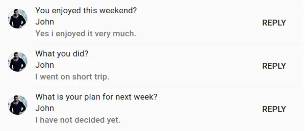
If you run the above example it will produce output something like this –
Angular Material Dialog
Angular Material Dialog: It is very simple to create a dialog box in Angular Material. <md-dialog> Directive and $mdDialog Service is used to create Dialogs in Angular Material. Here in this tutorial we are going to explain how to create dialog box such as – Alert Box,Confirm Box, Prompt Box, Custom Dialog and Tab Dialog using this directive. You can also use our online editor to edit and run the code online.
Angular Material Dialog Example
Let us first create very basic dialog box in Angular Material-
Angular Material Dialog Box: Alert Box Example
|
| Try It On → |

|

|
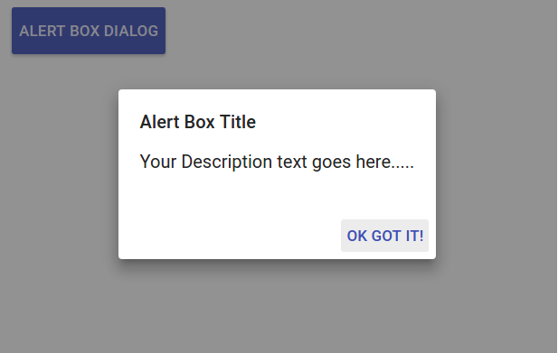
In the above example we have triggered alert box using JavaScript which uses default template, You can also use custom template.
If you run the above example it will produce output something like this –
Learn More About Dialog | Popup Box
Let us have some example and demo about the Angular Material Popup box.
Confirm Box
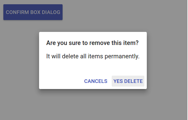
Here is javaScript part which contains the function for confirm box. Just call function showConfirmBox to trigger the confirm popup.You can create confirm box simply as below –
Confirm Dialog Box | Confirm Popup Example:
|
|
| Try It On → |
|
|
If you run the above example it will produce output something like this –
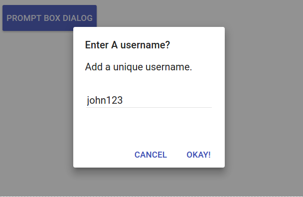
Prompt Dialog Box
JavaScript Part for prompt box is as below-
Prompt Dialog Box Example:
|
|
| Try It On → |
|
|
If you run the above example it will produce the following output –
Pre-Rendered Dialog | Modal Example
Sometimes we need pre-rendered dialog rather than adding the content from Script. It pre-rendered dialog template is not executed each time. It is very simple to create pre-rendered dialog. Here is an example of creating pre-rendered dialog.
Pre-Rendered Dialog Box | Modal Example
|
| Try It On → |
|
|
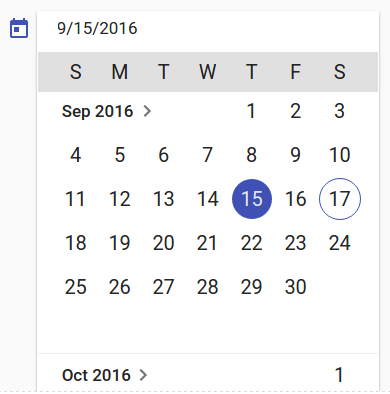
Angular Material Datepicker
Angular Material Datepicker(Calender) : <md-datepicker> directive is used to create a datepicker. Here in this tutorials we are going to explain how to use <md-datepicker> directive to create datepicker. You can use our online editor to edit and run the code online.
How to Create Angular Material Datepicker ? Calender
Let us go step by step to create Angular Material Datepicker.
<md-datepicker> Component supports AngularJs ngMessages Directive. Attributes supported are –
- required: This is used to set the field required or not.
- mindate: This is used to set the date range ie. minimum date allowed.
- maxdate:This is used to set the date range ie. maximum date allowed.
- debounceInterval: Miliseconds to delay in processing. Default value of delay time is 500ms.
Example
Now let us create very basic example using <md-datepicker> directive.
Angular Material Datepicker | Example:
|
|
| Try It On → |
|
|
If you run the above example it will produce output something like this –
Options Available
Following options are available you can use them as per your requirement.
-
ng-model(stringobject):
A model which expects javascript date object. - ng-model-options(Object): This is used to define the way ng-model is being updated. This can also be used to define the timezone.
- ng-change(expression)
Called when the model value gets changed. - ng-focus(expression)
Called when the input is focused. - ng-blur(expression)
Called when focus is removed from the input. - md-min-date(Date)
This expression is used to represent a minimum date. - md-max-date(Date)
This expression is used to represent a maximum date. - md-date-filter(function(Date): boolean) :
Function expecting a date and returning a boolean whether it will be selectable or not. - md-placeholder(String)
The date input placeholder value. - md-open-on-focus(String)
Calender is opened on focus event. - md-is-open(Boolean)
Expression used to open the datepicker’s calendar on-demand. - md-current-view(String)
Calender’s default open view. It can be either “month” or “year”. - md-hide-icons(String)
Determines which datepicker icons to hide. Use at your own risk because may create alignment issue. Possible values are:“all” – Hides all icons.
“calendar” – Only hides the calendar icon.
“triangle” – Only hides the triangle icon. - ng-disabled(boolean)
This is used to disable the datepicker. - ng-required(boolean)
You can use to make an input field as required for the datepicker.
Learn More | Customized Datepicker Examples
Let us have some example and demo about the Angular Material Calender.
Disabled Datepicker
You can create disabled datepicker using the attribute ng-disabled. Here is an example.
Enable Datepicker
To enable the datepicker just set ng-disabled=”false”.
Set Minimum and Maximum | Range in Datepicker
If you want to set the minimum and maximum date selection criteria you can use md-min-date and md-max-date attribute. Here is an example.
Where minDate and maxDate are date objects declared in controller.
If you run the above example it will produce output something like this. Only the months within the provided date will be enabled other will be disabled –

Angular Material Container
Angular Material Container: It is very simple to create Content Container in Angular Material. Here in this tutorial we are going to explain how you can create Angular Material Content Container. You can also use our online editor to edit and run the code online.
Angular Material Container | Directive | Example
Here we are going to create first example using the <md-content> directive-
In the above example we have created a very basic container. If you run the above example it will produce output something like this –
Learn More
Let us have some more example and demo about the Angular Material Content.
Angular Material Container : Add Layout Padding Example
If you want to add padding to content element you can use layout-padding attribute. Here is an example –
If you run the above example it will add padding to the content.
Angular Material Colors
Angular Material Colors: mdColors directive is used to apply the theme-based color expression as RGBA CSS style values. Here in this tutorial we are going to explain how you can apply colors using mdColors directive. You can also use our online demo edit and run the code online.
Angular Material Colors Example
Syntax
The syntax for adding color is similar as color defining in the scss.
Angular Material Colors | Syntax:
[?theme]-[palette]-[?hue]-[?opacity] |
- [theme] – The default value is the default theme.
- [palette] – Can be either palette name or it can be primary/accent/warn/background.
- [hue] – The default is 500 (hue-x can be used with primary/accent/warn/background).
- [opacity] – default is 1.
? it indicates the optional parameter.
Example
Now Let us create first example –
Add Background Color
You can use md-colors directive to add background color. He is an example to add the background color in Angular Material.
If you run the above example it will produce the output something like this –

Learn More
Let us have some example and demo about the Angular Material Colors.
Add Font Color : Change Text Color
You can use md-colors directive to add font color. He is an example to add the font color using md-colors.
If You run the above example it will produce output something like this –

Angular Material Chips
Angular Material Chips: <md-chips> is an input component which is used to create list of strings or objects. The list items are displayed as ‘chips’. Angular Material Provides beautiful and smooth chips functionality. Here in this tutorial we are going to explain how you can create chips using the <md-chips> component. You can also use online demo to edit and run the code online.
Angular Material Chips Example
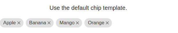
Let us first create a very basic chip using –
In the above example we have create an array of fruits which has been assigned to the input as default chips. You can add other chips also. If you run the above example it will produce the output something like this –
Options Available
Following options are available that be added easily if you need them-
-
ng-model(stringobject)
A model to bind the list of items. -
* md-transform-chip(expression)
An expression of form myFunction($chip). When this function is called it expects the following parameters:1. an object representing the $chip input string
2. undefined to simply add the $chip input string, or
3. null to prevent the chip from being appended -
* md-require-match(boolean)
If true, and the chips template contains an autocomplete, only allow selection of pre-defined chips and you can’t add the any other selection other than the pre-defined chips. -
placeholder(string)
Placeholder text for the input. -
secondary-placeholder(string)
This placeholder is displayed when there is at least one item in the list. -
md-removable(boolean)
This is used to enable and disable the removal of chips from the delete icon. Default is true. -
readonly(boolean)
Disables the addition/deletion and hides the input and delete buttons. If no ng-model is provided, the chips will automatically be marked as readonly. If md-removable is not defined, then the md-remove behavior will be overwritten and disabled. -
md-enable-chip-edit(string)
If you want to enable the editing of the chips set it true. The user can go into edit mode with pressing “space”, “enter”, or double clicking on the chip. Chip edit is only supported for chips with basic template. -
md-max-chips(number)
The maximum number of chips that can be added through user input. -
md-add-on-blur(boolean)
When set to true, remaining text inside of the input will be converted into a new chip on blur. -
md-on-add(expression)
An expression called when a chip has been added. -
md-on-remove(expression)
An expression called when a chip has been removed. -
md-on-select(expression)
An expression which will be called when a chip is selected. -
delete-hint(string)
A string read by screen readers instructing users that pressing the delete key will remove the chip. -
delete-button-label(string)
A label for the delete button which is hidden and read by screen readers. -
md-separator-keys(expression)
An array of key codes used to separate chips.
Learn More
Let us have some example and demo about the Angular Material Chips.
Use Custom Template
Here in this tutorial we have created a custom template.md-chip-template is used to create a custom template for chips. Here is an example of Custom Chips –
Editable Chips
You can make chips editable using the attribute md-enable-chip-edit=”true”.
Editable chips Example
|
Note: Editing functionality works with only basic templates.
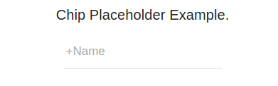
Add placeholder
If you want to add the placeholder you can use the attribute – placeholder,secondary-placeholder. Here is an example to add placeholders in Chips-
If you run the above example it will produce the following output-
Add Validation And Show Error Message
You can add validation and display error message simply as below –
Add Validation And Display Error Message: Example
|
|
Angular Material Checkbox
Angular Material – Checkbox: <md-checkbox> directive is used to create Checkbox as in AngularJs. Here in this tutorial we are going to explain how you can use Angular Material Checkbox with example. You can also use our online editor to edit and run the code online.
Angular Material Checkbox Example
Let us first create a simple checkbox using Angular Material directive-
If you run the above example it will produce output something like this –
Options Available
Following options are available in Angular Material Checkbox –
-
* ng-model(string)
Angular expression to data-bind to. -
name(string)
Property name of the form under which the control is published. -
ng-true-value(expression)
The value to which the expression should be set when selected. -
ng-false-value(expression)
The value to which the expression should be set when not selected. -
ng-change(string)
Angular expression is executed when user changes the input with the input element. -
md-no-ink(boolean)
This attribute is used to indicate the use of ripple ink effects. -
aria-label(string)
Adds label to checkbox for accessibility. Default is checkbox’s text. If no default is found then a log will be created. -
md-indeterminate(expression)
This determines when the checkbox should be rendered as ‘indeterminate’. -
ng-checked(expression)
If checkbox is checked then this expression is evaluated as true and css class md-checked is added to the checkbox which displays it as selected.
Angular Material Card
Angular Material – Card : The <md-card> directive is used to create Card in Angular Material. Various options are available to create cards. Here in this tutorial we are going to explain how you can create Angular Material card. You can also use our online editor to edit and run the code online.
Angular Material Card Example
Let us create basic Angular Material Card –
Example:
|

If you run the above example it will produce output something like this –

Following options are available –
- <md-card-header> – Header for the card, holds avatar, text and squared image
- <md-card-avatar> – Card avatar
- md-user-avatar – Class for user image
- <md-icon> : Icon directive
- <md-card-header-text> :– Contains elements for the card description
- md-title :– Class for the card title
- md-subhead – Class for the card sub header
- <img>: – Image for the card
- <md-card-title>:- Card content title
- <md-card-title-text>:– Card Title Directive Text.
- md-headline:-Class for the card content title
- md-subhead: – Class for the card content sub header
- <md-card-title-media>: – Squared image within the title
- md-media-sm :– Class for small image
- md-media-md :– Class for medium image
- md-media-lg: – Class for large image
- <md-card-content>: – Card content
- md-media-xl : – Class for extra large image
Angular Material Button
Angular Material – Button : <md-button> is used to create buttons in Angular Material. Angular Material Provides you the inbuilt classes to change the button color. Here in this tutorial we are going to explain how you can create buttons in Angular Material. You can also use our online editor to edit and run the code online.
Angular Material Button Example | Demo
Let us first create first button using the Angular Material. Here is html,JavaScript And css part-
If you run the above example it will produce the output something like this-

Learn More!
Let us have look over different types of buttons available in Angular Material.
Flat Button
Here are following types of flat buttons available in Angular Material. You can create Flat button – Primary Button, Disabled Button and Warning Button simply as below –
If you run the above example it will produce output something like this –
Raised Button
You can create Raised button as – Primary Button, Disabled Button and Warning Button simply as below –
If you run the above example it will produce output something like this –

Fab Button
You can create Fab Buttons simply as below –
Angular Material – Button : Fab Buttons
|
|
The output of the above example will be something like this –

Options
Following options are available for buttons in Angular Material-
- md-no-ink(boolean): If present, disable ripple ink effects.
- ng-disabled(expression)Used to Enable/Disable based on the expression
- md-ripple-size(string)This is used to Override the default ripple size logic. Options are: full, partial, auto.
- aria-label(string):This is used to Add alternative text to button for accessibility, useful for icon buttons. If no default text is found, a warning will be logged.


