Materialize Forms
Materialize Forms– Forms are basically used to get the user input. Materialize provides the various form input with smooth transition and smoothness. Here in this tutorial we are going to explain how you can create materialize forms. You can also use our online editor to edit and run the code online.
Materialize Forms Example
Materialize provides inbuilt classes to create form inputs, to show error/success messages, adding icons, changing colors and to add date pickers etc. Let us go step by step to understand the materialize
form inputs and elements.
Input Fields
Input fields are basically used to accept the user inputs. To create input field in Materialize wrap the input and label with div having class .input-field. In case of HTML 5 validation It adds the valid and invalid class as per the validation.
Now let us create a simple example form containing the basic form input fields.
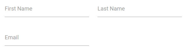
Materialize Input Fields Example:
<form class="col s12">
      <div class="row">
        <div class="input-field col s6">
          <input id="FirstName" type="text" class="validate">
          <label for="FirstName">First Name</label>
        </div>
        <div class="input-field col s6">
          <input id="LastName" type="text" class="validate">
          <label for="LastName">Last Name</label>
        </div>
         <div class="input-field col s6">
          <input id="Email" type="email" class="validate">
          <label for="Email">Email</label>
        </div>
      </div>
    </form>
|
Note : If you don’t want the red/green validation states remove the validate from the form inputs.
If you run the above example it will produce the output something like this –
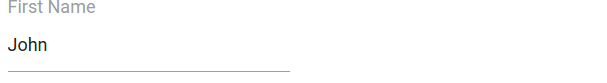
Prefilling Text Inputs
Sometimes we need to add some default(Prefilled) value in input field, you can do this by simply adding value attribute. Here is an example of Prefilling Text –
Prefilling Text Inputs Example:
<div class="row">
    <div class="input-field col s6">
      <input value="John" id="firstName" type="text" class="validate">
      <label class="active" for="firstName">First Name</label>
    </div>
  </div>
|
If you run the above example it will produce the output something like this –
Icon Prefixes | Add Icons To Input Field
Just add a icon before the form input field and add prefix class. Here is an example of Adding icons to input field in Materialize –
You can add –
How to Add Icons to input Fields in Materialize ?
   <div class="row">
    <form class="col s12">
      <div class="row">
        <div class="input-field col s6">
          <i class="material-icons prefix">phone</i>
          <input id="phone" type="text" class="validate">
          <label for="phone">Phone</label>
        </div>
      </div>
    </form>
  </div>
|
If you run the above example it will produce the output something like this –

Materialize Textarea
Add class materialize-textarea to textarea and wrap this textarea with a div having class input-field simply as below –
Materialize Textarea Example
   <div class="row">
    <form class="col s12">
      <div class="row">
        <div class="input-field col s12">
          <textarea id="mytextarea" class="materialize-textarea"></textarea>
          <label for="mytextarea">Textarea</label>
        </div>
      </div>
    </form>
  </div>
|
If you run the above example it will produce the textarea with materialize effects.
Learn More
Let us have some More example and demo about the Materialize Forms.
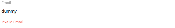
Custom Error | Success Messages
Sometimes we need customization in error or success messages, we can add custom error or success messges by simply adding the attribute
data-error and data-success to input labels. Here is an example of Custom error and messages –
How to Add Custom Error | Success Messages in Materialize ?
    <div class="row">
    <form class="col s12">
      <div class="row">
        <div class="input-field col s12">
          <input id="email" type="email" class="validate">
          <label for="email" data-error="Invalid Email" data-success="Correct Email">Email</label>
        </div>
      </div>
    </form>
  </div>
|
If you run the above example it will produce the output something like this –
Advertisements


