Materialize Buttons
Materialize Buttons: Materialize Provides the inbuilt classes to create different buttons with effects. It is very simple to create buttons in Materialize framework. Here in this tutorial we are going to explain how you can create buttons in Materialize framework. You can also use our online editor to edit and
run the code online.
Materialize Buttons Example
There are following types of Buttons Available in Materialize-
- →Raised
- →Floating
There are basically four types of floating buttons –
1. Fixed Action
2. Horizontal FAB
3. Click Only FAB
4. Toolbar FAB - →Flat
- →Submit
- →Large
- →Disabled
Let us go one by one to understand the above button types.
Raised Button
You can create Raised Button simply as below –
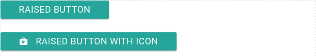
Materialize Raised Buttons | Example:
 <a class="waves-effect waves-light btn">Raised Button</a><br>
    <a class="waves-effect waves-light btn"><i class="material-icons left">shop</i> Raised Button With Icon</a>
|
If you will run the above example it will produce the output something like this –
Floating Button
Class btn-floating is used to create floating button in Materialize. Here is an example of floating button –
Materialize Floating Button Example:
<a class="btn-floating btn-large waves-effect waves-light red"><i class="material-icons">edit</i></a>
|
If you run the above example it will produce the following output –

Fixed Action Button
You can create fixed action which can contain multiple action that will appear on hover-
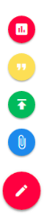
Materialize Floating Action Button Example:
 <div class="fixed-action-btn">
    <a class="btn-floating btn-large red">
      <i class="large material-icons">mode_edit</i>
    </a>
    <ul>
      <li><a class="btn-floating red"><i class="material-icons">insert_chart</i></a></li>
      <li><a class="btn-floating yellow darken-1"><i class="material-icons">format_quote</i></a></li>
      <li><a class="btn-floating green"><i class="material-icons">publish</i></a></li>
      <li><a class="btn-floating blue"><i class="material-icons">attach_file</i></a></li>
    </ul>
  </div>
|
If you run the above example it will produce the output something like this –
Horizontal Fab
Class horizontal is used to create horizontal fab button. You can create Horizontal Fab simply as below –
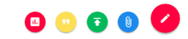
Materialize Horizontal Fab Button Example:
 <div class="fixed-action-btn horizontal">
    <a class="btn-floating btn-large red">
      <i class="large material-icons">mode_edit</i>
    </a>
    <ul>
      <li><a class="btn-floating red"><i class="material-icons">insert_chart</i></a></li>
      <li><a class="btn-floating yellow darken-1"><i class="material-icons">format_quote</i></a></li>
      <li><a class="btn-floating green"><i class="material-icons">publish</i></a></li>
      <li><a class="btn-floating blue"><i class="material-icons">attach_file</i></a></li>
    </ul>
  </div>
|
If you run the above example it will produce the output something like this –
Click Only Fab
If you want to open the option only on click, add the class click-to-toggle simply as below –
Materialize Click Only Fab Button Example:
 <div class="fixed-action-btn horizontal click-to-toggle">
    <a class="btn-floating btn-large red">
      <i class="large material-icons">mode_edit</i>
    </a>
    <ul>
      <li><a class="btn-floating red"><i class="material-icons">insert_chart</i></a></li>
      <li><a class="btn-floating yellow darken-1"><i class="material-icons">format_quote</i></a></li>
      <li><a class="btn-floating green"><i class="material-icons">publish</i></a></li>
      <li><a class="btn-floating blue"><i class="material-icons">attach_file</i></a></li>
    </ul>
  </div>
|
Fab To Toolbar
To create Fab toolbar add class toolbar to the fab. Here is an example of fab toolbar-
Materialize Fab Toolbar Example:
 <div class="fixed-action-btn horizontal click-to-toggle toolbar">
    <a class="btn-floating btn-large red">
      <i class="large material-icons">mode_edit</i>
    </a>
    <ul>
      <li><a class="btn-floating red"><i class="material-icons">delete</i></a></li>
      <li><a class="btn-floating yellow darken-1"><i class="material-icons">format_quote</i></a></li>
      <li><a class="btn-floating green"><i class="material-icons">publish</i></a></li>
      <li><a class="btn-floating blue"><i class="material-icons">attach_file</i></a></li>
    </ul>
  </div>
|
If you run the above example it will produce the output something like this –

Flat Button
Class btn-flat is used to create Flat button in Materialize. Here is an example of flat Button –
Materialize Flat Button Example:
<a class="waves-effect waves-teal btn-flat red">Flat Button</a> |
Submit Button
Materialize Submit Button Example:
<button class="btn waves-effect waves-light" type="submit" name="action">Submit Form </button> |
Disabled Button
Class disabled is used to create disabled button in materialize.
Materialize Disabled Button Example:
<button class="btn disabled">Disabled Button </button> |
If you run the above example it will produce output something like this –
Advertisements


