Tag Archives: materialize framework tutorial
Materialize SideNav
Materialize SideNav Menu : SideNav is one of the main component of any webpage which provides users side navigation. It is very easy to create sidenav in Materialize framework. As it is jQuery plugin so it needs the initialization. Here in this tutorial we are going to explain how you can create side navigation Menu in Materialize. You can also use our online editor to edit and run the code online.
Materialize SideNav Example
There are basically two parts of sidenav- 1. HTML, 2. jQuery. HTML part contains the sidenav html menu item stuffs and jQuery contains the script to initialize the side navigation menu. Let us create a simple navigation menu as below-
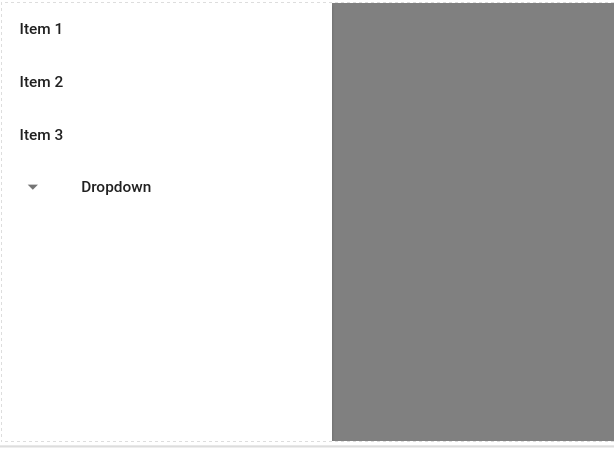
Materialize SideNav Menu with Dropdown Example
menu |
If you run the above example it will produce the output something like this-
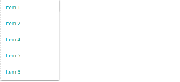
Materialize Dropdown
Materialize Dropdown : Materialize provides dropdown which can be embed with the buttons. Here in this tutorial we are going to explain how you can create dropdown buttons in Materialize framework. You can also use our online editor to edit and run the code online.
Materialize Dropdown Example
Let us create very basic dropdown in materialize- create a button and add class dropdown-button to it. Add data-activates it might be id of the ul tag. Here is the complete example-
If you run the above example it will produce the output something like this-
Options:
- induration : The duration of the transition enter in milliseconds. Default time for this is 300ms
- outduration : This is used to transition out in millisecond, Default time for this is 225ms.
- constrainwidth : If true, constrainWidth to the size of the dropdown activator. Default is set true.
- hover : This is used to open dropdown on hover by default it is false, if you want to open on hover set it true.
- gutter : This defines the spacing from the aligned edge. Default value is 0.
- beloworigin : This is used to set whether the dropdown will open below the activator, if you want to open dropdown below the activator set it true. Default is set false.
- alignment : Defines the edge the menu is aligned to. Default is set ‘left’
- stoppropagation : If true, stops the event propagating from the dropdown origin click handler. Default is set false
Example
You can use the above options simply as below-
Materialize Dropdown jQuery Options Example
|
|
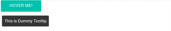
Materialize Tooltips
Materialize Tooltips: Tooltips are basically used to provide the extra information about the elements. It is very easy to create Tooltips in Materialize framework. Here in this tutorial we are going to explain how you can create and use the tooltips in Materialize. You can also use our online editor to edit and run the code online.
Materialize Tooltips Example
To Add Tooltip first Create a button and Add class tooltipped, attribute data-position=”bottom”,data-delay=”50″ and data-tooltip=”This is Dummy Tooltip” simply as below-
In the above example we have create a simple tooltip for a button. If you run the above example it will create output something like this-
Options
Following options are available in Materialize Tooltip-
- delay: Delay time before tooltip appears, Default is 350 ms.
- tooltip: Text to display on hover. It can be HTML if you have set html to true.
- position: This is used to set the position of the tooltip- it can be top, left, bottom, right. Default position is bottom.
- html: This is used to set true to display the html content in tooltip. Default is false.
Remove Tooltip
You can remove tooltip using jQuery simply as below –
Materialize Remove Tooltip Script
|
|
Where selector can be id, class of the button.
Learn More
Let us have some More example and demo about Materialize Tooltips.
Tooltip Position : Top
data-position=”top” is used to place the Tooltip at top –
If you run the above example it will give following output-
Tooltip Position : Left
data-position=”left” is used to place the Tooltip at Left –
If you run the above example it will give following output-
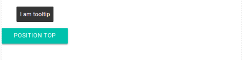
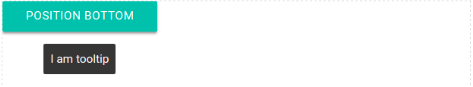
Tooltip Position : Bottom
data-position=”bottom” is used to place the Tooltip at Bottom –
If you run the above example it will give following output-
Tooltip Position : Right
data-position=”right” is used to place the Tooltip at Right –
If you run the above example it will give following output-
Materialize Toasts
Materialize Toasts: Toasts are basically used to provide the unobtrusive alerts to the user. Here in this tutorial we are going to explain how you can create Toasts in Materialize. You can also use our online editor to edit and run the code online.
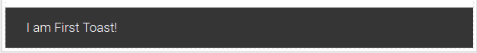
Materialize Toasts Example
Materialize.toast() function is used to create the toast in Materialize framework. It accepts mainly four parameters- 1. text, 2,. timeout. 3. rounded class, 4. callback. Text is the message that will be displayed in toast and timeout is used to add the time in milliseconds after which the text message will be disappeared. Third parameter is used for rounded toast and fourth parameter is callback. Third and fourth parameters are optional. Here is a very basic example of toast-
If you run the above example it will produce the output something like this –
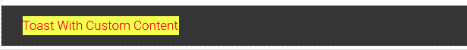
Custom HTML
Sometimes we need to add custom HTML in toast content,you can add HTML content in Toast simply as below-
If you run the above example will generate output something like this-
Callback
You can add a callback function when the toast is dissmissed –
Alert will be triggered when the Toast is dismissed.
Learn More
Let us create some more examples & demos for the Toasts.
Rounded Toast
To create rounded toast you can simply pass the third parameter as ’rounded’ –
If you run the above example it will produce the output something like this –

Materialize Collapsible
Materialize Collapsible: Collapsible are accordion that expands when you click on it. It displays only the relevant content and hides other content.
Materialize provides collapsible with various options which can be used easily anywhere. Here in this tutorial we are going to explain how you can create collapsible in Materialize. You can also use our online editor to edit and run the code online.
Materialize Collapsible Example
Let us create a very basic and simple Collapsible-
Materialize Collapsible Example:
|
In the above example we have created a very basic collapsible in Materialize. As we know it’s jQuery plugin so do not forget to initialize it.If you run the above example it will produce the output something like this –
Popout
To create popout collapsible add the class=”popout” to ul simply as below –
Materialize Collapsible Popout Example
|
If you run the above example it will produce output something like this –
Preselected Section | Active Section
Sometimes we need to open some section by default or using JavaScript, to do this simply add the active class to header. Here is an example of Active class –
Materialize Collapsible Preselected Example
|
If you run the above example it will produce output something like this –
Options
Following options are available –
- accordion(boolean): This is used to change the collapsible behavior to expandable instead of the default accordion style.
- onOpen(function): This is callback function triggered when collapsible is opened.
- onClose(function): This is callback function triggered when collapsible is closed.
Learn More
Let us have some More example and demo about the Collapsible in Materialize.
Collapsible Types
There are basically two types of collapsible avaialable in Materialize –
1. Accordion
2. Expandable
Let us understand both one by one –
Accordion
data-collapsible=”accordion” is used to create accodion. In Acoordion one section is opened at a time –
Materialize Collapsible Accordion Example
|
Expandable
data-collapsible=”expandable” is used to create expandable collapsible. In Expandable collapsible more than one section can be opened at the same time –
Materialize Collapsible Expandable Example
|
Run the above example and click on more than one section to open the other section at the same time. The output of the above example will look like something this –
Materialize Preloader
Materialize Preloader : Loaders are basically used to indicate that some background process/activity is happening. Materialize provides various loaders such as linear and circular with various options to customize it. Here in this tutorial we are going to explain how to create loaders in Materialize. You can also use our online editor to edit and run the code online.
Materialize Preloader | Loading | Loader Example
There are following types of Preloader –
- 1. Linear
- 2. Circular
Now let us go one by one to understand the loaders with example & demo –
Linear Progress Bar
There are basically two types of Linear Progress Bar-
- 1. Determinate
- 2. Indeterminate
Determinate
Create a div with class=”determinate”, add percentage of progress by adding style width(such as style=”width:60%”) and wrap this div by a div with class=”progress”.
If you run the above example it will produce the output something like this –
Indeterminate
Create a div with class=”indeterminate” and wrap this div by a div with class=”progress”.
Circular Loader | Loading
Materialize provides various types of Circular Loaders of different-different colors and sizes. Let us create a simple circular loader in materialize –
If you run the above example it will produce the output something like this –
Learn More
Let us have some More example and demo about the Materialize Loaders.
More Examples coming soon..
Materialize Pagination
Materialize Pagination : Pagination is used to show long data with the help of links to different-different parts. Materialize provides classes to create pagination. Here in this tutorial we are going to explain how you can create pagination in materialize framework. You can also use our online editor to edit and run the code online.
Materialize Pagination Example
First create ul with class=”pagination” and then add li and pagination link. You can use Class=”active” to show the active link. Here is an example of simple pagination-
If you run the above example it will produce the output something like this –
Learn More
Let us have some More example and demo about the Materialize Pagination.
Disable Pagination Link
You can disable the pagination by simply adding the class=”disabled” to li element simply as below-
If you run the above example it will produce the output something like this –
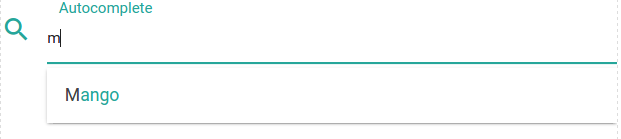
Materialize Autocomplete
Materialize Autocomplete : Autocomplete is basically used to provide the possible values as suggestion to the user. Here in this tutorial we are going to explain how you can create Autocomplete in MaterializeCSS framework. You can also use our online editor to edit and run the code online.
Materialize Autocomplete Example
First create a input box and then initialize the autocomplete using jQuery. Here is a simple example of Autocomplete in MaterializeCSS-
Autocomplete is part of jQuery plugin so it needs to be initialized as above. If you run the above example it will produce the output something like this –
Learn More
Let us have some More example and demo about Autocomplete.
Autocomplete Ajax
Sometimes while working with dynamic applications we get data from JSON or API and we display that data in autocomplete. You can get data for Autocomplete using Ajax from the specified URL. Here is an example of ajax autocomplete-
Materialize Autocomplete Ajax Example:
$(document).ready(function() {
$(function() {
$.ajax({
type: 'GET',
url: 'https://mywebsite.com/getAllcountryList',
success: function(response) {
var countryArray = response;
var countryList = {};
for (var i = 0; i < countryArray.length; i++) {
countryList[countryArray[i].name] = countryArray[i];
}
$('input.autocomplete').autocomplete({
data: countryList
});
}
});
});
});
|
Materialize Autocomplete Not Working?
Sometimes we face issue in autocomplete initialization, the possible reason could be you have not initialized the jQuery for autocomplete.
Materialize Autocomplete Not Working? Reason:
|
|
selector – class, id of input box.
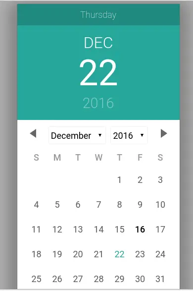
Materialize Date Picker
Materialize Date Picker : Date Picker is an important component of any framework which enables us to select the date from the calendar. Materialize provides a script to create cool date picker which can be easily integrated anywhere. Here in this tutorial, we are going to explain how you can use date picker script in Materialize Css. You can also use our online editor to edit and run the code online.
Materialize Date Picker | Time Picker| Calender | Format | Options | MaterializeCss Example
Let us create a simple date picker in Materialize. There are basically two parts first html and second JavaScript, in html part just create an input type date and add a class name to this, JavaScript part contains the calendar initialization part. Here is complete example of Date Picker –
If you run the above example it will produce output something like this –
:
Date Format
If you want to set or change the date format, you can do this by passing format:’dd/mm/yyyy’ option simply as below-
Options Format
Following options / Format are available for configuration of Date Picker.
- selectMonths(Boolean): It is used to Create a dropdown to control month.You can pass true to control month.
- format(dateFormat)– Use this parameter to set the date Format example – format: ‘d/mm/yyyy’.
- today(String)– This is used to set Today Button Text Label.
- clear(String)– Clear Button Label Text.
- close(String)– Close Button Label Text.
- closeOnSelect(Boolean)– Pass true if you want to close datepicker automatically once user selects date.
selectYears(Number): Creates a dropdown of years to control year example – selectYears(15) this will allow to control 15 years on calender.
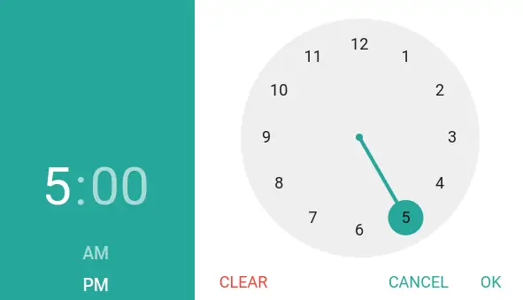
Time Picker
You can initialize timepicker using class on input field. Here is an example of timepicker in Materialize Css.
Date Picker Format In Materialize Caleneder:
|
|
Materialize timepicker looks like this-