Materialize Css Modal Popup
Materialize Css provides predefined classes to create beautiful modals. Materialize Css Modal Popup are used widely in any application so it is important to understand how we can use these popups. Here in this tutorial, we are going to explain how to create modal popup in Materialize css framework. You can also use our online editor to edit and run the code online.
Materialize Css Modal Popup Example
Class modal is used to define the modal, Class modal-content is used to define the content body. Class modal-footer defines the modal footer. Here is an example of Materialize modal popup.-
Example:
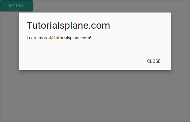
<a class="waves-effect waves-light btn modal-trigger" href="#modal1">Modal</a>
  <!-- Modal Structure -->
  <div id="modal1" class="modal">
    <div class="modal-content">
      <h4>Tutorialsplane.com</h4>
      <p>Learn more @ tutorialsplane.com!</p>
    </div>
    <div class="modal-footer">
      <a href="#!" class="modal-action modal-close waves-effect waves-green btn-flat">Close</a>
    </div>
  </div>
|
Class modal-close is used to add close button in modal.
Output of above example-
Modal Fixed Footer
Modal class modal-fixed-footer is used to create fixed footer. This class makes footer fixed in case of fixed footer.
Example:
<!-- Modal Button -->
  <a class="waves-effect waves-light btn modal-trigger" href="#modal1">Modal</a>
  <!-- Modal Body -->
  <div id="modal1" class="modal bottom-sheet">
    <div class="modal-content">
      <h4>Tutorialsplane.com</h4>
      <p>Learn everything online.</p>
    </div>
    <div class="modal-footer">
      <a href="#!" class="modal-action modal-close waves-effect waves-green btn-flat">Close</a>
    </div>
  </div>
|
jQuery Initialization
You must initialize model before using it simply as below-
$(document).ready(function(){
    $('.modal').modal();
  });
Open Modal
You can open model using following JavaScript-
$('#myModal').modal('open');
Close Model
You can close modal using the below JavaScript-
$('#myModal').modal('close');
Options
You can use the following options to customize the default behaviour of modal.
| Option | Description |
|---|---|
| dismissible | Whether Modal should be unmissable or not. |
| opacity | Adds opacity of overlay background. |
| inDuration | Transition in duration. |
| outDuration | Transition Our duration. |
| startingTop | To add top style attribute. |
| endingTop | To Add ending top style. |
| ready | Callback function when modal is ready. |
| complete | Callback function when modal is closed. |
Here is an example of above options-
Example:
  $('.modal').modal({
      dismissible: true,
      opacity: .5,
      inDuration: 300,
      outDuration: 200,
      startingTop: '4%',
      endingTop: '10%',
      ready: function(modal, trigger) {
        alert("Ready Callback");
        console.log(modal, trigger);
      },
      complete: function() { alert('Closed triggered'); }
    }
  );
|
Advertisements


