Tag Archives: Bootstrap Tutorials Online
Bootstrap form control states
Bootstrap form control states : Bootstrap Form Controls are specially used for representing form’s state such as input focus, input disabled and validation state eg. form input validation error or success.
Using the bootstrap form control states you can represent the states in nice way.
We are going to explain the states available in bootstrap with example and demo.
List Of Bootstrap form control states
Here is the list of form control states –
-
VALIDATION STATES
- Error : Represents the input with error. Add the class .has-error in its parent element.
- Warning : Represents the input with warning. Add the class .has-warning in its parent element.
- Success : Represents the input with success. Add the class .has-success in its parent element.
- DISABLED INPUTS : Represents inputs in disabled state. .disabled class is used to disable the input field.
- READONLY INPUTS ; Represents a readonly input field. .readonly class is used to make the input field readonly.
- INPUT FOCUS : Used to focus the input field.
- DISABLED FIELDSETS: Used to represent the Disabled field set.
- ICONS(Feedback) .has-feedback is used to add feedback icon.
- HIDDEN LABELS: The class .sr-only is used for invisible icons.
Bootstrap form control states Example
The above form control states are included in the demo. You can edit and try them online to see the output.
Output of the above code-
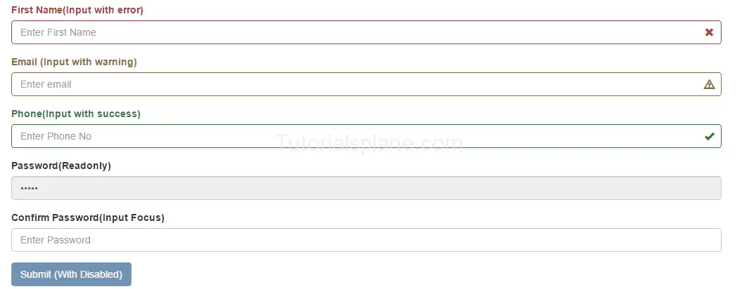
The above form control states shown in the example are used in Validation or when you some special state of the form elements. These states are important when you are validating the form. You can use these states to show different states while you are validating form or you want to represent some state with message.
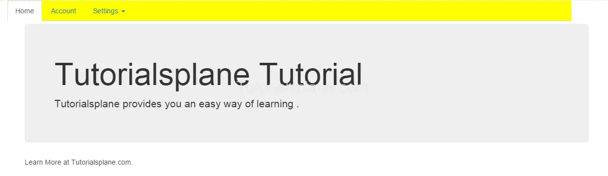
How to change navbar color in Bootstrap 3
How to change navbar color in Bootstrap 3 : You can create you own class to change the background color of bootstrap 3. It may help you when you are customizing the bootstrap’s default navigation menu.
How to change navbar color in Bootstrap 3
Add the following css to change the background color of the navigation bar of the bootstrap.
.my-navbar{
    background-color:yellow;
    color:333;
    border-radius:0;
}
The above code will produce the following output.
Bootstrap pager
Bootstrap pager is just type of pagination which provides next and previous buttons only.
You can create pager by just adding the .pager class in the <ul>
element.
Pager are basically used when we need next and back(previous) button.
Bootstrap Pager Demo
<ul class="pager"> <li><a href="#">Previous</a></li> <li><a href="#">Next</a></li> </ul> |
Bootstrap Tooltip
Bootstrap tooltips works as small popup. Bootstrap tooltips are used to provide the hint when user hover’s on any link , button or label.
Tooltips becomes important for new visitors by providing them information about the link or button when they hover on them. You can place the tooltop at any position top, left, right or bottom of link. By default the tootltip color is black.
Bootstrap Tooltip Syntax And Example
Required javascript to create tooptips. Here is an example –
Add Js Code to Enable tooltips
|
|
The above Example will produce following output-

Bootstrap Tooltip Positions
You can change tooltip position by using data-placement attribute. Here are following positions of tooltips-
- Top- Attribute data-placement = “top” is used for tooltip top position.
- Bottom- Attribute data-placement = “bottom” is used for tooltip bottom position.
- Left- Attribute data-placement = “left” is used for tooltip left position.
- Right- Attribute data-placement = “right” is used for tooltip right position.
The above example will output something like this-

Add Bootstrap positions using JavaScript
You can also add positions using javascript. Here we are going to bind tooltip positions using javascript and class of element-
- Top- $(selector).tooltip({placement : ‘top’}) is used for tooltip top position.
- Bottom- $(selector).tooltip({placement : ‘bottom’}) is used for tooltip bottom position.
- Left- $(selector).tooltip({placement : ‘left’}) is used for tooltip left position.
- Right- $(selector).tooltip({placement : ‘right’}) is used for tooltip right position.
The Output of the above example will be –

Options
Lets Have an overview on available options
Here are options available which can used via data-attribute or JavaScript.
[table width=”100%” colwidth=”20|100|100|160″ colalign=”left|left|center|left|left|left”]
Option,Type,Default Value,Data Attribute, Description,Demo
animation,boolean,true, data-animation,Used to add fade transition to the tooltip.,
placement,string,’top’,data-placement,Used to add tooltip position. Default position is top.,
html,boolean,false,data-html,Used to add html content in tooltip.,
selector,string,false,data-selector,Adds tooltip to the specified selector.,
title,string|function, “”,data-title, Adds text to the tooltip title.,
trigger,string,hover focus,data-trigger,binds event how it tooltip trigger will happen example- on click- on hover – on focus or manually.,
container,string,false,data-container, Appends tooltip in container element Example “body”.,
delay,number|object,0,data-delay, Defines the seconds to show and hide tooltip.,
[/table]
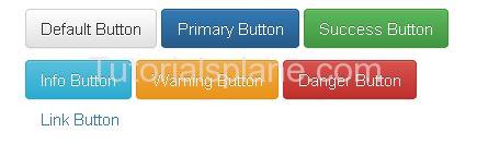
Bootstrap Buttons
Bootstrap Buttons : Bootstrap provides button styles which can be used as per our need. Bootstrap’s basic button can be created with simple class name .btn which will add simple button responsive style and compatible to different devices. Here in this tutorial we are going to explain how you can create buttons In Bootstrap With different- different examples. You can also use our online editor to edit and run the code online.
Bootstrap also provides classes to create the buttons of different sizes. You can also use the different button style which represents different state and message.
Bootstrap Buttons Example
Bootstrap provides some inbuilt buttons which you can use easily for example it provides default, primary, success, info, warning, danger and link buttons .
To Use these classes you just need to the following classes-
- Bootstrap Default Button(.btn-default) – Class .btn-default is used to create Default Button.
- Bootstrap Primary Button(.btn-primary) – Class .btn-primary is used to create Primary Button
- Bootstrap Success Button(.btn-success) – Class .btn-success is used to create Success Button
- Bootstrap Info Button(.btn-info) – Class .btn-info is used to create Info Button
- Bootstrap Warning Button(.btn-warning) – Class .btn-warning is used to create Warning Button
- Bootstrap Danger Button(.btn-danger) – Class .btn-danger is used to create Danger Button
- Bootstrap Link Button(.btn-link) – Class .btn-link is used to create Link Button
Example
Now let us create an example to understand the buttons in Bootstrap.
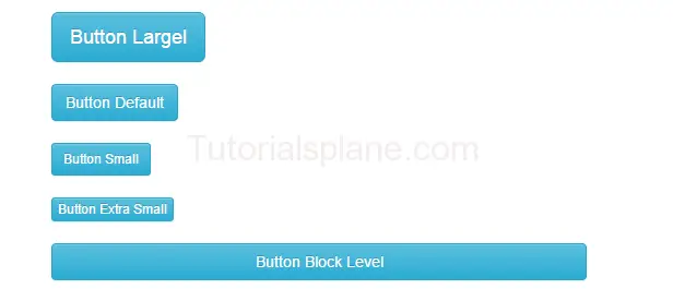
Bootstrap Button size
We sometimes need different-different button sizes, bootstrap provides you buttons of different-different sizes such as – Large, small, block level buttons.
Here are following button sizes available in bootstrap –
[table width=”100%” colwidth=”20|100|50 |50″ colalign=”left|left|left|left”]
no,Size,Class, Description
1 , Large Button, .btn-lg, This is used to create large button
2 , Default Button,.btn, This is used to create regular button
3 , Small Button,.btn-sm, This is used to create small button
4 , Extra Small Button,.btn-xs,This is used to create Extra small button
5 , Block Button,.btn-block, This is used to create block level button
[/table]
|
|
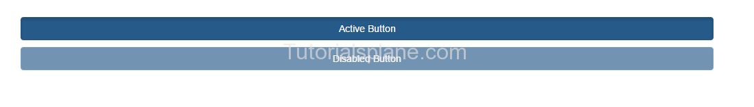
Bootstrap Buttons States
You can represent the states with the Active and Disabled states.
.active class is used to make the button in active state.
.disabled class is used to make the button in disabled state.
If want to create or learn about the button groups go to the Next Page ….
Bootstrap Grid System
Bootstrap Grid System overview :
Bootstrap’s grid system allows you to create layout using rows & columns .Bootstrap gird system is designed to provide the responsive layout which will be compatible to all devices as per their screen size and resolution. Just follow the bootstrap rules and enjoy the responsive development in bootstrap.
The common example for grid system containing the rows & columns is as :
Example
|
Bootstrap Grid System Overview : 12 Columns
Bootstrap allows you to add maximum 12 columns in the page. All 12 columns have equal width
Example
|
The above column will generate the 12 - column pattern. You can also group them to use as per your need.
Output
Bootstrap Grid System Overview : 2 Columns Set Example
Bootstrap allows you to divide 12 columns layout in columns set. We have shown 6 columns
Bootstrap Grid System Overview : 4 - 8 (Unequal) Columns Set Example
Bootstrap allows you to divide columns in various set layout in columns set. Here is an example of 4-8 column ie.
4 columns and 8 columns.


