Category Archives: Bootstrap
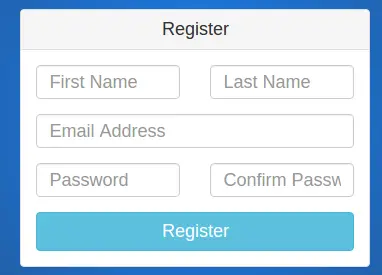
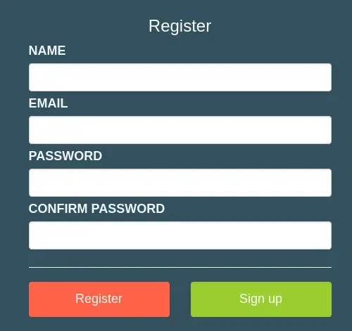
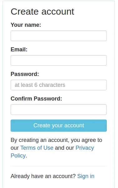
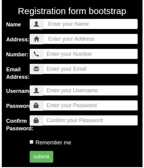
Bootstrap Registration Page Templates
Bootstrap Registration Page Templates Sample Download: Here We are going to create some basic and advanced ready to use register templates in Bootstrap. All of these templates are single page register templates which you can use simply anywhere.
You can also see online demo and download them.
Bootstrap Registration Page Templates Sample Download
Login Page Gallery List-
Basic Registration Templates
Bootstrap Disable Enable button jQuery
Bootstrap Disable Enable button jQuery : There are many ways to enable and disable the bootstrap buttons. Bootstrap provides .disable class to display the disabled state. Here in this tutorial we are going to explain how you can enable/disable the buttons using the jQuery. We will explain this functionality with example and demo.
Bootstrap Disable Enable button jQuery
You can disable and enable the button in bootstrap using the jquery as below –
Disable Example-
You can disable the bootstrap button simply as below –
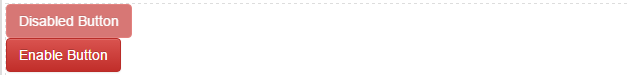
If run the above example it will produce the following output like this-
Enable Button
You can enable the disabled button simply as below –
If run the above example it will produce the following output like this-
Bootstrap Panels
Bootstrap Panels : A Panel in bootstrap is basically a box with some styles like border , padding etc. Bootstrap provides predefined boxes which are known as panel. We often need to show data in box with some padding and border for this bootstrap panel component becomes very useful. Bootstrap panel component provides many types of panel. We are going to explain panels with example and demo.
Bootstrap Panels
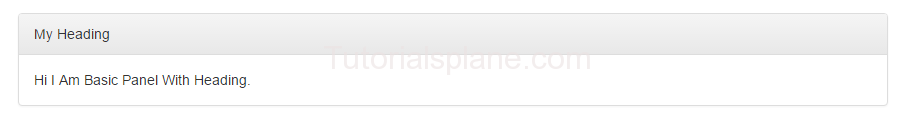
Here is very basic panel –
If you run the above example it will produce output like this –

Bootstrap Panel Heading
.panel-heading is used to add heading in panel.
If you run the above example it will produce output like this –
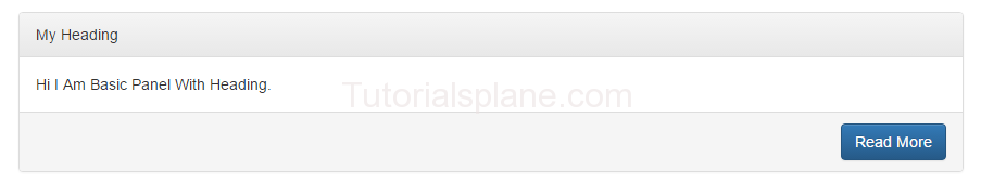
Bootstrap Panel Footer
.panel-footer is used to add footer in panel.
If you run the above example it will produce output like this –
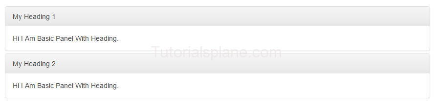
Bootstrap Panel Group
You can make group of panels by adding a wrapper div with class .panel-group.
Here is an example of panel group-
Panel Group Example-
|
The above example will produce following output-
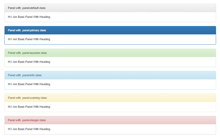
Bootstrap Panels with Contextual Classes
Bootstrap provides contextual classes to add color in panels which represents different states.
Here are available classes for panel state –
- .panel-default – Represents Default States
- .panel-primary – Primary State
- .panel-success – Represents Success Message
- .panel-info – Represents Information
- .panel-warning – Represents Warning
- .panel-danger – Represents Error Message With Danger State
Let us have look on each state with example And demo-
Bootstrap Panel States
Example-
|
The above example will produce following output-
Bootstrap form control states
Bootstrap form control states : Bootstrap Form Controls are specially used for representing form’s state such as input focus, input disabled and validation state eg. form input validation error or success.
Using the bootstrap form control states you can represent the states in nice way.
We are going to explain the states available in bootstrap with example and demo.
List Of Bootstrap form control states
Here is the list of form control states –
-
VALIDATION STATES
- Error : Represents the input with error. Add the class .has-error in its parent element.
- Warning : Represents the input with warning. Add the class .has-warning in its parent element.
- Success : Represents the input with success. Add the class .has-success in its parent element.
- DISABLED INPUTS : Represents inputs in disabled state. .disabled class is used to disable the input field.
- READONLY INPUTS ; Represents a readonly input field. .readonly class is used to make the input field readonly.
- INPUT FOCUS : Used to focus the input field.
- DISABLED FIELDSETS: Used to represent the Disabled field set.
- ICONS(Feedback) .has-feedback is used to add feedback icon.
- HIDDEN LABELS: The class .sr-only is used for invisible icons.
Bootstrap form control states Example
The above form control states are included in the demo. You can edit and try them online to see the output.
Output of the above code-
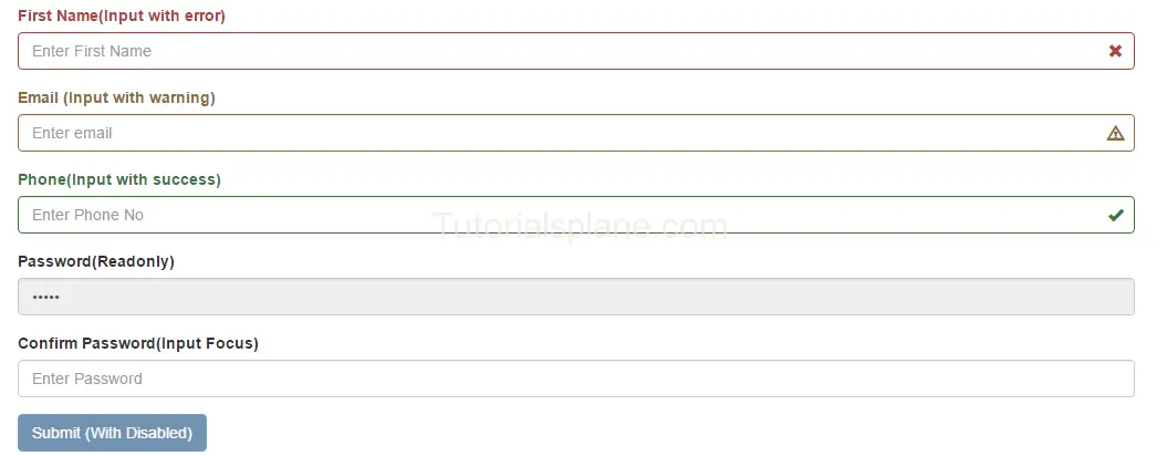
The above form control states shown in the example are used in Validation or when you some special state of the form elements. These states are important when you are validating the form. You can use these states to show different states while you are validating form or you want to represent some state with message.
Bootstrap Switch Button
Bootstrap Switch Button example : Bootstrap switch buttons are used to provide the switch functionality. You need to add js and css file in order to create and use the bootstrap switch buttons. We are going to create swith button step by step and demo with online editor. You can edit code and see output online with our online editor.
Bootstrap Switch Button Example with demo
Steps to create switch buttons in bootstrap –
- Include – bootstrap-switch.min.css – Download this file and keep in your css folder or include it from cdn.
- Include – bootstrap-switch.min.js – Download this file and keep in your js folder or include it from cdn.
We have included these files from cdn.
Here is an Example with Demo – Try It :
The Above Example Will Produce output something like this-
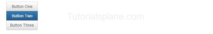
Bootstrap Button Groups
Bootstrap Button Groups : You can create a group of buttons (ie. in single line) in bootstrap.
.btn-group is used to create button group in bootstrap.
Basic Example of Bootstrap Button Groups is :

Bootstrap Button Groups : Justified
.btn-group-justified class is used to create justified bootstrap button group.

Bootstrap Button Groups : Vertical
.btn-group-vertical class is used to create vertical bootstrap button groups.
Bootstrap Button Groups : Nested
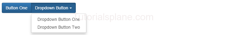
Simple example of nested bootstrap button group is as :
Bootstrap Progress Bar
Bootstrap Progress Bar : Is used to show user’s task progress.
Different types of progress bars are available in the Bootstrap.
A simple and default Progress bar is :
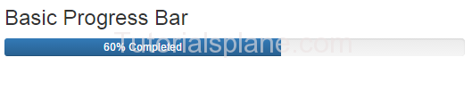
Bootstrap progress bar basic example demo
Progress Bar Colored :
Following are the classes used for the colored Progress Bar.
.progress-bar-info
.progress-bar-warning
.progress-bar-success
.progress-bar-danger
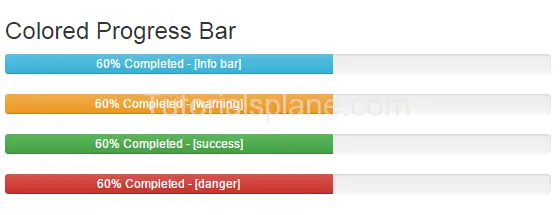
Bootstrap colored progress bar example
Bootstrap Progress Bar Striped :
Add the following class for the stripped progress bar.
.progress-bar-striped
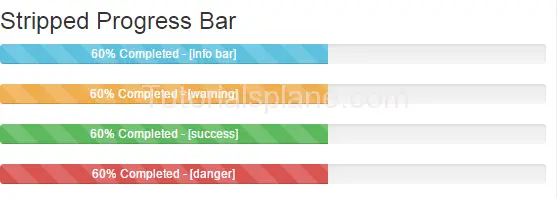
Bootstrap striped progress bar example demo
Progress Bar Animated :
Add the following class for the animated progress bar.
.active
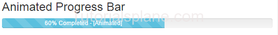
Bootstrap animated progress bar example demo
Bootstrap Scrollspy
Bootstrap Scrollspy : Bootstrap scrollspy is used for navigation. It navigates the users to the different sections of the page.
Bootstrap Scrollspy : Basic Example
|
Bootstrap Modal Plugin
Bootstrap Modal Plugin : Bootstrap Modals are basically dialog box/popup box which are used to provide some additional information or prompt user to perform some action. Bootstrap modals are easy to implement.
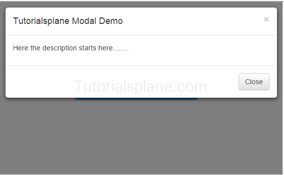
Bootstrap Modal Demo And Example
Create Basic Modal
Bootstrap Modal Plugin
BootStrap Modal Sizes :
There are following bootstrap modal size available .
Note : Class .modal-sm is used for creating small modal.
Note : Class .modal-lg is used for creating large modal.


