Tag Archives: bootstrap tutorial for beginners
Pass Data to Bootstrap Modal
Pass Data to Bootstrap Modal : Some times we need to pass dynamic data to bootstrap modal. There are many ways to pass data in bootstrap modal. Here in this tutorial we are going to explain how you can pass dynamic data in bootstrap modal. We will explain each method with example and demo.
Pass Data to Bootstrap Modal
Here is an example to pass the data in bootstrap modal –
Html Part
Here is html part which contains the modal structure-
Pass Data to Bootstrap Modal JavaScript Example
|
|
The above example contains the Modal and link to launch the modal.
Now let us create the JavaScript Part For this –
JavaScript Part
JavaScript Part Contains the following part –
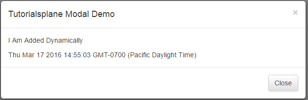
Here in this example we have passed data to bootstrap modal in myHeading variable which will be added in the content body element. $(“#modal-body”).html(myHeading + x); will add the data in modal body element which has id “modal-body”. Thus you can pass any data you want in the modal body. You can also use ajax to pull the data from server and pass into the bootstrap modal.
If you run the above example it will produce the output something like this –
Launch Bootstrap Modal on page load
Launch Bootstrap Modal on page load – Sometimes we need to open bootstrap modal on page load for some reasons. We can trigger the modal event on page load using the javascript. Here in this tutorial we are going to explain how you can launch bootstrap modal when page is loaded. We will explain this with demo.
Launch Bootstrap Modal on page load | Show After Page Load | Open After few Seconds | jQuery | Example
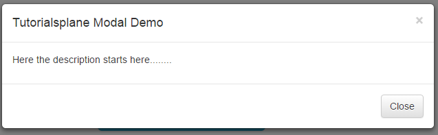
You can launch modal on page load simply as below –
The above method will be called on window load as soon as it is triggered modal is launched. If you run the above example it will show modal on page load-
Bootstrap modal on page load once | JavaScript
You can load modal only one time after page load using the jQuery cookie. Here is an example –
Launch Bootstrap Modal on page load: JavaScript Example
|
Open Modal Automatically after 2 Seconds
Sometimes we need to trigger modal automatically after 2 seconds, 3 seconds or few second of page load. You can do it easily using the jQuery simply as below-
Bind function with Bootstrap Modal Close
Bind function with Bootstrap Modal Close : Sometimes we need to bind function with Modal close event. $(‘#modal’).on(); is used to bind a function with the close event. This method can be used to trigger the function when the close event occurs. Here in this tutorial we are going to explain how you can call function on modal close event. We will explain this with online demo.
Bind function with Bootstrap Modal Close
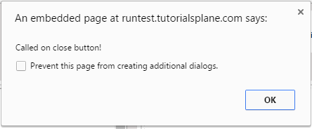
You can call function on bootstrap modal close event as below –
Bootstrap 3 : Call Function On Modal Close Event
If you are using the bootstrap 3 you can call a function on close event as below –
If you run the above example and click on the modal popup to close it trigger the alert on close event.
Bootstrap 2.3.3 : Call Function On Modal Close Event
If you are using the bootstrap 2.3.3 you can call a function on close event as below –
Call function on Bootstrap Modal Close Button Click : Example
|
|
This will work same as the above example .
Change Input HTML5 placeholder color with css
Change Input HTML5 placeholder color with css – HTML5 provides inbuilt feature to add the placeholders to the input fields which are supported in HTML5. Sometimes we need to change the default placeholder color of HTML5. Here in this tutorial we are going to explain how you can add your color to the HTML5’s input field’s placeholder.
Change Input HTML5 placeholder color with css
Add the following css to change the default HTML5 input’s placeholder-
The above stylesheet will change the default placeholder color to the blue color. If you run the above example it will produce the output something like this –
Bootstrap change icon size and color
Bootstrap change icon size and color : Sometimes we need to change the color and size of icons in twitter bootstrap. You can change the icon color by overriding the default css or you can add your own css. Here in this tutorial we are going to explain how to change the icon color and size in twitter bootstrap with example and demo.
Bootstrap change icon size and color
Here is an example to change the default icon color and size to the custom color as below-
Now add this css to the icon. Thus you can add your own color to the bootstrap icons.
If you run the above example it produce the following output-
More Examples
Let’s have look over more example and demo here.
Bootstrap change icon size
Here is an example to change the default icon size to the customized size –
Now add this css to the icon. This will change the icon size to the given size.
If you run the above example it will produce output like this –

Align center column using Twitter Bootstrap
Align center column using Twitter Bootstrap – Sometimes we need a column to align center in twitter bootstrap. There are many ways to align center in twitter bootstrap. In this tutorial we are going to explain the different approaches to align center column in twitter bootstrap. We will explain this with example and demo.
Align center column using Twitter Bootstrap
You can align center in bootstrap column as –
Bootstarp 3.1.1 And Above
If you are using bootstrap 3.1.1 and above version you can directly use the class class=”center-block” to align the column content. Here is an example and demo.
Align center column using Twitter Bootstrap:
|
If you run the above example it will give the following result –

More About Column Align Center
Bootstrap align center using offsets
You can also align center the columns using the offsets in bootstrap which will work with all versions-
If you run the above example it will produce the following output-
Bootstrap align center using custom css
You can also create your own css to align center the column content as below –
Bootstrap align center using offsets:
.custom-center{
text-align:center;
display: inline-block
}
|
If you want to create your custom css you can create css as above and add this to the div to align column contents in bootstrap.
Bootstrap change button color
Bootstrap change button color: We sometimes need to customize the bootstrap colors button color or sometimes we need to change some other styles. All these can be done very easily if you go to the thing in proper manner. For this override the bootstrap’s default classes css. Here we are going to explain how to override the bootstrap’s default classes to change the style as per our need.
Bootstrap change button color
Here is a simple example of changing the background color.
Bootstrap change button color
.btn-danger { border-color: #E85757; background-color: #FDA2A2; color:#FFF;}

.btn-danger:hover { border-color: #FC0D0D; background-color: #D20606; }
|
Add this class to change the behavior of danger button.
Bootstrap change icon color using css
Bootstrap change icon color using css: You can change the icon color in bootstrap by adding the custom css class. Icon adopts the color of it’s parent element. Here we are going to change the default color of icon by our own class.
Bootstrap change icon color using css
Here is an example of change background color-
Bootstrap change icon color using style css:
|
|
Or you can add the class as below
Bootstrap change icon color using css:
|
|
Bootstrap Panels
Bootstrap Panels : A Panel in bootstrap is basically a box with some styles like border , padding etc. Bootstrap provides predefined boxes which are known as panel. We often need to show data in box with some padding and border for this bootstrap panel component becomes very useful. Bootstrap panel component provides many types of panel. We are going to explain panels with example and demo.
Bootstrap Panels
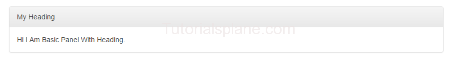
Here is very basic panel –
If you run the above example it will produce output like this –

Bootstrap Panel Heading
.panel-heading is used to add heading in panel.
If you run the above example it will produce output like this –
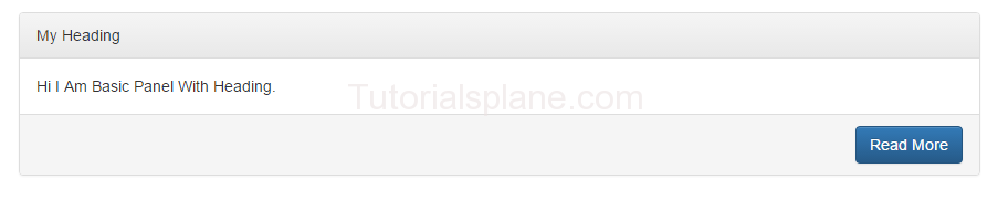
Bootstrap Panel Footer
.panel-footer is used to add footer in panel.
If you run the above example it will produce output like this –
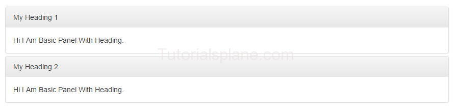
Bootstrap Panel Group
You can make group of panels by adding a wrapper div with class .panel-group.
Here is an example of panel group-
Panel Group Example-
|
The above example will produce following output-
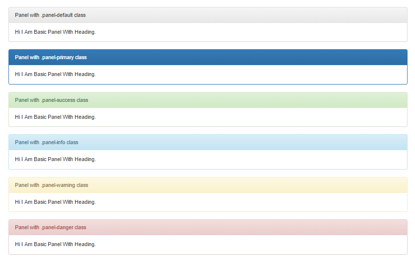
Bootstrap Panels with Contextual Classes
Bootstrap provides contextual classes to add color in panels which represents different states.
Here are available classes for panel state –
- .panel-default – Represents Default States
- .panel-primary – Primary State
- .panel-success – Represents Success Message
- .panel-info – Represents Information
- .panel-warning – Represents Warning
- .panel-danger – Represents Error Message With Danger State
Let us have look on each state with example And demo-
Bootstrap Panel States
Example-
|
The above example will produce following output-


