Category Archives: Bootstrap
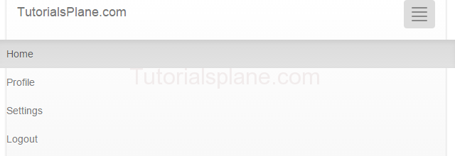
Bootstrap Navigation Bar
Bootstrap Navigation Bar : Bootstrap Navigation header is the top of header contating the navigation link of the site. You can place the navigation bar anywhere in header, footer or content area as per your need. This navigation menu provides the default responsive navigation means on mobile device they collapse and displays the icon to expand and show the menu items. By default on desktop or regular screen this navigation is horizontal. It becomes vertical on mobile devices.
Bootstrap Navigation Bar
There are following types of navigation available in bootstrap:
Default Navigation
For Adding Default navigation .navbar-default class is used.”
Here is an example of very basic default navigation menu.
The above code will produce the following result-

Bootstrap Inverted Navigation
Inverted navigation provides you the inverse style than the default style in bootstrap. Class .navbar-inverse is used to create the inverse navigation menu.
Here is very basic and simple example of inverted navigation bar.
The Above code will produce the following output-

Bootstap Navbar COllapse
You Can create a navbar which will collapse on smaller resolution such as mobile device, tablet devices.
Add the following code to make navigation collapse on mobile devices.
It will produce the following output –
Bootstrap Navbar fixed : Top
You can create fixed navigation menu placed at top of the page. This navigation is always fixed at the top of the page though you scroll down page.
For top fixed navigation menu add the following css .navbar-fixed-top
Bootstrap Navbar fixed : Bottom
You can create fixed navigation menu placed at bottom of the page. This navigation is always fixed at the bottom of the page though you scroll down page.
For top fixed navigation menu add the following css .navbar-fixed-bottom
Colored Navigation
If You want to create the colored navigation Add Css to modify the background colored.
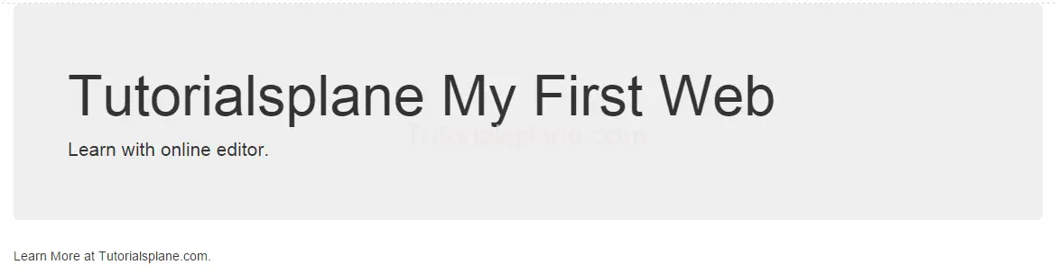
Bootstrap Jumbotron
Bootstrap Jumbotron: Bootstrap Jumbotron is big box which is used as landing page or used for displaying some specific information to draw the user’s attention.
Bootstrap Jumbotron is basically a special box which contains some useful information which can catch user’s attention.
.Jumbotron class is used to create Jumbotron in bootstrap.
Here is simple example of Bootstrap Jumbotron.
Bootstrap Jumbotron with example
Example
|
The above code will produce the following output-
Bootstrap Jumbotron Background Color
If you need colored background Jumbotron you can add style to change the background color.
Colored Background Example
|
The above code will produce the following code –

Bootstrap Jumbotron Background Image
Sometimes you need background image instead of background color in Jombortom you can add background image easily by adding following css as below.
Image Background Example
|
The above code will produce the following code –

Thus you can modify the defualt jombotron as per your need.You can customize the default jumbotron with background image, background color and different font style. You can also modify and add your custom font styles with the help of custom css.
Bootstrap Forms
Bootstrap Forms : Bootstrap provides three types of forms -vertical, horizontal and inline. Based on your requirement you can easily create these forms. Generally creating a form in html and styling them using css is a boring task. Bootstrap forms comes with the rich form elements and well organised layout. You need only add classes to make them beautiful. Thus bootstrap has simplified our task by providing well defined classes for creating form. Here in this tutorial we are going to explain how you can create Forms in Bootstrap. You can also use our online
editor to edit and run the code online.
Bootstrap Forms Example
Bootstrap provides basically three types of forms as below :
1. Vertical Form
2. Horizontal Form
3. Inline Form
Now let us go one by one to understand the bootstrap forms-
Bootstrap Vertical Form
By Default bootstrap creates vertical form, this comes with the bootstrap’s default setting. For Creating bootstrap you need to add following css and role in form elements.
1 – Add Role : First Add Role(form) in Form tag –
2 – Add Form Group Wrapper –
3 – Add Form Input Element – Add .form-control class in form input fields.
Note : By default bootstrap provides 100 % width of input fields

Bootstrap Buttons
Bootstrap Buttons : Bootstrap provides button styles which can be used as per our need. Bootstrap’s basic button can be created with simple class name .btn which will add simple button responsive style and compatible to different devices. Here in this tutorial we are going to explain how you can create buttons In Bootstrap With different- different examples. You can also use our online editor to edit and run the code online.
Bootstrap also provides classes to create the buttons of different sizes. You can also use the different button style which represents different state and message.
Bootstrap Buttons Example
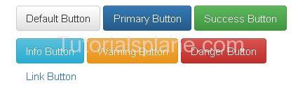
Bootstrap provides some inbuilt buttons which you can use easily for example it provides default, primary, success, info, warning, danger and link buttons .
To Use these classes you just need to the following classes-
- Bootstrap Default Button(.btn-default) – Class .btn-default is used to create Default Button.
- Bootstrap Primary Button(.btn-primary) – Class .btn-primary is used to create Primary Button
- Bootstrap Success Button(.btn-success) – Class .btn-success is used to create Success Button
- Bootstrap Info Button(.btn-info) – Class .btn-info is used to create Info Button
- Bootstrap Warning Button(.btn-warning) – Class .btn-warning is used to create Warning Button
- Bootstrap Danger Button(.btn-danger) – Class .btn-danger is used to create Danger Button
- Bootstrap Link Button(.btn-link) – Class .btn-link is used to create Link Button
Example
Now let us create an example to understand the buttons in Bootstrap.
Bootstrap Button size
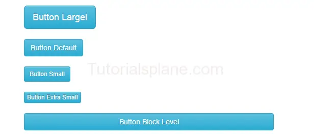
We sometimes need different-different button sizes, bootstrap provides you buttons of different-different sizes such as – Large, small, block level buttons.
Here are following button sizes available in bootstrap –
[table width=”100%” colwidth=”20|100|50 |50″ colalign=”left|left|left|left”]
no,Size,Class, Description
1 , Large Button, .btn-lg, This is used to create large button
2 , Default Button,.btn, This is used to create regular button
3 , Small Button,.btn-sm, This is used to create small button
4 , Extra Small Button,.btn-xs,This is used to create Extra small button
5 , Block Button,.btn-block, This is used to create block level button
[/table]
|
|
Bootstrap Buttons States
You can represent the states with the Active and Disabled states.
.active class is used to make the button in active state.
.disabled class is used to make the button in disabled state.

If want to create or learn about the button groups go to the Next Page ….
Bootstrap Grid System
Bootstrap Grid System overview :
Bootstrap’s grid system allows you to create layout using rows & columns .Bootstrap gird system is designed to provide the responsive layout which will be compatible to all devices as per their screen size and resolution. Just follow the bootstrap rules and enjoy the responsive development in bootstrap.
The common example for grid system containing the rows & columns is as :
Example
|
Bootstrap Grid System Overview : 12 Columns
Bootstrap allows you to add maximum 12 columns in the page. All 12 columns have equal width
Example
|
The above column will generate the 12 - column pattern. You can also group them to use as per your need.
Output
Bootstrap Grid System Overview : 2 Columns Set Example
Bootstrap allows you to divide 12 columns layout in columns set. We have shown 6 columns
Bootstrap Grid System Overview : 4 - 8 (Unequal) Columns Set Example
Bootstrap allows you to divide columns in various set layout in columns set. Here is an example of 4-8 column ie.
4 columns and 8 columns.
Bootstrap Home
Bootstrap Tutorial – Bootstrap is most popular framework for development of responsive & mobile first websites.
The resources used in bootstrap are HTML, CSS & Javascript. It enables users to rapid responsive
layout development.
Bootstrap Tutorial
Bootstrap provides rich grid-based responsive layout system. Bootstrap is powerful framework to develop responsive mobile-first website, It is one of the most loved framework for developing the mobile-first websites.
This tutorial is designed for the professionals to help them in learning the basic concept of Bootstrap. In this tutorial we will cover the basic and powerful features which can help the professionals to create fast, beautiful and mobile-first web applications using Bootstrap.
Bootstrap is free to use, you can use it free of cost.
Top 5 Reasons to Use Bootstrap
Bootstrap have become one of the most popular framework in Last few years. The Bootstrap framework is rich framework and have several benefits to use it. Here are top 5 reasons to use bootstrap framework.
- Rapid Development– If you are looking rapid development then bootstrap can be one of the best option, it provides the rich inbuilt readymade blocks which can be used easily without needing any extra effort.
- Responsive– Bootstrap uses media query which scales the websites on each devices from smart phone to desktop easily, you don’t need to write any extra code for other devices.
- Easy to Learn & Implement– It is very easy to learn & implement if you have basic knowledge of HTML, Css & jQuery you can learn and implement it easily.
- Customizable– Bootstrap is customizable you can override the default layout by overriding the classes.
- Support– Bootstrap Has great community support & it is growing day by day.


