Category Archives: Bootstrap
Bootstrap Popover
Bootstrap Popover is something like toltips but contains more information than the toltips. It Display information when user clicks on it or hovers on it. The four positions of popover plugin are available top, bottom, left , Right. Positions are defined in data attribute data-placement=”top”, data-placement=”bottom”,data-placement=”left” and data-placement=”right” .
Bootstrap Popover Syntax
We are going to explain with very basic example and demo-
Popovers can also be triggered using javascript as in example below:

popover plugin example
Full Code :
Bootstrap List Groups
Bootstrap List Groups : Bootstrap List group is used to display data in lists. You can display data in list groups in stylish format. Here we are going to demonstrate the list groups with example and demo.
Bootstrap List Groups : Basic
Basic list group is an unordered list group of Items. Here is an example of basic ie. unordered list –

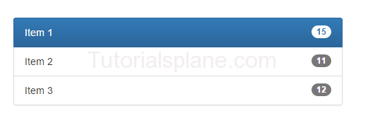
List Groups : Active

List Groups : Active With Badges
Bootstrap pager
Bootstrap pager is just type of pagination which provides next and previous buttons only.
You can create pager by just adding the .pager class in the <ul>
element.
Pager are basically used when we need next and back(previous) button.
Bootstrap Pager Demo
<ul class="pager"> <li><a href="#">Previous</a></li> <li><a href="#">Next</a></li> </ul> |
Bootstrap Tables
Bootstrap tables : Tables are basically used to represent data in row column format. Bootstrap provide classes to create responsive tables with cool look. .table class is used for basic table design in bootstrap. Bootstrap tables becomes important when you want to show data in table format with cool look. There are following types of bootstrap tables available in bootstrap.
Bootstrap Tables Type
Let us learn bootstrap tables with demo and example-
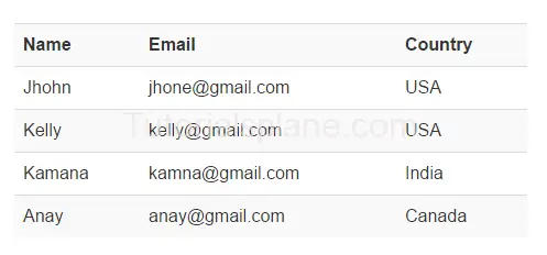
Bootstrap Basic Table
It adds simple style in table it adds the simple line between the rows.
for basic bootstrap table .table class is used.
Bootstrap Table : Basic
|
Example
The above example will produce the following output-
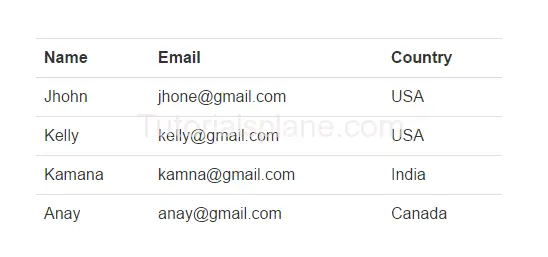
Bootstrap Bordered Table
For adding border in bootstrap table class.table-bordered is used
Bootstrap Table : Bordered
|
The above example will produce the following output-
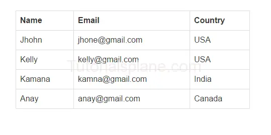
Bootstrap Table: Condensed
It makes tables cells more compact by removing the space.
For adding condensed table property in bootstrap table class.table-condensed is used
Bootstrap Table: Condensed
|
The above example will produce the following output-
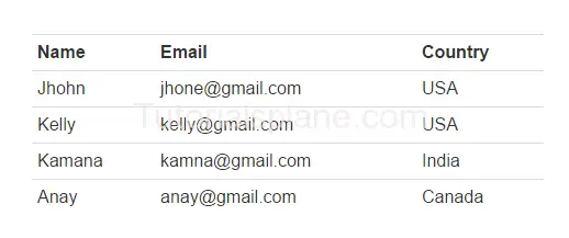
Bootstrap Table: Striped Rows
Used to provide zebra-strips.
For adding stripped in bootstrap table class.table-striped is used
Bootstrap Table: Striped Rows
|
The above example will produce the following output-
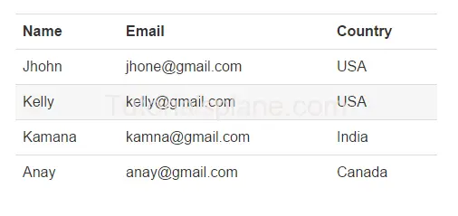
Bootstrap Table: Table Hover
Used to provide hover functionality in table.
For table hover in bootstrap table class.table-hover is used
Bootstrap Table: Table Hover
|
The above example will produce the following output-
Bootstrap Tooltip
Bootstrap tooltips works as small popup. Bootstrap tooltips are used to provide the hint when user hover’s on any link , button or label.
Tooltips becomes important for new visitors by providing them information about the link or button when they hover on them. You can place the tooltop at any position top, left, right or bottom of link. By default the tootltip color is black.
Bootstrap Tooltip Syntax And Example
Required javascript to create tooptips. Here is an example –
Add Js Code to Enable tooltips
|
|
The above Example will produce following output-

Bootstrap Tooltip Positions
You can change tooltip position by using data-placement attribute. Here are following positions of tooltips-
- Top- Attribute data-placement = “top” is used for tooltip top position.
- Bottom- Attribute data-placement = “bottom” is used for tooltip bottom position.
- Left- Attribute data-placement = “left” is used for tooltip left position.
- Right- Attribute data-placement = “right” is used for tooltip right position.
The above example will output something like this-

Add Bootstrap positions using JavaScript
You can also add positions using javascript. Here we are going to bind tooltip positions using javascript and class of element-
- Top- $(selector).tooltip({placement : ‘top’}) is used for tooltip top position.
- Bottom- $(selector).tooltip({placement : ‘bottom’}) is used for tooltip bottom position.
- Left- $(selector).tooltip({placement : ‘left’}) is used for tooltip left position.
- Right- $(selector).tooltip({placement : ‘right’}) is used for tooltip right position.
The Output of the above example will be –

Options
Lets Have an overview on available options
Here are options available which can used via data-attribute or JavaScript.
[table width=”100%” colwidth=”20|100|100|160″ colalign=”left|left|center|left|left|left”]
Option,Type,Default Value,Data Attribute, Description,Demo
animation,boolean,true, data-animation,Used to add fade transition to the tooltip.,
placement,string,’top’,data-placement,Used to add tooltip position. Default position is top.,
html,boolean,false,data-html,Used to add html content in tooltip.,
selector,string,false,data-selector,Adds tooltip to the specified selector.,
title,string|function, “”,data-title, Adds text to the tooltip title.,
trigger,string,hover focus,data-trigger,binds event how it tooltip trigger will happen example- on click- on hover – on focus or manually.,
container,string,false,data-container, Appends tooltip in container element Example “body”.,
delay,number|object,0,data-delay, Defines the seconds to show and hide tooltip.,
[/table]
Bootstrap Dropdown
Bootstrap dropdown menu allows uses to select one value from the defined list. Dropdown menu provides fancy and responsive dropdown. You can add toggle effect using the .dropdown-toggle class.
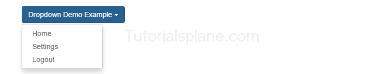
Bootstrap Dropdown Example
Let us understand Dropdown with basic example
The above example will produce following example-

If you click on the above button it will open the dropdown like this –
Bootstrap dropdown class Explaination
- .dropdown Defines the dropdown menu.
- .dropdown-toggle Binds the trigger event with the link.
- .caret Adds the icon which points the dropdown menu.
- .dropdown-menu is added in unordered list. It contains the list items to create link items.
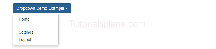
Bootstrap Dropdown Divider
Dividers are used to separate the two link items in dropdown menu. Class .divider is used to create divider between the two link items.
The output of the above example will produce the following output-
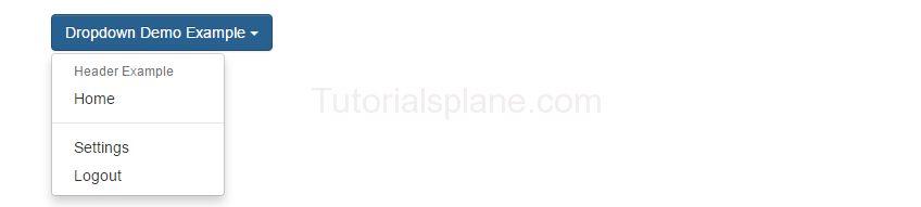
Bootstrap Dropdown Header
If you want to add headers in dropdown list use the class .dropdown-header class in <li> tag.
The output of the above example will produce the following output-
More Examples
Bootstrap Dropdown menu in navigation bar
Here is an example of Dropdown in Navigation bar-
The above method will generate the below output-

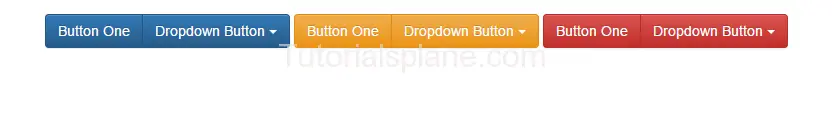
Bootstrap Dropdown Button Group Example
Here is simple button groups example with dropdown-
Following output will be produced-
Bootstrap Breadcrumbs
Bootstrap Breadcrumbs is navigation system which indicates user’s location in the website from the home page ie. the root of the website.
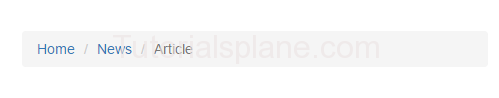
Bootstrap-breadcrumbs
Bootstrap Alerts
Bootstrap Alerts : Bootstrap provides inbuilt alert messages for showing various types of alerts to the user. Bootstrap has the following alert messages. Bootstrap provides default dismiss button also so you need not to add close button on alert box. We are going to learn each and everything step by step with complete demo try it and enjoy!
Bootstrap Alerts
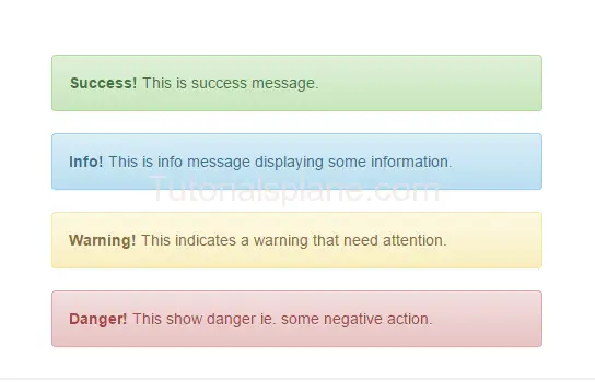
Below is List Of Bootstrap Alert Messages.
Bootstrap Alert Message Types
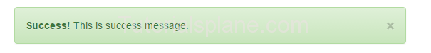
- Success: Is used to display the success messages.
- Info : Is used to display the information messages.
- Warning : Is used to display the warning messages.
- Danger : Is used to display the error messages.
Here is Example of alert messages –
Bootstrap Alerts – Messages
|
Success! This is success message.
Info! This is info message displaying some information.
Warning! This indicates a warning that need attention.
Danger! This show danger ie. some negative action.
|
The Above code will produce the following output –
Bootstrap-alert-messages
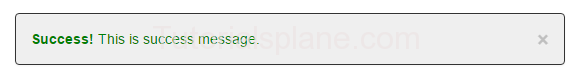
Dismiss Bootstrap Alerts Using Data Attributes
You can easily close bootstrap alert messages using data attributes.
The above code will produce following result-
Note : This is screenshot of the output. To run this demo click on the above “Try it” button.
Dismiss Bootstrap Alerts Using JavaScript
You can easily close bootstrap alert messages using data JavaScript as below –
More Effects
Bootstrap Animate Alerts : Fade In Example
Now let us add some more effects to make Alerts better. Add .fade and .in to add fading effect. This will add fade effect when you click on the close button.
Customize Effects
Now let us customize the bootstrap alert’s default effect and add some more cool effects with the help of jQuery.
Note jQuery library is required for these effects because we are going to add jQuery effects in alerts.
Bootstrap Alerts fadeOut Effect Using jQuery
Here is a simple example of fadeOut Effect using the jQuery fadeOut –
You can add fadeOut Speed as per your need in $(this).parent().fadeOut(‘slow’);.
Bootstrap Alerts : Dismiss On Click Anywhere
If you want to close alert box on click anywhere just add the following jQuery-
Bootstrap Alerts : slideUp Effect Using jQuery
Here is a simple example of slideUp Effect using the jQuery slideUp –
Customize Colors
If you want to customize the font color, background color or text color you can add custom css as following.
Bootstrap Alerts : Change background color,font color And border color
Here we are going to customize the Bootstrap success alert message.
The above code will produce the following output –
Bootstrap pagination
Bootstrap pagination : Pagination basically content divided in an organized manner. If have a lot of data and you want to show that using links(url) by dividing them into small pieces, pagination is the best way to display them by using the links to individual page. You can also add different types of pagination sizes as per your need by adding the classes – .pagination-lg and .pagination-sm.
Bootstrap pagination:

Bootstrap pagination
Following states are Available in bootstrap pagination.
1. Active State.
2. Disabled State.
Bootstrap pagination : Active State
Active state shows which page currently active. .active class is used to show the active state.Active link will be highlighted with background color.

Bootstrap pagination : Disabled State
Disabled State makes the link disabled means that link will not be clickable. .disabled class is used to show the disabled state. This can be useful when you want to prevent user to click the link in the pagination.

For more sizes you can also use the following class in the pagination.
Bootstrap pagination : Larger size
For large size .pagination-lg class is used. If you want larger pagination button size you can use the .pagination-lg class. Below example shows the large pagination. To try the large pagination just click try and edit code to see out.

Bootstrap pagination : Smaller size
For Smaller size the class .pagination-sm is used. If want smaller pagination use .pagination-sm to create smaller pagination button. Below is an example which shows the smaller pagination than default pagination button size. You can try it to see the output also you can edit code online to try the pagination size.
Bootstrap pagination : Change Background Color
If You Want to change the background color of bootstrap pagination you can add following css to add background color.

Bootstrap pagination : Rounded Pagination Style
If You Want rounded pagination you can add following css.

Bootstrap pagination : Rounded Colored Pagination
You can simply decorate the rounded pagination with background color. Add the following css to make the background colored.
The above code will produce the following beautiful output –


