Tag Archives: Ionic Tutorials
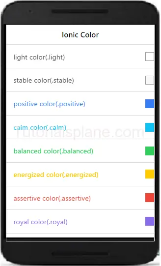
Ionic Colors
Ionic Colors : Ionic provides ready color utility which you can use frequently in you application. Ionic provides recommended naming convention for colors. It’s easy and simple to use ionic colors utility rather than adding the colors in css. You can also override the default colors. Here we are going to explain the color utility with example and demo.
Ionic Colors
Here is list of colors available in ionic Colors-
Text Colors Class
If you want to change the text color add the below css-
- .dark
- .stable-dark
- .positive
- .calm
- .balanced
- .energized
- .assertive
- .royal
- .dark
Background Colors Class
If you want to change the background color add the below css-
- .dark-bg
- .stable-dark-bg
- .positive-bg
- .calm-bg
- .balanced-bg
- .energized-bg
- .assertive-bg
- .royal-bg
- .dark-bg
Here an example of both text and background color
Ionic Colors example with syntax
|
If you run the above example it will produce the following output-
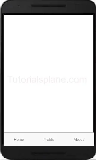
Ionic Tabs
Ionic Tabs : Tabs are basically used for navigation in mobile device. It can be placed on the top or bottom. It can contain the the links icons in top or bottom. Tabs are beautiful ways used for navigation in mobile devices. Here we are going to explain the ionic tabs with example and demo.
Syntax for Ionic Tabs
The class .tabs is used to create the tabs. Items in tab are added using the .tab class. Tab can be positioned at top or bottom of the screen.
The above example will give following output-
Ionic Tabs on Top of Screen
The class .tabs-icon-top is used to create the tabs on top of screen.
The above example will give following output-
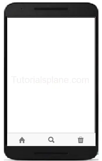
Tabs with icons
You can add icons in ionic framework as below –
The above example will give following output-
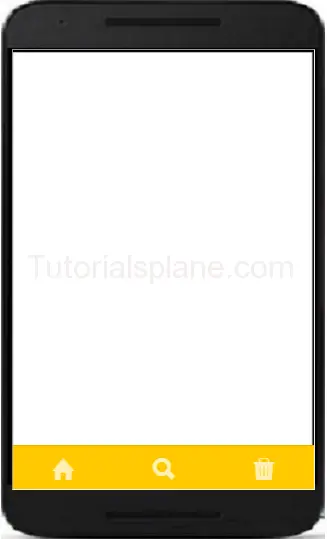
Colored Tabs Example
You ca create colored tabs using the ionic color pattern. Here is list of colors available in ionic –
- tabs-default
- tabs-light
- tabs-stable
- tabs-positive
- tabs-calm
- tabs-balanced
- tabs-energized
- tabs-assertive
- tabs-royal
- tabs-dark
You Can use the above classes to add the color in Ionic Tabs-
The above example will give following output-
Get Mobile Number in Ionic Framework
Get Mobile Number in Ionic Framework : In ionic framework you can use the DeviceInformation plugin to get the information from device. Install the cordova plugin from – https://github.com/vliesaputra/DeviceInformationPlugin. Here we are going to explain the method to get information from device such as – Get phone number, SIM card serial number etc.
Get Mobile Number in Ionic Framework
Using the https://github.com/vliesaputra/DeviceInformationPlugin plugin you can get the following information –
- Your unique Device ID
- Phone Number (if it is stored in your SIM card)
- Country ISO of your phone network provider
- Network provider name
- SIM Card Serial number
- Country ISO of your SIM card
- Name of your SIM card mobile operator
- E-mail/Phone number used by apps listed in your Settings > Accounts & Sync list
Below is sample code to get device information to get the desired data from the result
Get Phone Number in Ionic Framework
var deviceInformation = cordova.require("cordova/plugin/DeviceInformation");
deviceInformation .get(function(result) {
        console.log("result = " + result);
    }, function() {
        console.log("error");
    });
|
The above example will give you the device information such as phone number.
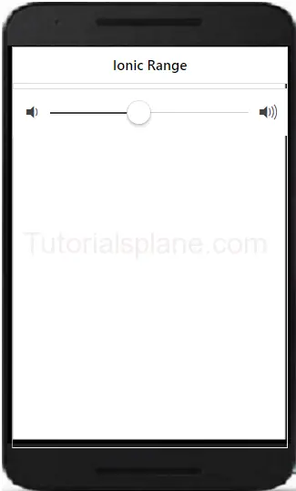
Ionic Range
Ionic Range Slider: Range Slider enables the user to select the range between the given points. Range slider provides disks to manage the range. There are various range selectors in Ionic which you can use in your application. It is very easy to customize the range slider. You can use classes to add the colors to the elements. We are going to explain the method how to use range sliders and how to customize them.
Ionic Range Slider Example | Color | Selector
Let us understand the Range selector with very basic example –
If you run the above example it will produce the output like this –
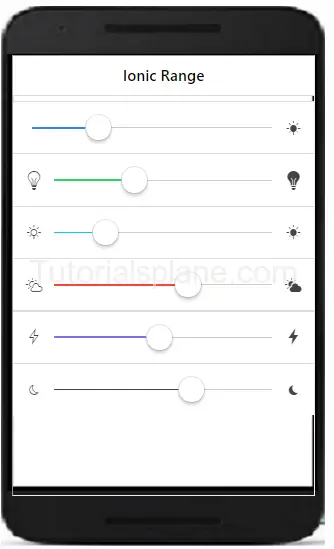
More Examples
Let us learn more abot the ionic range. Here we are going to explain how to add different colors and icons.
Ionic Range List With Different Colors And Icons
Here we are going to add different icons and colors in the range of ionic framework.
The above example will produce the following output-
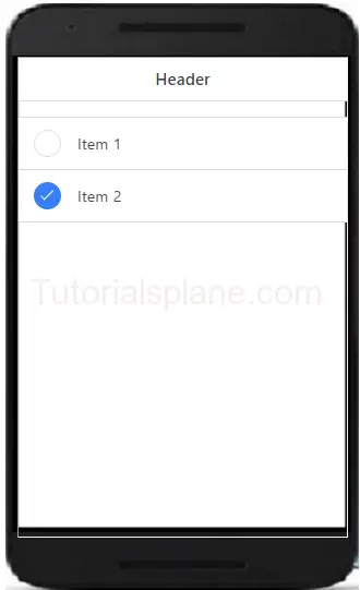
Ionic Radio Button
Ionic Radio Button: Radio button are specially used to select one item from the given list. There is main difference between the radio buttons and checkbox – Checkbox allows you multiple selection of items in list while radio buttons allows you to select only one item in given list. We are going to explain the functionality of radio buttons in ionic framework.
Ionic Radio Button
Here is an example of radio button in ionic –
After running the above example it will produce the following output as bellow-

Ionic Checkbox
Ionic Checkbox: Checkbox is basically used for selecting items from the set of choice. Ionic provides classes to create beautiful checkboxes. A label wrapper with class checkbox is used to wrap the input checkbox. It will represent both the selected and unselected checkboxes in beautiful design. We are going to explain the ionic Checkboxes with example and online demo.
Ionic Checkbox Example
Here is simple example of ionic checkbox with shows both states of checkbox.
The above example produce the following output as below-
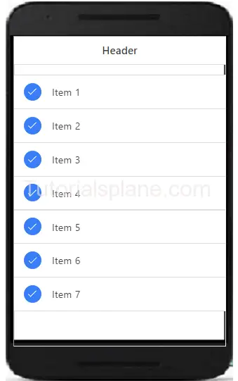
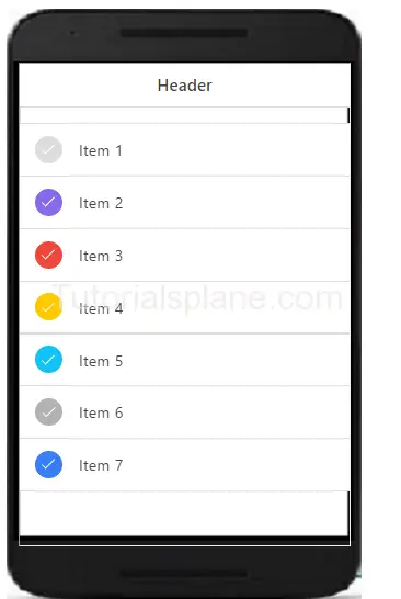
Ionic Multiple Checkboxes
You can create multiple checkboxes in ionic. The li class .item-checkbox is used to create multiple checkboxes in ionic framwork.
The above example produce the following output as below-
Ionic Colored Checkbox
You can add colors to the ionic checkboxes using color classes available in ionic to create colored Checkboxes-
The above example produce the following output as below-
Ionic Toggle
Ionic Toggle – Toggle is functionality which enables users to select one option from two options. Ionic provides classes to create toggle in app which you can easily animate and decorate with ionic colors. Ionic toggle works as html input checkbox. Ionic toggles are beautiful you will definitely love it. We are going to implement the ionic toggle on the basis of the classes.
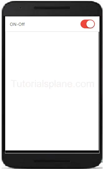
Ionic Toggle Example
Checkbox is wrapped with the label and class .toggle. Toggle contains the track div which create background and contains div with class .handle.
The above example will produce the following output-
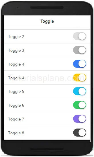
Ionic Mutiple Toggle Button In Colored Style
Let us have an example of html multiple toggles in colored style.
Ionic colored multiple toggle-
|
The above example will produce the following output-
Ionic Form
Ionic Form – Form is also an important component of ionic. Ionic provides inbuilt form elements which can be used frequently. Class .list is used to wrap the form elements. Class .item and .item-input is used to input field’s label. Label tag contains the input field of the form. Here we are going to explain the HTML5 input elements.
It is very simple to create form and it’s input fields in Ionic framework. Here in this tutorial we are going to explain how you can create form in Ionic Framework. You can also use our online demo to see the output of the examples.
Ionic Form Syntax | Example | Demo
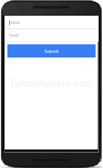
Let us go to understand form & it’s input fields. Here is simple example of Ionic Form, In this example we have simply create two input fields- name, email and submit button. –
If you run the above example it will produce the output something like this-
Text Input – Inline Label
You can add labels input label in ionic by adding the class input-label simply as in below example –
Text Input – Stacked Label
You can add Stacked input label in ionic by adding the class item-stacked-label –
Text Input – Floating Label
You can add Floating input label in ionic by adding the class item-floating-label –
Ionic Forms Inset Inputs
You can create inset forms by adding the class list-inset in wrapper div. Here is an example of form inset input –
Ionic Input Icons
Sometimes we need to add the icons to the form inputs, for this you don’t need to write any extra css, You can simply add icons in input fields by adding ion icon classes. Here is an example of input icons –
To the demo and see the output of the above code just hit the “try it” button.
If you run the above example it will produce the output with input icons field as below-
Ionic Cards
Ionic Cards : Ionic cards are great way to display information in an organized way. Cards are used widely by the companies like google, twitter. Cards can be any size and animated. Cards can be swiped left or right. You can add shadow and border to the ionic cards. Class “card” is used to create ionic cards. Here we are going to explain the card functionality with example and demo.
Ionic Cards
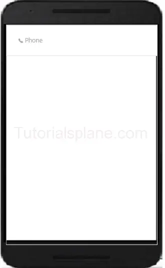
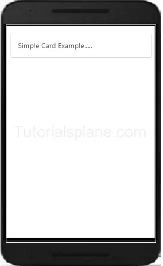
Add the class .card in wrapper div and then add child elements. Here is simple example of ionic cards.
The above example will produce the following output-
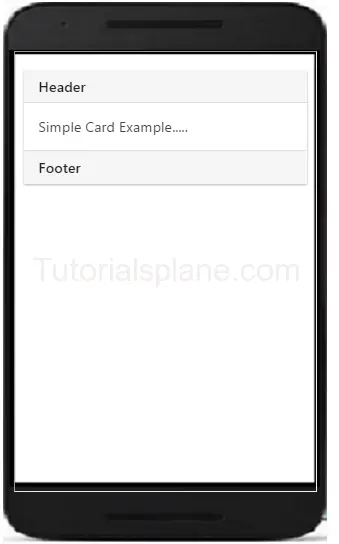
Headers And Footers
Headers and Footers are important part of ionic Cards. You can add Headers and footers by adding the class – .item-divider in header and footer. Example of header is as –
The above example will produce the following output-
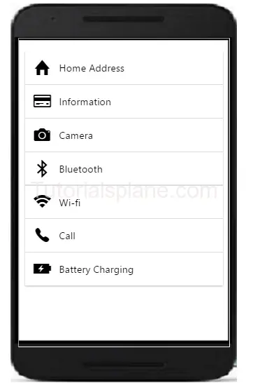
Ionic Cards With List
The class – .list is used to create cards with list. Example of card list is as –
The above example will produce the following output-
Ionic Card Images
Cards are perfect to display images and content. Images in cards looks great. Here is an example card image-


The above example will produce the following output-

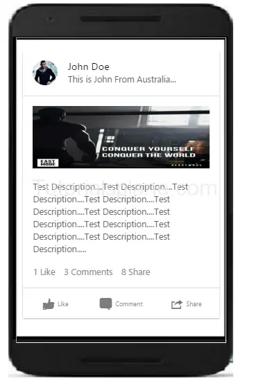
Card Showcase
Card Showcase contains several items such as item-avatar, item-card, images and item-body etc. Card Showcase are great way to display the rich content. Here is example of Card Showcase-
Card Showcase Example
|
The above example will produce the following output-


