Tag Archives: bootstrap tutorial for beginners
Twitter Bootstrap Tooltips Example And Demo
Twitter Bootstrap Tooltips Example And Demo : Example with demo and full description.
Twitter Bootstrap Tooltips Example And Demo
Bootstrap modal appearing below background
Bootstrap modal appearing below background : Add the following script to increase the z-index of the modal.
Bootstrap modal appearing below background
Add the following css to increase the z-index of bootstrap modal
|
|
Change the background color in bootstrap modal
Change the background color in a twitter bootstrap modal : You can change bootstrap modal’s background color as below
Change the background color in bootstrap modal
Add the following css to change the background color of bootstrap modal
Change the background color in bootstrap modal : Example
Output :
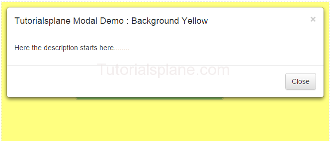
Change the background color in bootstrap modal
Disable bootstrap modal window from closing
Disable bootstrap modal window from closing : You can disable the bootstrap modal from closing.
Disable bootstrap modal window from closing Syntax
Add the following jquery to make your bootstrap modal disable from closing.
$(modal-selector).modal({
  backdrop: 'static',
  keyboard: true
})
Where modal-selector is id of your modal. You can also disable keyboard closing by setting keyboard parameter as false.
$(modal-selector).modal({
  backdrop: 'static',
  keyboard: false
})
Disable bootstrap modal window from closing : Example
$("#tutorialsplaneModal").modal({
  backdrop: 'static',
  keyboard: true
})
|
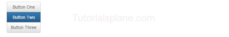
Bootstrap Button Groups
Bootstrap Button Groups : You can create a group of buttons (ie. in single line) in bootstrap.
.btn-group is used to create button group in bootstrap.
Basic Example of Bootstrap Button Groups is :

Bootstrap Button Groups : Justified
.btn-group-justified class is used to create justified bootstrap button group.

Bootstrap Button Groups : Vertical
.btn-group-vertical class is used to create vertical bootstrap button groups.
Bootstrap Button Groups : Nested
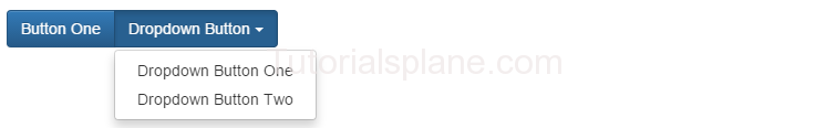
Simple example of nested bootstrap button group is as :
Bootstrap Progress Bar
Bootstrap Progress Bar : Is used to show user’s task progress.
Different types of progress bars are available in the Bootstrap.
A simple and default Progress bar is :
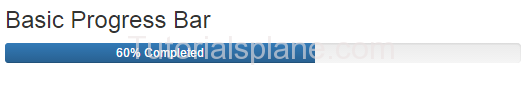
Bootstrap progress bar basic example demo
Progress Bar Colored :
Following are the classes used for the colored Progress Bar.
.progress-bar-info
.progress-bar-warning
.progress-bar-success
.progress-bar-danger
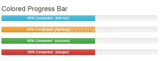
Bootstrap colored progress bar example
Bootstrap Progress Bar Striped :
Add the following class for the stripped progress bar.
.progress-bar-striped
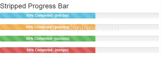
Bootstrap striped progress bar example demo
Progress Bar Animated :
Add the following class for the animated progress bar.
.active
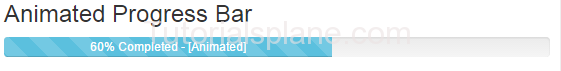
Bootstrap animated progress bar example demo
Bootstrap Scrollspy
Bootstrap Scrollspy : Bootstrap scrollspy is used for navigation. It navigates the users to the different sections of the page.
Bootstrap Scrollspy : Basic Example
|
Bootstrap Modal Plugin
Bootstrap Modal Plugin : Bootstrap Modals are basically dialog box/popup box which are used to provide some additional information or prompt user to perform some action. Bootstrap modals are easy to implement.
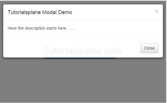
Bootstrap Modal Demo And Example
Create Basic Modal
Bootstrap Modal Plugin
BootStrap Modal Sizes :
There are following bootstrap modal size available .
Note : Class .modal-sm is used for creating small modal.
Note : Class .modal-lg is used for creating large modal.


