Semantic UI Header
Semantic UI Header– Header is basically used to represent the short summary of the content. There are various types of headers available in Semantic UI Framework- Such as Page Headers, Content Headers, Icon Headers and Sub Headers. Here in this tutorial, we are going to explain the headers one by one. You can use our online editor to edit and run the code online.
Semantic UI Header Tutorial
Let us go one by one to understand the Headers available in semantic UI.
- Types
- Content
- States
- Variations
Types
Following types of headers are available-
- 1. Page Headers
- 2. Content Headers
- 3. Icon Headers
- 4. Sub Headers
Page Headers
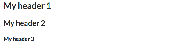
To create page header add class ui header to heading(h1, h2, h3, h4, h5, h6) element. –
Example:
<h1 class="ui header">My header 1</h1> <h2 class="ui header">My header 2</h2> <h3 class="ui header">My header 3</h3> |
If you run the above example it will produce the output something like this-
Content Headers
You can add header in content container using predefined classes. There are various size classes available such as – huge, large, medium which can be used to create different size of headers.
Example:
<div class="ui sizer vertical segment"> <div class="ui huge header">Huge Header</div> <p>This Dummy Paragraph...</p> <div class="ui large header">Large Header</div> <p>This Dummy Paragraph...</p> <div class="ui medium header">Medium Header</div> <p>This Dummy Paragraph...</p> <div class="ui small header">Small Header</div> <p>This Dummy Paragraph...</p> <div class="ui tiny header">Tiny Header</div> <p>This Dummy Paragraph...</p> </div> |
Output of above example-
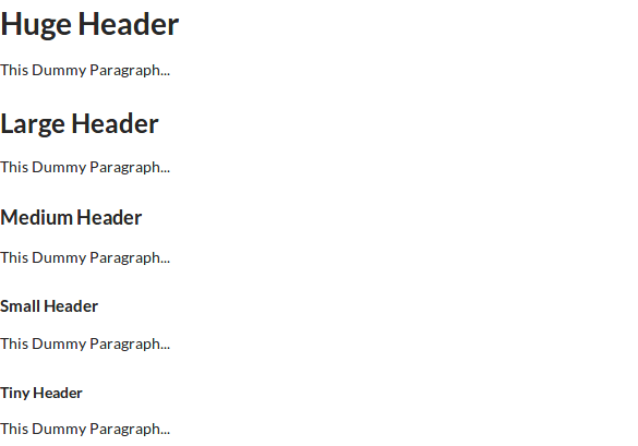
In the above output you can see the different size of content header, to change the size of header you just need to add the size modifier class to heading element.
Icon Headers
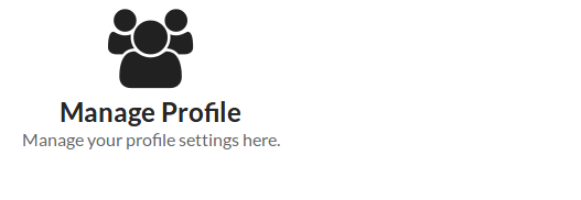
We can create icon headers using the icon class along with header class.
Example:
<h2 class="ui icon header"> <i class="users icon"></i> <div class="content"> Manage Profile <div class="sub header">Manage your profile settings here.</div> </div> </h2> |
To add icon in header first add class icon to header, then add icon using semantic icons. In the above example we have added users icon using class users icon”>.
Output of above example-
Sub Headers
Class sub is used to create sub header.
Add class sub to heading along with class ui header then add span to add the label text.
Output of above example-

Content
You can create following content headers.
- 1. Image
- 2. Icon
- 3. Subheader
Image
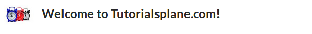
You can add image to header using image class image.
Example:
<h2 class="ui header"> <img class="ui image" src="/images/my_img.jpg" /> <div class="content"> Welcome to Tutorialsplane.com! </div> </h2> |
Output of above example-
Icon
You can add icon to header using icon class simply as below.
Example:
<h2 class="ui header">
  <i class="thumbs up outline icon"></i>
  <div class="content">
    Like Us!
  </div>
</h2>
|
You can get complete icon list from here – Semantic UI Icons List
Output of above example-

Subheader
You can add subheader of any header. Add class sub to the child header.
Example:
<h2 class="ui header"> Profile Settings <div class="sub header">Go profile settings for more options to manage your Account.</div> </h2> |
In the above example we have added class sub along with class header. On the same way you can add other subheader.
If you run the above example it will generate output something like this-

States
Following State is available for headers-
- Disabled Header– Add class disabled to create disabled header.
Example:
<h2 class="ui disabled header"> Dsiabled Header <div class="sub header">Go profile settings for more options to manage your Account.</div> </h2> |
Output of above example-

Learn More
Don’t Stop, Keep Learning!
Variations
Following variations are available for headers.
- 1. Dividing
- 2. Block
- 3. Attached
- 4. Floating
- 5. Text Alignment
- 6. Colored
- 7. Inverted
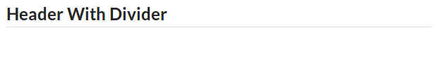
Dividing
You can add divider to the bottom of header using class dividing. Here is an example of header divider.
Adding class dividing to heading will add divider below to the header.
Output of above example-
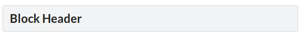
Block
You can add class block to make block level header.
After adding class block it will add a light border of 1px with padding. Block headers can also be used to display messages like- Notice, Warning, Error or Success.
Output of above example-
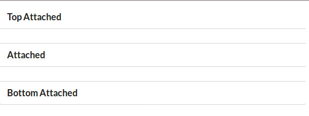
Attached
Like segment headers can also be attached to content.
Example:
<h3 class="ui top attached header"> Top Attached Header </h3> <div class="ui attached segment"> <p>This is dummy text...</p> </div> <h3 class="ui attached header"> Attached Header </h3> <div class="ui attached segment"> <p>This is dummy text...</p> </div> <h3 class="ui bottom attached header"> Bottom Attached Header </h3> |
Add class top attached to create top attached header. Add class bottom attached to create bottom attached header. Add class attached to create simple attached header.
If you run the above example it will produce output something like this-
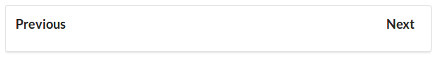
Floating
You can use floating class left floated or right floated to make it float left or right.
Example:
<div class="ui clearing segment">
  <h3 class="ui right floated header">
    Next
  </h3>
  <h3 class="ui left floated header">
    Previous
  </h3>
</div>
|
Output of above example will look something like this-
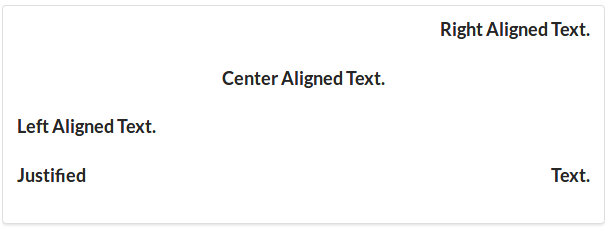
Text Alignment
You can use text alignment classes to make header text left aligned, center aligned or right aligned or justified.
Example:
<div class="ui segment"> <h3 class="ui right aligned header"> Right Aligned Text. </h3> <h3 class="ui center aligned header"> Center Aligned Text. </h3> <h3 class="ui left aligned header"> Left Aligned Text. </h3> <h3 class="ui justified header"> Justified Text. </h3> </div> |
Output of above example-
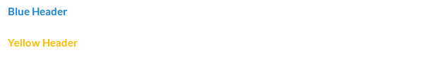
Colored
You can use color classes to change the header text color. You just need to add the color class to header. Here is an example of colored header text.
Example:
<h4 class="ui blue header">Blue Header</h4> <h4 class="ui yellow header">Yellow Header</h4> |
On the same way you can change the text color of header. If you want to add custom color add custom color class to header.
Output of above example-
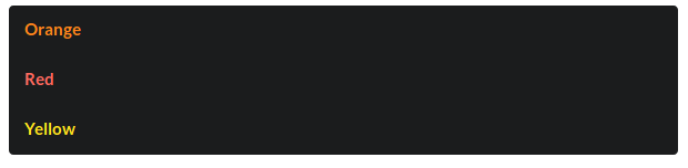
Inverted Color
If you want inverted color add class inverted to header.
Example:
<div class="ui inverted segment"> <h4 class="ui orange inverted header">Orange</h4> <h4 class="ui red inverted header">Red</h4> <h4 class="ui yellow inverted header">Yellow</h4> </div> |
If you run the above example it will produce output something like this-
Advertisements


