Semantic UI Buttons
Semantic UI Buttons– Class ui button is used to create buttons in semantic ui framework. There are different types of buttons available in Semantic UI. Here in this article we are going to explain how you can create Beautiful buttons in Semantic UI framework. You can also use our online editor to edit and run the code online.
Semantic UI Buttons Tutorial
Let us create first simple button, Add class ui button to button element-
If you run the above example it will produce output something like this-
Following types of buttons are available in semantic UI.
Basic Button
To create basic button add class basic to button.
Output of above example-
You can change the style of basic button to any of the following-
- 1. Primary Button
- 2. Secondary Button
- 3. Positive Button(Success)
- 4. Negative Button(Warning)
Example
Example:
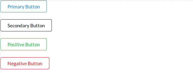
<button class="ui primary basic button">Primary Button</button> <button class="ui secondary basic button">Secondary Button </button> <button class="ui positive basic button">Positive Button</button> <button class="ui negative basic button">Negative Button</button> |
Ouput of above example-
Change Basic Button Color
If you want to change the color of basic button you can apply color class simply as below-
Example:
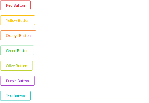
<button class="ui red basic button">Red Button</button> <button class="ui yellow basic button">Yellow Button</button> <button class="ui orange basic button">Orange Button</button> <button class="ui green basic button">Green Button</button> <button class="ui olive basic button">Olive Button</button> <button class="ui purple basic button">Purple Button</button> <button class="ui teal basic button">Teal Button</button> <button class="ui blue basic button">Blue Button</button> <button class="ui violet basic button">Violet Button</button> <button class="ui brown basic button">Brown Button</button> <button class="ui pink basic button">Pink Button</button> <button class="ui grey basic button">Grey Button</button> <button class="ui black basic button">Black Button</button> |
Ouput of above example-
Standard Button
To create standard button add class ui button.
- 1. Primary Button
- 2. Secondary Button
- 3. Positive Button(Success)
- 4. Negative Button(Warning)
Here is an example of standard buttons.
Example:
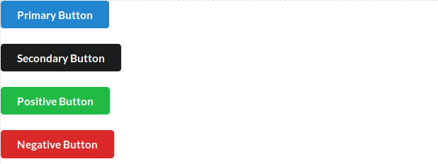
<button class="ui primary button">Primary Button</button> <button class="ui secondary button">Secondary Button </button> <button class="ui positive button">Positive Button</button> <button class="ui negative button">Negative Button</button> |
Ouput of above example-
Change Standard Button Color
You can change standard button color using color class simply as below-
Example:
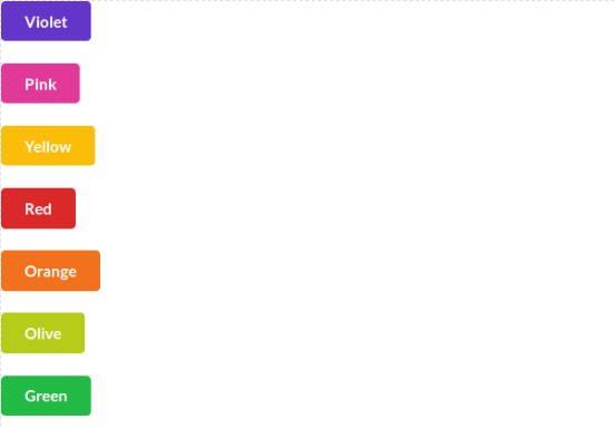
<button class="ui violet button">Violet</button> <button class="ui pink button">Pink</button> <button class="ui yellow button">Yellow</button> <button class="ui red button">Red</button> <button class="ui orange button">Orange</button> <button class="ui olive button">Olive</button> <button class="ui green button">Green</button> <button class="ui teal button">Teal</button> <button class="ui blue button">Blue</button> <button class="ui purple button">Purple</button> <button class="ui brown button">Brown</button> <button class="ui grey button">Grey</button> <button class="ui black button">Black</button> |
Ouput of above example-
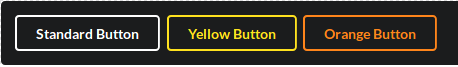
Inverted Button
To create inverted buttons first create div wrapper with class – ui inverted segment and then add button with inverted class. Here is an example of inverted Button.
Example:
<div class="ui inverted segment"> <button class="ui inverted button">Standard Button</button> <button class="ui inverted yellow button">Yellow Button</button> <button class="ui inverted orange button">Orange Button</button> </div> |
Ouput of above example-
Add Icon to Button
You can create button with icon using icon and label class.
Example:
<button class="ui yellow button"> <i class="icon user"></i> Add As Friend </button> |
Ouput of above example-
Button Groups
You can create button groups simply as below-
Example:
<div class="large ui buttons"> <button class="ui red button">Button 1</button> <button class="ui gray button">Button 2</button> <button class="ui yellow button">Button 3</button> </div> |
Ouput of above example-
Advertisements


