Ionic Buttons
Ionic Buttons : Buttons plays an important role in any application. Ionic provides beautiful ready made buttons, you can use them frequently. Basic class for buttons used is button. We are going to explain the buttons in ionic framework.
Syntax for Ionic Buttons
Here is list of buttons in ionic. By default the buttons uses the class .inline-block
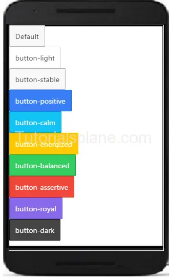
Ionic Buttons Example –
<button class="button"> Default </button> <button class="button button-light"> button-light </button> <button class="button button-stable"> button-stable </button> <button class="button button-positive"> button-positive </button> <button class="button button-calm"> button-calm </button> <button class="button button-energized"> button-energized </button> <button class="button button-balanced"> button-balanced </button> <button class="button button-assertive"> button-assertive </button> <button class="button button-royal"> button-royal </button> <button class="button button-dark"> button-dark </button> |
If you run the above example it will produce the following output-
Ionic Block Button
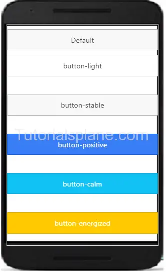
You can use block level buttons as below. Add Class .button-block to create block level button-
Ionic Block Buttons Example –
<button class="button button-block"> Default </button> <button class="button button-light button-block"> button-light </button> <button class="button button-stable button-block"> button-stable </button> <button class="button button-positive button-block"> button-positive </button> <button class="button button-calm button-block"> button-calm </button> <button class="button button-energized button-block"> button-energized </button> <button class="button button-balanced button-block"> button-balanced </button> <button class="button button-assertive button-block"> button-assertive </button> <button class="button button-royal button-block"> button-royal </button> <button class="button button-dark button-block"> button-dark </button> |
The Above example will produce the following output–
Ionic Full Button
You can use full buttons as below. Add Class .button-full to create full button-
Ionic Full Buttons Example –
<button class="button button-full"> Default </button> <button class="button button-light button-full"> button-light </button> <button class="button button-stable button-full"> button-stable </button> <button class="button button-positive button-full"> button-positive </button> <button class="button button-calm button-full"> button-calm </button> <button class="button button-energized button-full"> button-energized </button> <button class="button button-balanced button-full"> button-balanced </button> <button class="button button-assertive button-full"> button-assertive </button> <button class="button button-royal button-full"> button-royal </button> <button class="button button-dark button-full"> button-dark </button> |
The Above example will produce the following output–
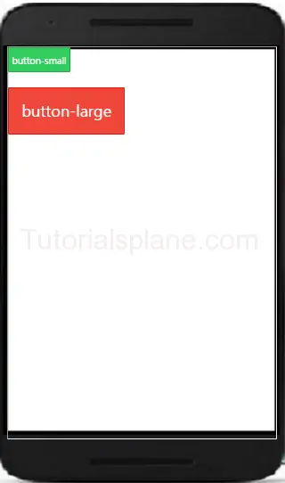
Ionic Button Sizes
Ionic Basically provides the two size of buttons- small and large. .button-small and .button-large is used to create small and large buttons. Here is an example of button size –
Ionic Outlined Buttons Example –
<button class="button button-balanced button-small"> button-small </button><br><br> <button class="button button-assertive button-large"> button-large </button> |
The above example will produce the following output–
Ionic Outlined Button-
If you want to create button with transparent background and thin border you can use outlined button style. Class .button-outline is used to create outlined button in ionic.
Ionic Full Buttons Example –
<button class="button button-outline"> Default </button> <button class="button button-light button-outline"> button-light </button> <button class="button button-stable button-outline"> button-stable </button> <button class="button button-positive button-outline"> button-positive </button> |
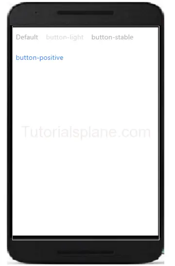
Ionic Clear Buttons-
If you want to remove border and make text in style button. Use . .button-clear to create the buttons with clear style.
Ionic Full Buttons Example –
<button class="button button-clear"> Default </button> <button class="button button-light button-clear"> button-light </button> <button class="button button-stable button-clear"> button-stable </button> <button class="button button-positive button-clear"> button-positive </button> |
Out of the above example will be something like this –
Ionic Button Colors
Here are ionic color options available-
| No | Class | Color name | Color |
|---|---|---|---|
| 1 | bar-light | White | |
| 2 | bar-stable | Light Gray | |
| 3 | bar-positive | Blue | |
| 4 | bar-calm | Light blue | |
| 5 | bar-balanced | Green | |
| 6 | bar-energized | Yellow | |
| 7 | bar-assertive | Red | |
| 8 | bar-royal | Violet | |
| 9 | bar-dark | Black |
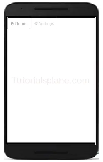
Ionic Button Icons
Ionic Button Icons Example –
<button class="button button-outline ion-home"> Home </button> <button class="button button-light button-outline ion-settings"> Settings </button> |
The Above example will produce output something like this –
Advertisements
Add Comment
📖 Read More
- 1. Ionic List
- 2. Ionic Cards
- 3. Ionic Form
- 4. Ionic Toggle
- 5. Ionic Checkbox
- 6. Ionic Radio Button
- 7. Ionic Range
- 8. Ionic Select
- 9. Ionic Tabs
- 10. Ionic Grid


