Tag Archives: Material Design Lite Tutorial
Material Design Lite – Dialogs
Material Design Lite – Dialogs : The Material Design Lite (MDL) dialog component allows us to perform the action such as user action verification, input data and alerts box to provide extra information to users. Here in this tutorial we are going to explain how you can Material design lite dialogs. You can use our online editor to edit and run the code online.
Material Design Lite – Dialogs | Popup | Modal | Alert Box | Example
Sytax for Dialogs is as below-
Syntax –
Material Design Lite Dialog | Modal | Alert Syntax
|
|
The above syntax is used to create basic modal, alert box in Material design lite.
Now let us create a simple example to understand the basic dialog in Material Design Lite.
Example
If you run the above example it will produce the output something like this –

Mdl Dialog Classes
- mdl-dialog : This is used to define the container of the dialog component.
- mdl-dialog__title : This is used to define the title container in the dialog.
- mdl-dialog__content : This is used to define the content container of the dialog.
- mdl-dialog__actions : This is used to define the actions container in the dialog.
- mdl-dialog__actions–full-width : This Modifies the actions to make the full width of the container and it makes each to take their own line.
More Examples
Let’s have look over more example and demo here.
Material Design Lite Alert Box
Material Design Lite Confirm Box
Material Design Lite – Lists
Material Design Lite – Lists : Material Design Lite (MDL) list is used to display multiple items line wise vertically. Material design provides the inbuilt classes to create beautiful list. Here in this tutorial we are going to explain how you can create list. We will explain it with example and demo. You can use our online editor to run and edit the code.
Material Design Lite – Lists
Let us first create simple list as below-
Basic List
Add the class mdl-list to the <ul> and mdl-list__item to the <li>. This will create a simple list in material design lite.
If you run the above example it will produce output something like this –

Basic List With Primary Content
Add the class mdl-list to the <ul> and mdl-list__item-primary-content to the <span>.
Material Design Lite – Lists Add Icon Example:
|
If you run the above example it will produce output something like this –

Material Design Lite – List Classes
Following classes are available in material design lite lists. You can use these classes to create beautiful classes.
- .mdl-list(required) – This is used to define list as an MDL component.
- .mdl-list__item(required)– This is used to define the List Items
- .mdl-list__item–two-line(optional) – This is used to define the List’s Items as Two Line.
- .mdl-list__item–three-line(optional)- This is used to define the List’s Items as a Three Line Optional Three.
- .mdl-list__item-primary-content(optional) – This is used to define the primary content sub-division –
- .mdl-list__item-avatar(optional) – This is used to define the avatar sub-division –
- .mdl-list__item-icon(optional)– This is used to define the icon sub-division –
- .mdl-list__item-secondary-content(optional)-This is used to define the secondary content sub-division requires
- .mdl-list__item-two-line or .mdl-list__item-three-line(optional)
-
.mdl-list__item-secondary-info(optional)– This is used to define the information sub-division
.mdl-list__item-two-line or .mdl-list__item-three-line. - .mdl-list__item-secondary-action(optional)– This is used to define the Action sub-division. .mdl-list__item-two-line or .mdl-list__item-three-line.
- .mdl-list__item-text-body – This is used to define the Text Body sub-division needs .mdl-list__item-three-line class.
More Examples
Let’s have look over more example and demo here.
List With Avatars & Actions
You can create list with avatars & actions as below –
Material Design Lite – Lists Add Icon Example:
If you run the above example it will produce the output something like this –

Material design lite not Working on mobile devices
Material design lite not Working on mobile devices – Sometimes material desgin lite responsiveness does not supports in all devices due to some error. Here in this tutorial we are going to explain how you can fix the material design responsiveness issue.
Material design lite not Working on mobile devices
If the meta viewport tag is missing please add the meta view port tag.
Material design lite not Working on mobile devices Example:
|
|
Now check after adding this tag it might fix you problem.
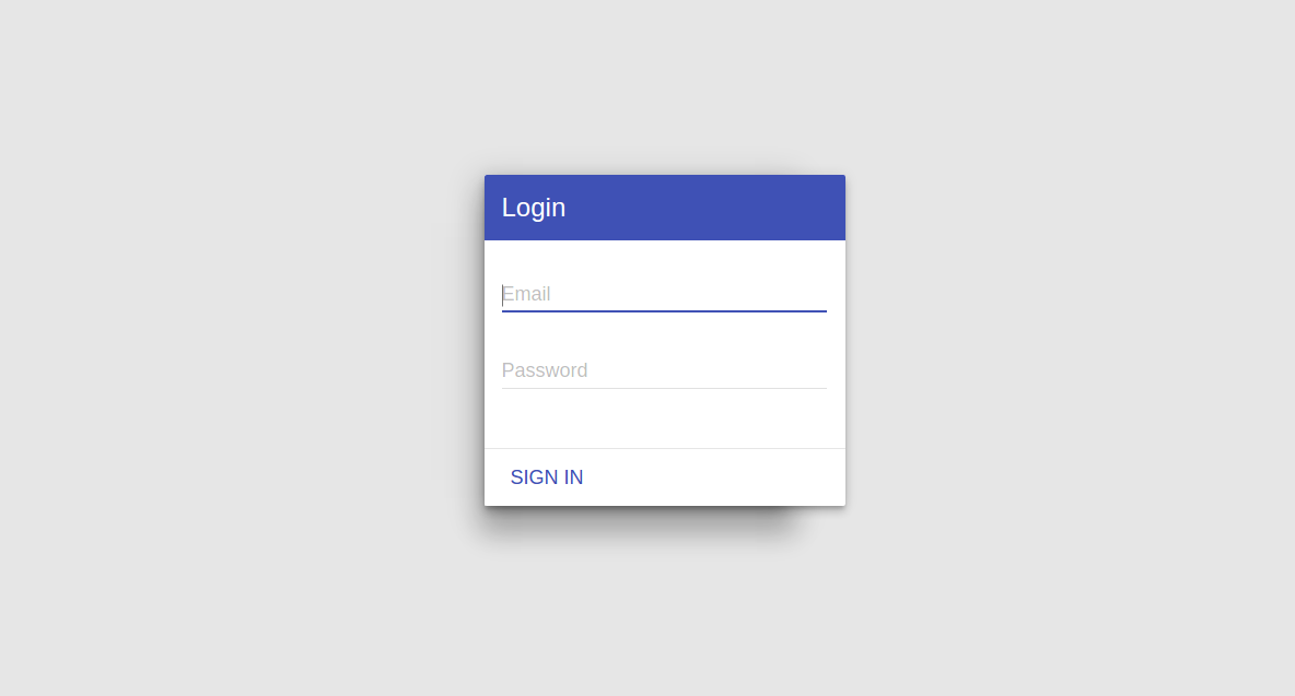
Material design lite login page
Material design lite login page(template) : You can create login form using predefined classes in material design lite. Here in this tutorial we are going to explain how you can create a simple login page with example and demo.
Material design lite login page | Login Form | Template Example
You can create simple login form in material design lite as below. This form contains two input fields – email, password and one submit button.
If you run the above example it will produce the output something like this –

Learn More
Let us have some More example on Login templates of Material Design Lite.
Material Design Lite Login Form In Popup Dialog(Modal)
You can create login form in material design lite popup modal simply as below –
Login Form in Popup Dialog Modal Example:
<html>
<head>
<link rel="stylesheet" href="https://fonts.googleapis.com/icon?family=Material+Icons">
<link rel="stylesheet" href="https://code.getmdl.io/1.1.1/material.indigo-pink.min.css">
<script defer src="https://code.getmdl.io/1.1.1/material.min.js"></script>
<style>
.remove-padding{
padding:0px;
}
</style>
</head>
<body>
  <button id="show-dialog" type="button" class="mdl-button">Login</button>
  <dialog class="mdl-dialog remove-padding">
        <div class="mdl-card mdl-shadow--6dp">
			<div class="mdl-card__title mdl-color--primary mdl-color-text--white">
				<h2 class="mdl-card__title-text">Login</h2>
			</div>
	  	        <div class="mdl-card__supporting-text">
				<form action="#">
					<div class="mdl-textfield mdl-js-textfield">
						<input class="mdl-textfield__input" type="text" id="email" />
						<label class="mdl-textfield__label" for="email">Email</label>
					</div>
					<div class="mdl-textfield mdl-js-textfield">
						<input class="mdl-textfield__input" type="password" id="userpass" />
						<label class="mdl-textfield__label" for="userpass">Password</label>
					</div>
				</form>
			</div>
			<div class="mdl-card__actions mdl-card--border">
				<button class="mdl-button mdl-button--colored mdl-js-button mdl-js-ripple-effect">Sign In </button>

			</div>
		</div>
  </dialog>
  <script>
    var dialog = document.querySelector('dialog');
    var showDialogButton = document.querySelector('#show-dialog');
    if (! dialog.showModal) {
      dialogPolyfill.registerDialog(dialog);
    }
    showDialogButton.addEventListener('click', function() {
      dialog.showModal();
    });
  </script>
</body>
</html>
|
If you run the above example it will show a popup dialog and login form simply as below –
Material Design Lite – Cards
Material Design Lite – Cards : Material Design Lite(MDL) Cards are basically self-contained pieces of paper with data such as images, texts, links etc about a single subject. Cards are basically new feature in user interface which provides more complex & Detailed information. Material design lite provides predefined classes to create the beautiful & interactive Cards. Here in this tutorial we are going to explain how you can create cards in material design lite. We will explain the functionality with example and demo.
How to Create Material Design Lite – Cards ?
Let us create first card –
Material Design Lite – Wide Card
We have created a wide card in material design as below. We have added custom css to customize the width of the Card.
Material Design Lite – Cards Example:
|
|
In the above example we have created simple card in material design. If you run the above example it will produce output something like this –

Material Design Lite – Square Card
You can create a square card by adding your custom css as below-
Material Design Lite – Cards Example:
|
|
In the above example we have created simple square card. If you run the above example it will produce output something like this –

Material Design Lite – Image Card
You can create a image card by following the steps as below-
If you run the above example it will produce output something like this –

Material Design Lite Card Classes
Here are the classes availble for material design lite cards –
- mdl-card – This is used to define div element as an MDL card container.
- mdl-card–border-This is used to Add border to the card section.
- mdl-shadow–2dp(optional)– This is used to define the shadow with variable depth 2dp.
- mdl-card__title – This defines div as a card title container.
- mdl-card__title-textThis is used to Assign the appropriate text characteristics to card title.
- mdl-card__subtitle-text-This is used to Assign the appropriate text characteristics to card subtitle.
- mdl-card__media– This is used to defines div as a card media container
- mdl-card__supporting-text– This defines div as a card body text container which supports the text.
- mdl-card__actions – This defines div as a card actions container.
More Examples & Customizations
Let’s have look over more example and customization of cards here.
Coming.. soon.
Material Design Lite – Badges
Material Design Lite – Badges : Material design lite(MDL) provides beautiful badges to display notification. It is basically circle which contains the number or icon. It is also considered as small status descriptor for ui elements. It becomes important when you want to draw user’s attention to display some important message. The most common example can be display the new message notification on the screen. Material design lite provides various pre defined classes which can be used to add beautiful styles, look and feel. Here in this tutorial we are going to explain how you can create badges in material design lite. We Will explain this with example and online demo.
Material Design Lite – Badges Example
Let us create a simple badge in material design –
Badges With Number
Here is an example of badge with number in material design lite –
If you run the above example it will produce the output something like this –
Badges With Icon
Here is an example of badge with icon in material design lite –
If you run the above example it will produce the output something like this –
Material Design Lite Badges Options
- mdl-badge(Required)– This Defines the badge as an MDL component.
- mdl-badge–no-background(optional)– Used to Apply open-circle effect on badge.
- mdl-badge–overlap(optional) Used to Make the badge overlap with its container.
- data-badge=”value”– Used to Assign string value to badge.
More Examples
Let’s have look over more example and demo here.
Badge Icons (On Texts)
If you want to add the badge icons on text or links you can add simply as below –
If you run the above example it will produce the output something like this –
Material Design Lite – Tabs
Material Design Lite – Tabs : Material Design lite(MDL) Tab is basically used to create a user interface which contains the multiple views in the same space. All The views are displayed in the same space exclusively. Material Design lite provides predefined classes to create beautiful tabs. Here in this tutorial we are going to explain how you can create tabs in material design lite and customize them. We will go step by step to explain each examples with example and demo.
Material Design Lite – Tabs Example
Here is an example of tab. First we have added width class “mdl-tabs mdl-js-tabs” main div which contains the tab elements and class “mdl-js-ripple-effect” is added to add the ripple effect.
Tabs have two parts – header & panel. Header contains the header elements. Header elements are added using the class “mdl-tabs__tab” and class “is-active” is used to represent the default tab selected. The header element’s href contains the id of panel which you want to display on button click.
Panel class “mdl-tabs__panel” is used to create the panel content you can add the class “is-active” to show the default tab panel.
Material Design Lite – Tabs : Example
|
If you run the above example it will produce the output like this –

Material Design Lite – Tabs Classes
Here are the inbuilt classes for material design lite tabs-
- mdl-layout : This class is used to define the div container as MDL Component.
- md-tabs : This class is used to define the tab container.
- mdl-js-tabs : This class is used to add MDL Behaviour in tabs.
- mdl-tabs__tab-bar: This class is used to create the tab header which contains the links.
- mdl-js-ripple-effect: This class is used to add the ripple effect in the tab headings
- mdl-tabs__tab: This identifies the link as MDL tab link.
- mdl-tabs__panel: This class is used to create contains for tab content.
- is-active: This class is used to represent the active tab.
More About Material Design Lite – Tabs
Let us learn more about Material Design Lite Tabs.
Material Design Lite Table full Width
Material Design Lite Table full Width 100% : You can add custom class to make the table fullscreen ie. full width. Here in this tutorial we are going to explain how to make material design lite tables full width using custom class css.
Material Design Lite Table full Width 100% Example
You can create custom class and add the following css to make material design tables full width 100% as in the below example-
In the above example we have created custom class and added css width:100%; to make the table full width 100%. If you run the above example it will produce the output something like this-

If want to check for different screen size run demo in fullscreen mode.
Material design lite – Center Aligned form
Material design lite – Center Aligned form : Sometimes you need to keep the form centered aligned in material design lite. There are many ways to align center the data in material design lite. Here we are going to explain how to create a simple form and keep it centered aligned.
Material design lite – Center Aligned form
You can use mdl-layout-spacer for centered align form in material design-
The above example creates a form which will be placed in the center of the screen. If you run the above example it will produce the output something like this.


