Tag Archives: learn bootstrap online
Bootstrap Panels
Bootstrap Panels : A Panel in bootstrap is basically a box with some styles like border , padding etc. Bootstrap provides predefined boxes which are known as panel. We often need to show data in box with some padding and border for this bootstrap panel component becomes very useful. Bootstrap panel component provides many types of panel. We are going to explain panels with example and demo.
Bootstrap Panels
Here is very basic panel –
If you run the above example it will produce output like this –

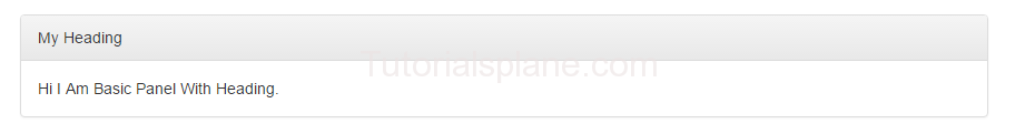
Bootstrap Panel Heading
.panel-heading is used to add heading in panel.
If you run the above example it will produce output like this –
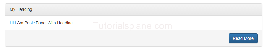
Bootstrap Panel Footer
.panel-footer is used to add footer in panel.
If you run the above example it will produce output like this –
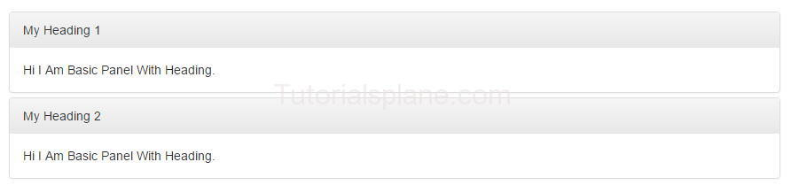
Bootstrap Panel Group
You can make group of panels by adding a wrapper div with class .panel-group.
Here is an example of panel group-
Panel Group Example-
|
The above example will produce following output-
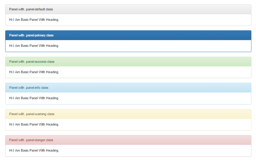
Bootstrap Panels with Contextual Classes
Bootstrap provides contextual classes to add color in panels which represents different states.
Here are available classes for panel state –
- .panel-default – Represents Default States
- .panel-primary – Primary State
- .panel-success – Represents Success Message
- .panel-info – Represents Information
- .panel-warning – Represents Warning
- .panel-danger – Represents Error Message With Danger State
Let us have look on each state with example And demo-
Bootstrap Panel States
Example-
|
The above example will produce following output-


