Tag Archives: Ionic Tutorials
Customize font size in Ionic Framework
Customize font size in Ionic Framework : Sometimes we need to customize the font size, font style in ionic framework. You can add font css in style.css to override the default font size as per your requirement. Here in this tutorial we are going to explain the font customization in ionic.
Customize font size in Ionic Framework
Go to project/www/css open style.css and add the following css.
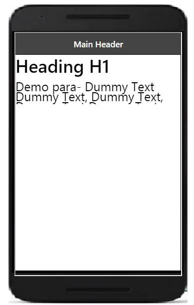
The above css will override the default css for font size and set it to 25px. You can add font size as per your need.
If you run the above example it will produce the following output-
Ionic place tabs at the bottom of the screen
Ionic place tabs at the bottom of the screen : In ionic framework we some time face problem in the position of the tabs. In this tutorial we are going to explain how to place the tabs at the bottom of screen in ionic framework.
Ionic place tabs at the bottom of the screen
Suppose we have tabs something like in this example –
Ionic tabs at the bottom of the screen example:
|
To place the above tabs at the bottom of the screen add the following code in app.js just after the angular.module.
Place Ionic tabs at the bottom of the screen:
angular.module('myApp', ['ionic']) |
If you will run the above demo it will produce the output like this -

Ionic full screen background image
Ionic full screen background image : In ionic framework full screen background image can be added using css. Here in this tutorial we are going to explain how to add full screen background image in ionic framework with example and demo.
Ionic full screen background image
You can add the full background image in ionic framework simply adding the class .pane in ionic view and add the background image to this class as below-
If you run the above example it will produce the following output –

Ionic Popup
Ionic Popup- Popups are basically used to draw user’s attention and get some information from the user or provide some information. Popups Appear on the top of app’s content. You can manually dismiss the popup to interact the app again.
Ionic Provides various popup alerts that can be used easily in any application. There are – Basic Alerts, Prompt Alerts, Confirmation Alerts, Radio Alerts and Checkbox Alerts available in Ionic.
Here in this tutorial, we are going to explain how to create ionic popup alert step by step with example and demo.You can also use our online editor to edit and run the code online.
Note : These popups are supported in Angular Version > 2.x.
Ionic Popup | Alert | Prompt | Confirmation Alert | Example
Popup is dialog box that is used to show important message or information to User or It can can used
to get some input from user for example – Prompt box to enter wi-fi username/password.
Now let us understand popup alert with example & demo –
- 1. Basic Alerts
- 2. Prompt Alerts
- 3. Confirmation Alerts
- 4. Radio Alerts
- 5. Checkbox Alerts
AlertController is required to create alerts so don’t forget to import this controller.
Basic Alerts
- 1. HTML Part – It contains the view part of basic alert.
- 2. Script Part – This contains typescript code for the basic Alert.
Html Part : demo.html
So now add the following code to create button layout-
Ionic Popup Example: Html Part
|
Html contains the Layout part of the page, a button “Show Alert” is created to call function showAlert() which opens a basic alert, this function is defined in JavaScript Typescript – demo.ts file.
Script Part : demo.ts
It contains script resources to create Alert Box, showAlert() function is defined in this file which is triggered on Button click to open the Alert Box.
Ionic Popup Alerts Example: Script Part
import { Component } from '@angular/core';
import { AlertController } from 'ionic-angular';
@Component({
templateUrl: 'demo.html'
})
export class DemoPage {
constructor(public atrCtrl: AlertController) {
}
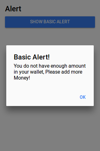
showAlert() {
let alert = this.atrCtrl.create({
title: 'Basic Alert!',
subTitle: 'You do not have enough amount in your wallet, Please add more Money!',
buttons: ['OK']
});
alert.present();
}
}
|
Import AlertsController, add in constructor and call create() method with parameters.
So we can see clearly only following things are required to create alerts.
1. importing AlertController.
2. calling it in constructor.
The output of above example will be something like this-
Confirm Alerts | Confirmation Box | Yes | No
Confirmation Alert is used to get acceptance of user. Here is simple Confirmation Box
- 1. HTML Part – It contains the Html Part.
- 2. Script Part – It contains typescript code for the Confirmation Alerts.
Html Part : demo.html
Html template contains button to Call the Confirm Alert which calls showConfirmAlert Function –
Ionic Confirmation Box Alert Example: Html Part
|
Script Part : demo.ts
This contains definition of showConfirmAlert() function which is used to show confirm box –
Ionic Confirmation box Alerts Example: Script Part
import { Component } from '@angular/core';
import { AlertController } from 'ionic-angular';
@Component({
templateUrl: 'demo.html'
})
export class DemoPage {
constructor(public atrCtrl: AlertController) {
}
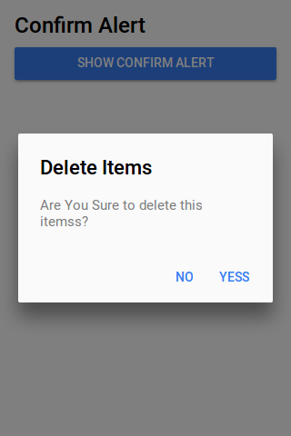
showConfirmAlert() {
let alertConfirm = this.atrCtrl.create({
title: 'Delete Items',
message: 'Are You Sure to delete this itemss?',
buttons: [
{
text: 'No',
role: 'cancel',
handler: () => {
console.log('No clicked');
}
},
{
text: 'Yess',
handler: () => {
console.log('Yes clicked');
}
}
]
});
alertConfirm.present();
}
}
|
The output of above example will look something like this –
Prompt Alerts
This basically used to get user input for example- Enter Wifi password.
- 1. HTML Part – It contains the Html Part.
- 2. Script Part – It contains typescript code for the Prompt Alerts.
Html Part : demo.html
This contains button to Call the Prompt Alert box which calls prompt Function –
Ionic Prompt Alerts Example: Html Part
|
Script Part : demo.ts
Script Part contains the definition of prompt function –
Ionic Prompt box Alerts Example: Script Part
import { Component } from '@angular/core';
import { AlertController } from 'ionic-angular';

@Component({
  templateUrl: 'demo.html'
})
export class DemoPage {
  constructor(public atrCtrl: AlertController) {

  }
 showPromptAlert() {
  let alert = this.atrCtrl.create({
    title: 'Login',
    inputs: [
      {
        name: 'username',
        placeholder: 'Enter Username'
      },
      {
        name: 'password',
        placeholder: 'Enter Password',
        type: 'password'
      }
    ],
    buttons: [
      {
        text: 'Cancel',
        role: 'cancel',
        handler: data => {
          console.log('You Clicked on Cancel');
        }
      },
      {
        text: 'Login',
        handler: data => {
          if (User.isValid(data.username, data.password)) {
            // login is valid
          } else {
            // invalid login
            return false;
          }
        }
      }
    ]
  });
  alert.present();
}

}
|
The Above Example Will Output something like this –
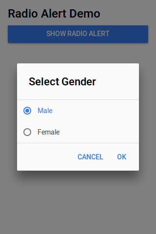
Radio Alerts
This shows radio options to user and user can select only one option from list.
- 1. HTML Part – It contains the Html Part.
- 2. Script Part – It contains typescript code for the Radio Alerts.
Html Part : demo.html
Html template contains button to which triggers radio alert Function –
Ionic Radio Popup Alert Box Example: Html Part
|
Script Part : demo.ts
It contains function definition
Ionic Radio Alert Popup box Example: Script Part
import { Component } from '@angular/core';
import { AlertController } from 'ionic-angular';

@Component({
  templateUrl: 'demo.html'
})
export class DemoPage {
  constructor(public atrCtrl: AlertController) {

  }
 showRadioAlert() {
    let alert = this.atrCtrl.create();
    alert.setTitle('Select Gender');

    alert.addInput({
      type: 'radio',
      label: 'Male',
      value: 'Male',
      checked: true
    });
     alert.addInput({
      type: 'radio',
      label: 'Female',
      value: 'Female',
      checked: true
    });

    alert.addButton('Cancel');
    alert.addButton({
      text: 'OK',
      handler: data => {
        this.testRadioOpen = false;
        this.testRadioResult = data;
      }
    });
    alert.present();
  }
}

}
|
Radio Alert output looks like this
Checkbox Alerts
It is used to provide multiple options and user can select more than one option from list.
- 1. HTML Part – It contains the Html Part.
- 2. Script Part – It contains typescript code for the Checkbox Alerts.
Html Part : demo.html
Html template contains button to Call Checkbox alert Function –
Ionic Checkbox Alerts Box Example: Html Part
|
Script Part : demo.ts
This contains definition of showCheckboxAlert() function –
Ionic Checkbox Alert box Alerts Example: Script Part
import { Component } from '@angular/core';
import { AlertController } from 'ionic-angular';

@Component({
  templateUrl: 'demo.html'
})
export class DemoPage {
  constructor(public atrCtrl: AlertController) {

  }
  showCheckboxAlert() {
    let alert = this.atrCtrl.create();
    alert.setTitle('Which Fruit do you like?');

    alert.addInput({
      type: 'checkbox',
      label: 'Mango',
      name: 'input-mango',
      id: 'input-mango',
      value: 'Mango',
      checked: true
    });

   alert.addInput({
      type: 'checkbox',
      label: 'Banana',
      name: 'input-banana',
      id: 'input-banana',
      value: 'Banana'
    });
   alert.addInput({
      type: 'checkbox',
      label: 'Apple',
      name: 'input-apple',
      id: 'input-apple',
      value: 'Apple'
    });

    alert.addButton('Cancel');
    alert.addButton({
      text: 'Okay',
      handler: data => {
        console.log('Checkbox data:', data);
      }
    });
    alert.present();
  }

}
|
Learn More
Don’t Stop! Learn More..
Instance Members
config
create(options)
Display an option with title, inputs and buttons.
-
options – Options to configure the alert box.
Options
Following options are available-
| Property | Type | Detail |
|---|---|---|
| title | string | This is used to add the title for alert box. |
| subTitle | string | Adds subtitle for alert box. |
| message | string | Adds message for alert box |
| cssClass | string | Adds custom css classes, Add classes separated by space. |
| inputs | Array | An array of inputs, See input options below. |
| buttons | Array | An array of buttons. See options below. |
| enableBackdropDismiss | Boolean | Disable backdrop tap dismiss, set false, default value for this option is true. |
Input options
| Property | Type | Description |
|---|---|---|
| type | string |
This is used to define the input type such as – text, email, number, etc. |
| name | string |
The name for the input box. |
| placeholder | string |
This is used to add the placeholder for input box. |
| value | string |
Adds default value of input. |
| label | string |
Adds label of input. |
| checked | boolean |
Whether or not the input is checked. |
| id | string |
Add input box id. |
Button Options
| Property | Type | Description |
|---|---|---|
| text | string |
Adds button text. |
| handler | any |
Emitted when the button is pressed. |
| cssClass | string |
Adds custom css class to button. |
| role | string |
The buttons role, null or cancel. |
Keywords
Ionic popup modal, template, popup close, alert, button style, window etc.
Ionic Popover
Ionic Popover : The popover is basically a view which is used to provide additional information of element when user hovers, clicks or performs some action. Content which needs to show on popover keep them inside the <ion-popover-view> tag. Here in this tutorial we are going to explain Ionic Popover with example and demo.
Ionic Popover
Let us first create a template and add the popover view inside it. Here we are going to create a button and call a function on click event.
Popover Html Part-
Here is html part of popover in ionic.
Ionic Popover:
|
|
In the above example we have created a button and called a function openPopover on click event. We will create this function in next step. We have created template with id test-popover.html which we will call to show the popover content on button click. <ion-popover-view> tag is used to create popover view which contains the title & content etc.
Popover Controller Part-
Here is controller part of popover in ionic-
The above controller has $ionicPopover which is required for ionic popover. The function openPopover is used to trigger the event to show the popover. You can call function closePopover to close the popover. The Controller code also contains the events based actions such as if you want to perform some action on popover hidden or popover removed. You can add event based action in the above example also.
If you run the above example it will produce output something like this-

Methods-
Following methods are available in Ionic Popover-
1. fromTemplate()
2. fromTemplateUrl().
fromTemplate(templateString, options):
- templateString(string) : This is string used for popover content.
- options(Object): This is object. This is used for Options which are passed to the initialize method.
fromTemplateUrl(templateUrl, options):
- templateUrl(string) : Url to load Template.
- options(Object): This is object. This is used for Options which are passed to the initialize method.
More About Ionic Popover
Let us Customize the popover.
Add icon in Ionic Popover
Let us add icon in popover template –
Popover Html Part-
Here is html part of popover in ionic.
In the above example we have added an icon and added custom style for the position of icon. You can also add your own style to manage the icon position and size.
Add Animation in Ionic Popover : slide In Up
You can add the animation in popover simply as below –
The above example will show the popover with the slide in up effect. You can also add other animation effects that ionic supports.
Change Background of Popover
You can add your custom css style to change the background color-
The above example will show the popover with the yellow color and text color in #333.
Change Background Color of Backdrop of Popover
You can override the default background of backdrop of popover by overriding the class .popover-backdrop. So now let us check how it works-
As you see we have added custom background with important style in .popover-backdrop class because we have to override the default background and replace with our custom background. The above example will show the popover backdrop with the custom background color.
You can customize the popover in ionic as per your need. You can also override the default position of the popover. Most of the time we are concerned about the height & width of the popover you can override the height & width also by adding custom class in wrapper or you can directly override main popover class.
Ionic Navigation
Ionic Navigation : Navigation in app is used to provide navigation to the users throughout the application. Ionic provides a beautiful navigation system which you can use easily. Ionic uses the AngularJs UI Router for navigation. In this tutorial, we are going to explain the functionality of ionic navigation.
Ionic Navigation
As Ionic uses the AngularUI Router so app interfaces are organized into various “states”. State contains the state name and template url. Ionic maintains the history of the states which makes it’s better. In this example we are going to create a navigation system which will contain different states for the app.
Controller Code
Ionic Navigation Example
.config(function($stateProvider, $urlRouterProvider) {

  $stateProvider
    .state('tabs', {
      url: "/tab",
      abstract: true,
      templateUrl: "templates/tabs.html"
    })
    .state('tabs.home', {
      url: "/home",
      views: {
        'home-tab': {
          templateUrl: "templates/home.html",
          controller: 'MainCtrl'
        }
      }
    })
	.state('profile', {
      url: "/profile",
      templateUrl: "templates/profile.html"

    })
	.state('contact', {
      url: "/contact",
      templateUrl: "templates/contact.html"

    });
   $urlRouterProvider.otherwise("/tab/home");

})

.controller('MainCtrl', function($scope, $ionicModal) {
});
|
When the app is started the router searchs the index state and loads it’s template. If index state is not defined it will load the default router.
$urlRouterProvider.otherwise(“/tab/home”); defines the default router if no router is found.
The above part contains the controller & Services Required for the navigation
Html Code
Here is html part of the above example –
If you Run the above example it will produce output like this-

Navigation Components
Let us Understand the components of navigation system.
ion-nav-view
|<ion-nav-view> And </ion-nav-view>| is used to define the ion-nav-view. Ionic nav view contains the ion-view. In the above example we have added ion-nav-view which is necessary for navigation.
Ion Nav View
|
|
ion-view
This is child of the ion-nav-view and container for view content and navigational and header bar. Here is an example of ion-view –
|
ion-nav-bar
ion-nav-bar which is used to create topbar which is updated when the application states are changed.You can add ion-nav-back-button to create the back button. Here is an example of ion-nav-bar –
|
|
Ionic Modal
Ionic Modal: Ionic modal is basically content pane area which appears over the main content view. Ionic modal is popup with rich functionality which provides users more functionality. You can customize the ionic’s default modal easily. In this tutorial we are going to explain the modal functionalities with example and demo. We will also cover how to customize modal such as color background color or size of modal. It’s cool you will definitely love it.
Ionic Modal
<ion-modal-view> is used for creating model. Place content inside the tag <ion-modal-view> and </ion-modal-view> which you want to show in modal. Here is html template and controller for modal script.
Html Template
Ionic Modal Html Template Code
Controller Code
Below code contains the function to open a model and close model also code to execute action on events such as on open or on close of modal. Here is full code of controller required for opening and closing a modal.
Ionic Modal Controller
angular.module('myApp', ['ionic'])
.controller('MyCtrl', function($scope, $ionicModal) {
  $ionicModal.fromTemplateUrl('test-modal.html', {
    scope: $scope,
    animation: 'slide-in-up'
  }).then(function(modal) {
    $scope.modal = modal;
  });
  $scope.openModal = function() {
    $scope.modal.show();
  };
  $scope.closeModal = function() {
    $scope.modal.hide();
  };
  //Cleanup the modal when we're done with it!
  $scope.$on('$destroy', function() {
    $scope.modal.remove();
  });
  // Execute action on hide modal
  $scope.$on('modal.hidden', function() {
    // Execute action
  });
  // Execute action on remove modal
  $scope.$on('modal.removed', function() {
    // Execute action
  });
});
|
If you run the above example it will produce the following output-

Ionic loading
Ionic loading : Ionic provides beautiful loading functionality which represents the activity and prevents users interaction until the activity is completed. $ionicLoading.show() is used to show ionic default loader and $ionicLoading.hide() is used to hide the loader. Here we are going to explain the functionality with example and demo.
Ionic loading
Here is default Ionic loader –
The above example will produce the following output-

Ionic Keyboard
Ionic Keyboard: Keyboard is very important feature in ionic. Ionic provides functionality which automatically identifies the field elements which needs a keyboard. The field elements should be in ionic’s scroll view or directive such as content.
Ionic Keyboard Example
Ionic keyboard functionality becomes very important when you want to customize the default behavior of the keyboard. Here we are going to explain this with an example-
How to use Ionic Keyboard?
Suppose you want to implement a functionality when keyboard is open such as hide an element when the keyboard is open. For this functionality you can use the class .hide-on-keyboard-open Here is an example –
Ionic Keyboard Example
|
|
When click on the above input field email the keyboard will be open at the time of the keyboard open the element div with class .hide-on-keyboard-open will be hidden.
You can find the plugin at https://github.com/driftyco/ionic-plugin-keyboard


