Bootstrap Vertical and Horizontal Divider
Bootstrap Vertical and Horizontal Divider – Dividers are basically used to create line which works as separator. Here in this tutorial we are going to explain how you can create bootstrap vertical and horizontal divider. We will explain this with example and demo.
Bootstrap Vertical and Horizontal Divider
You can create vertical and horizontal divider as below-
Bootstrap Horizontal Divider : Between Rows
You can create Horizontal divider as below-
Bootstrap Vertical and Horizontal Divider : Example
<style type="text/css">
.h-divider{
 margin-top:5px;
 margin-bottom:5px;
 height:1px;
 width:100%;
 border-top:1px solid gray;
}
</style>
<div class="row">
    <div class="col-xs-3">Col 1</div>
    <div class="col-xs-2">Col 2</div>
    <div class="col-xs-2">Col 2</div>
    <div class="col-xs-3">Col 3</div>
    <div class="col-xs-3">Col 4</div>
</div>
<div class="h-divider">
</div>
<div class="row">
    <div class="col-xs-3">Col 1</div>
    <div class="col-xs-3">Col 2</div>
    <div class="col-xs-3">Col 3</div>
    <div class="col-xs-3">Col 4</div>
</div>
|
If you run the above example it will produce the following output as below –

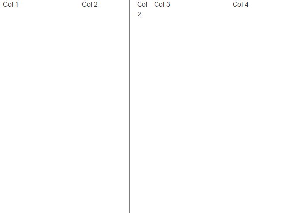
Bootstrap Vertical Divider : Between Columns
Bootstrap vertical divider between columns – You can create Vertical divider as below-
Bootstrap Vertical and Horizontal Divider : Vertical Example
<style type="text/css">
.v-divider{
 margin-left:5px;
 margin-right:5px;
 width:1px;
 height:100%;
 border-left:1px solid gray;
}
</style>
<div class="row">
    <div class="col-xs-3">Col 1</div>
    <div class="col-xs-2">Col 2</div>
    <div class="col-xs-2 v-divider">Col 2</div>
    <div class="col-xs-3">Col 3</div>
    <div class="col-xs-3">Col 4</div>
</div>
|
If you run the above example it will produce the following output as below –
Advertisements


