Bootstrap form control states
Bootstrap form control states : Bootstrap Form Controls are specially used for representing form’s state such as input focus, input disabled and validation state eg. form input validation error or success.
Using the bootstrap form control states you can represent the states in nice way.
We are going to explain the states available in bootstrap with example and demo.
List Of Bootstrap form control states
Here is the list of form control states –
-
VALIDATION STATES
- Error : Represents the input with error. Add the class .has-error in its parent element.
- Warning : Represents the input with warning. Add the class .has-warning in its parent element.
- Success : Represents the input with success. Add the class .has-success in its parent element.
- DISABLED INPUTS : Represents inputs in disabled state. .disabled class is used to disable the input field.
- READONLY INPUTS ; Represents a readonly input field. .readonly class is used to make the input field readonly.
- INPUT FOCUS : Used to focus the input field.
- DISABLED FIELDSETS: Used to represent the Disabled field set.
- ICONS(Feedback) .has-feedback is used to add feedback icon.
- HIDDEN LABELS: The class .sr-only is used for invisible icons.
Bootstrap form control states Example
The above form control states are included in the demo. You can edit and try them online to see the output.
<form role="form"> <div class="form-group has-error has-feedback" > <label class="control-label" for="fname">First Name(Input with error)</label> <input type="text" name= "First Name" class="form-control" id="fname" placeholder="Enter First Name"> <span class="glyphicon glyphicon-remove form-control-feedback"></span> </div> <div class="form-group has-warning has-feedback"> <label class="control-label" for="email">Email (Input with warning)</label> <input type="text" name="email" class="form-control" id="email" placeholder="Enter email"> <span class="glyphicon glyphicon-warning-sign form-control-feedback"></span> </div> <div class="form-group has-success has-feedback"> <label class="control-label" for="Phone">Phone(Input with success)</label> <input type="text" name="phone" class="form-control" id="phone" placeholder="Enter Phone No"> <span class="glyphicon glyphicon-ok form-control-feedback"></span> </div> <div class="form-group"> <label class="control-label" for="Password">Password(Readonly)</label> <input type="password" name="password" class="form-control" readonly id="password" placeholder="Enter Password" value="12344"> </div> <div class="form-group"> <label class="control-label" for="Password">Confirm Password(Input Focus)</label> <input type="password" name="confirmpassword" class="form-control" id="confirmpassword" placeholder="Enter Password"> </div> <button type="submit" class="btn btn-primary disabled">Submit (With Disabled)</button> </form> |
Output of the above code-
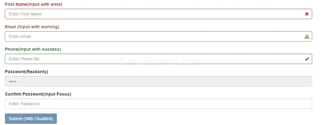
The above form control states shown in the example are used in Validation or when you some special state of the form elements. These states are important when you are validating the form. You can use these states to show different states while you are validating form or you want to represent some state with message.
Advertisements
Add Comment
📖 Read More
- 1. Bootstrap Panels
- 2. Bootstrap Disable Enable button jQuery
- 3. Bootstrap Registration Page Templates


